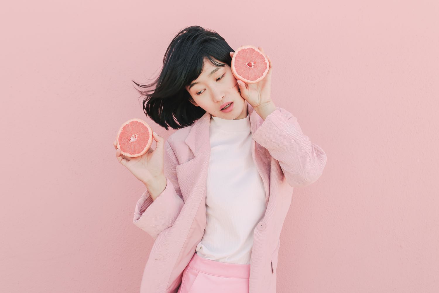
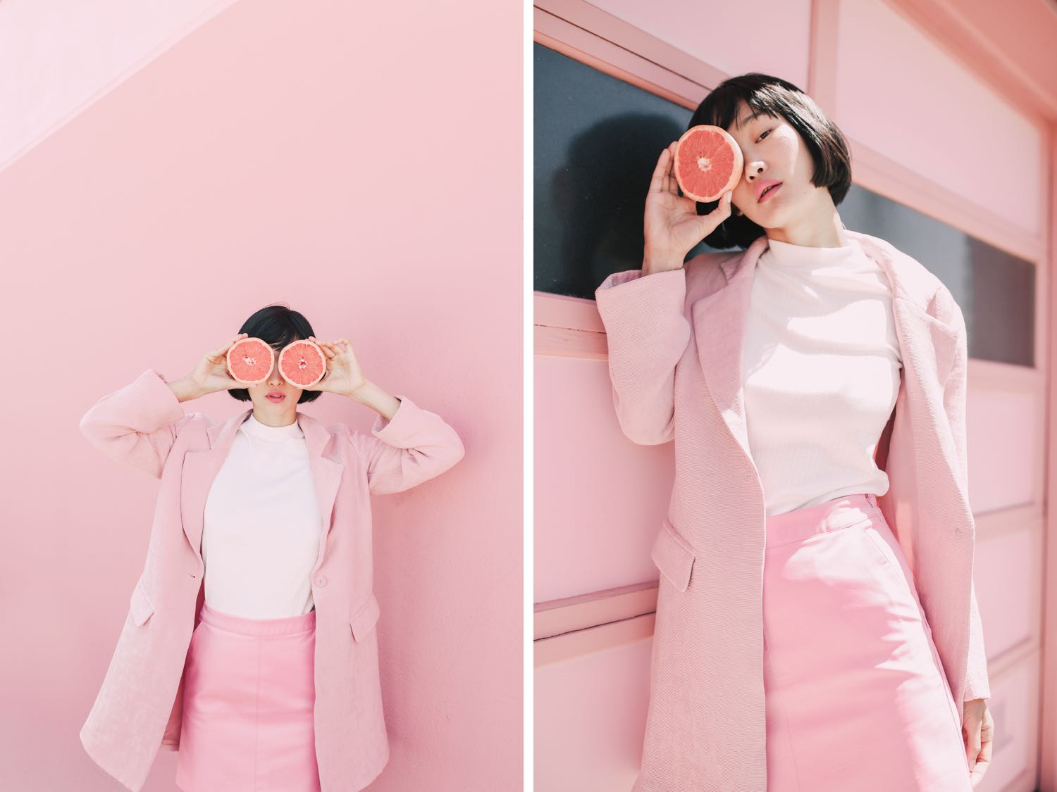
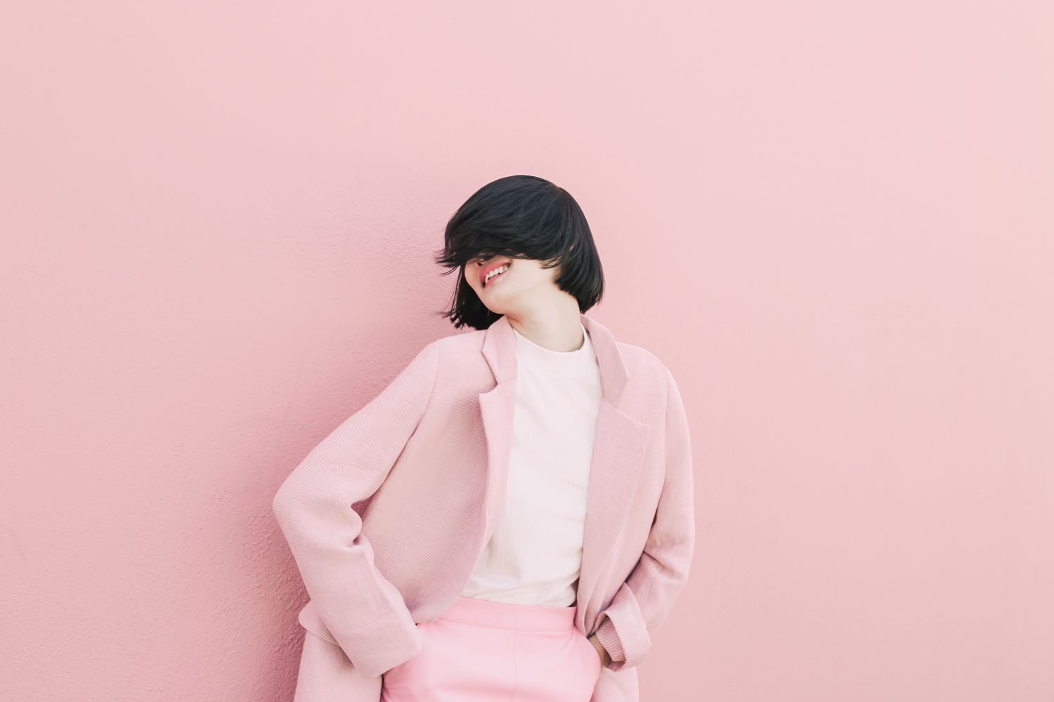
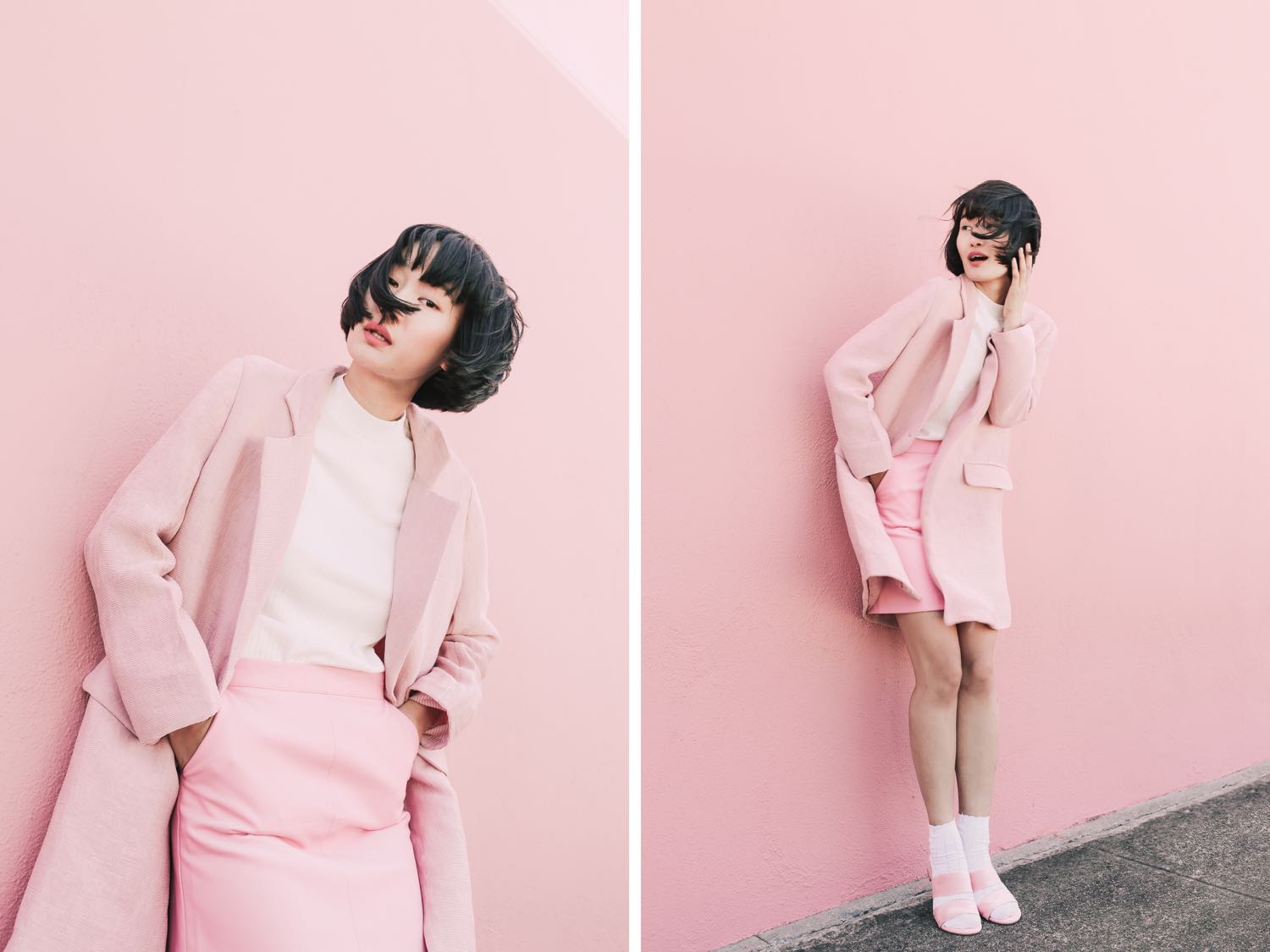
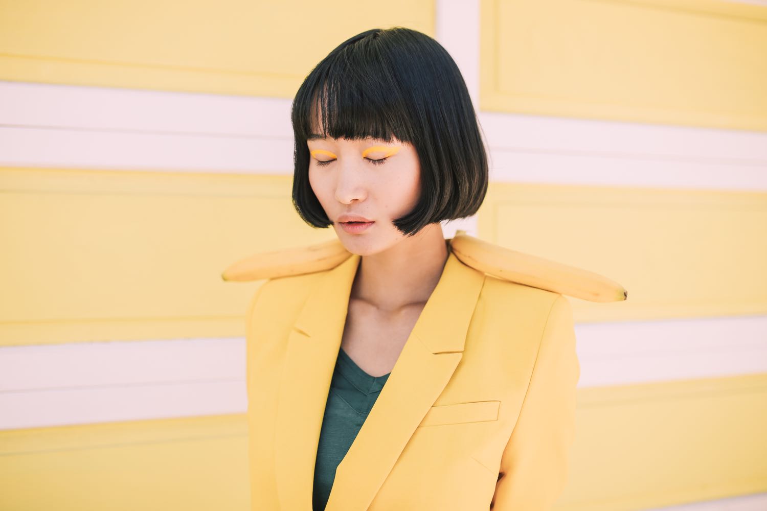
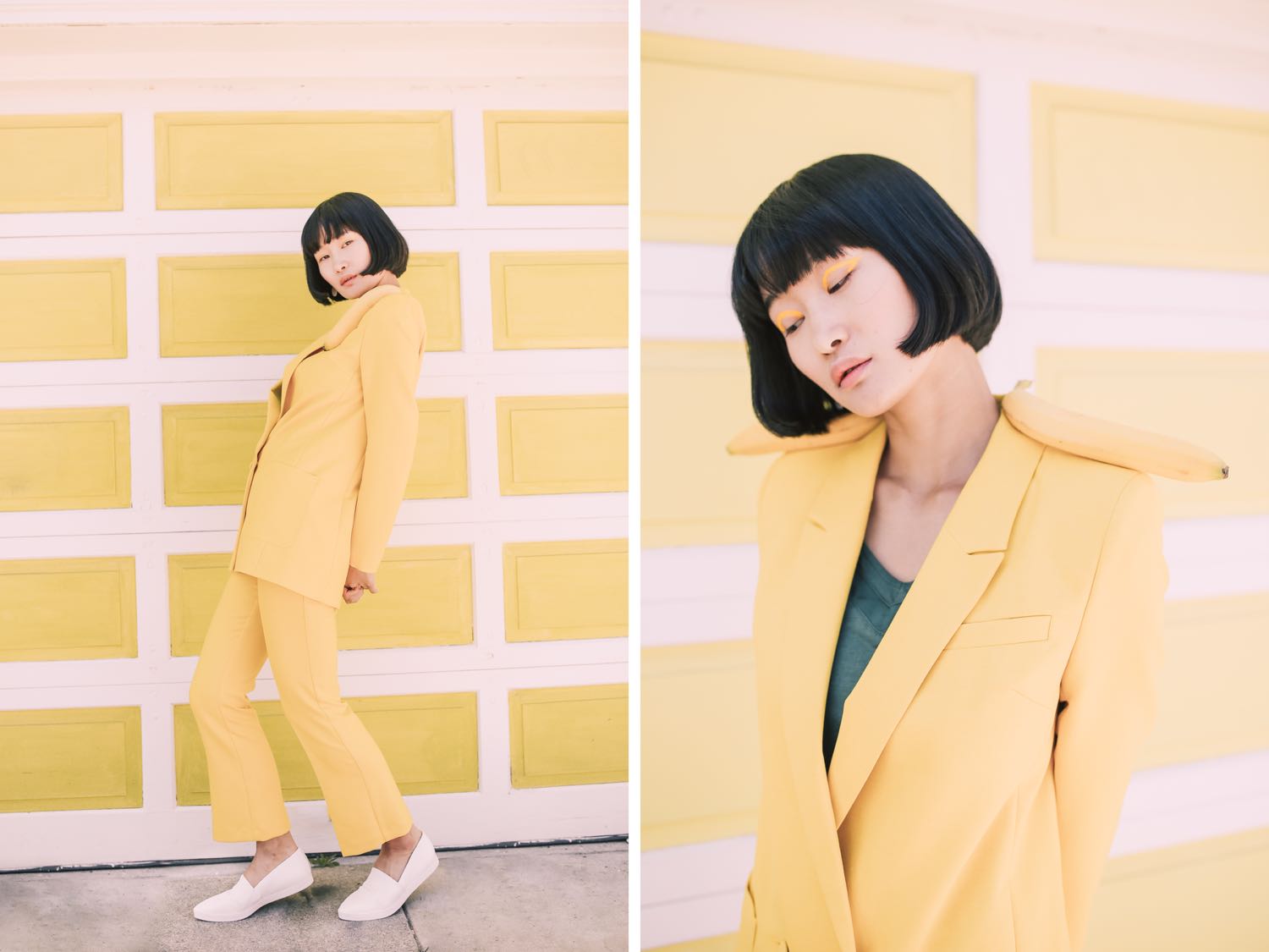
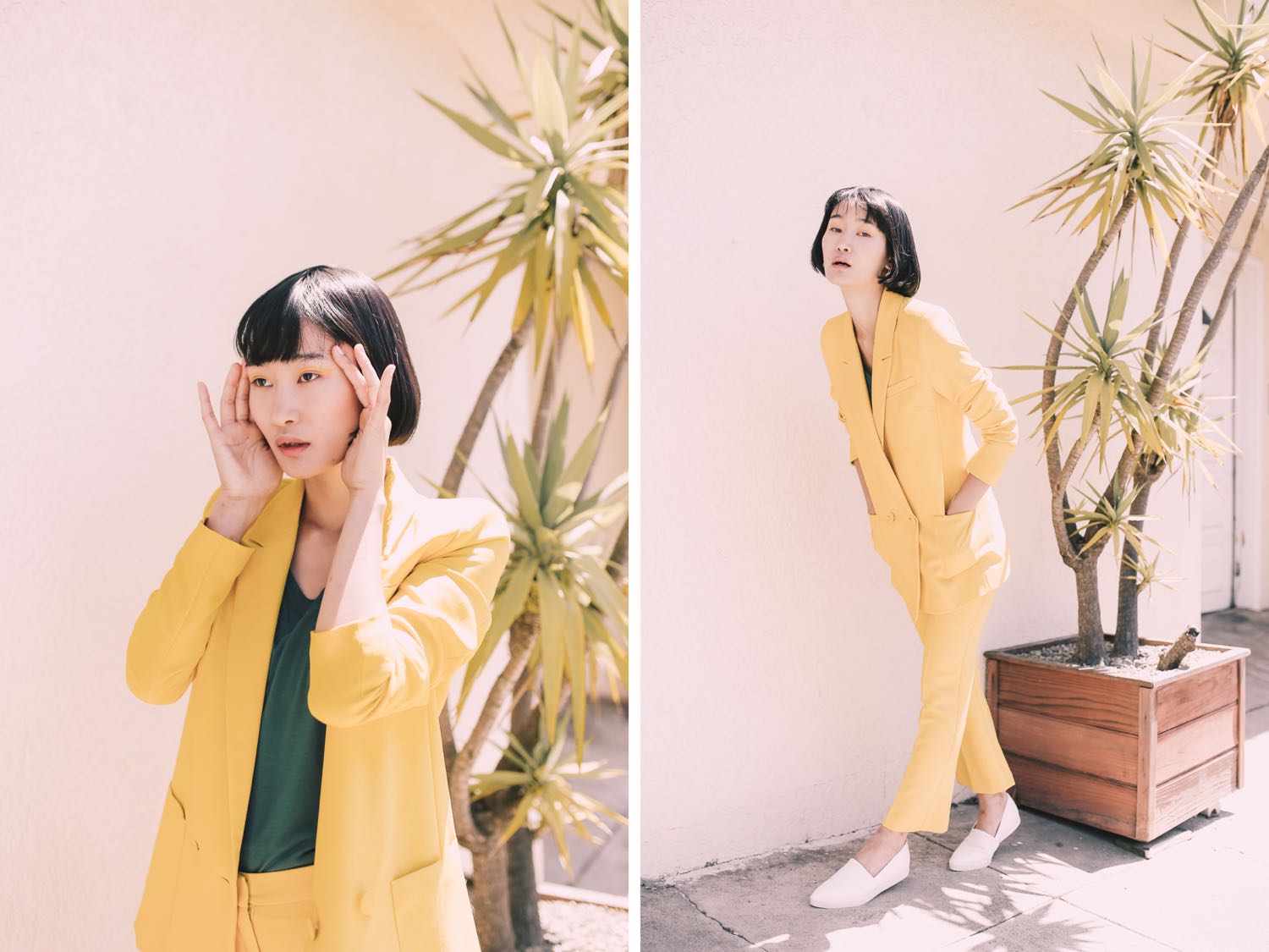
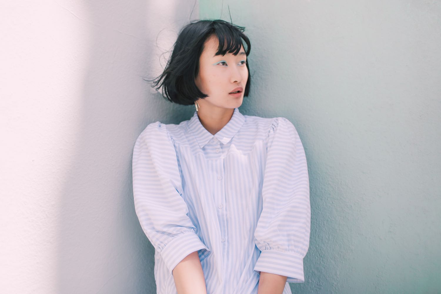
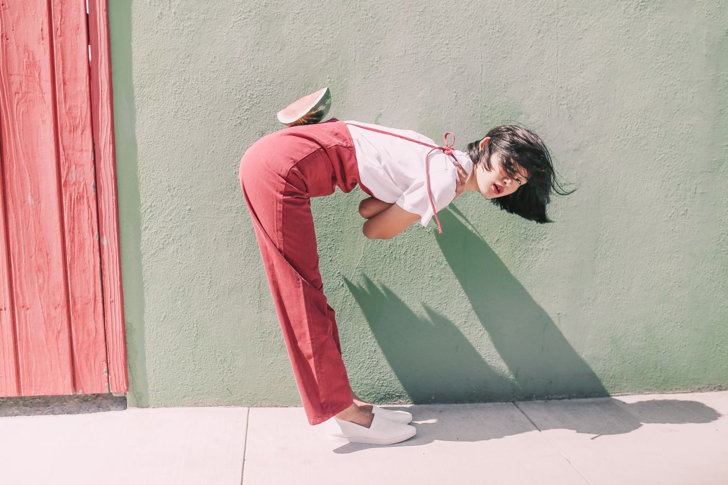
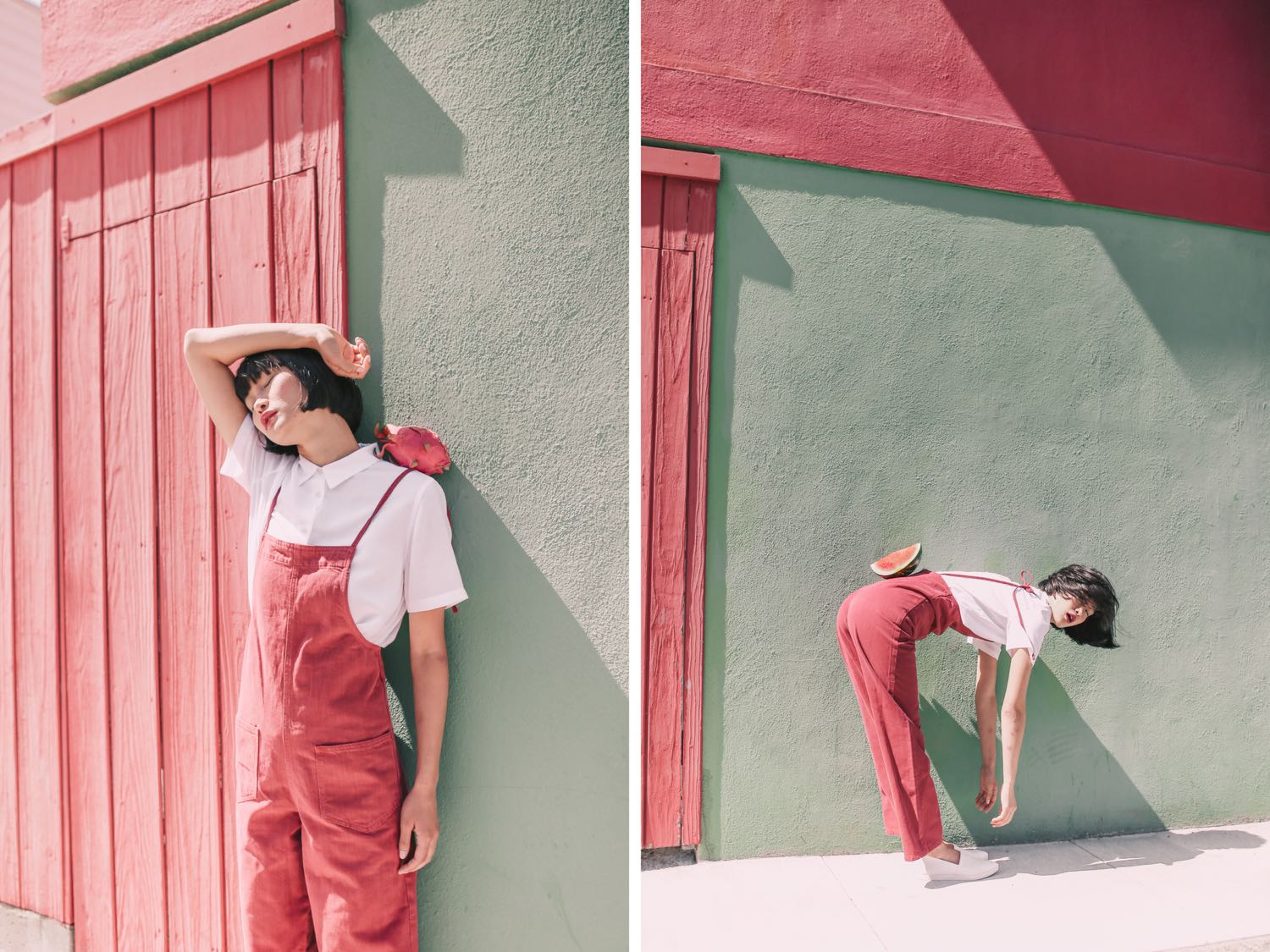
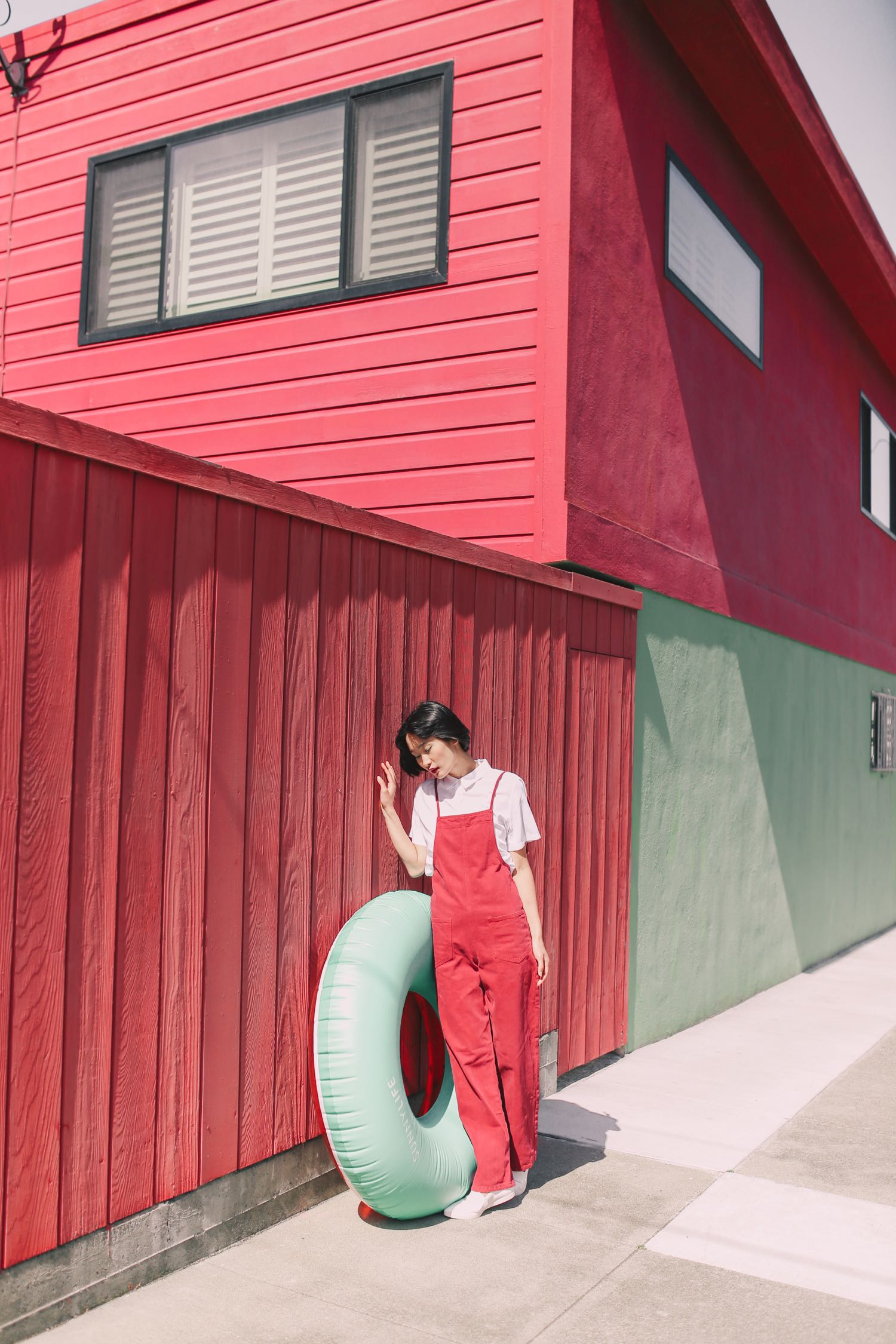
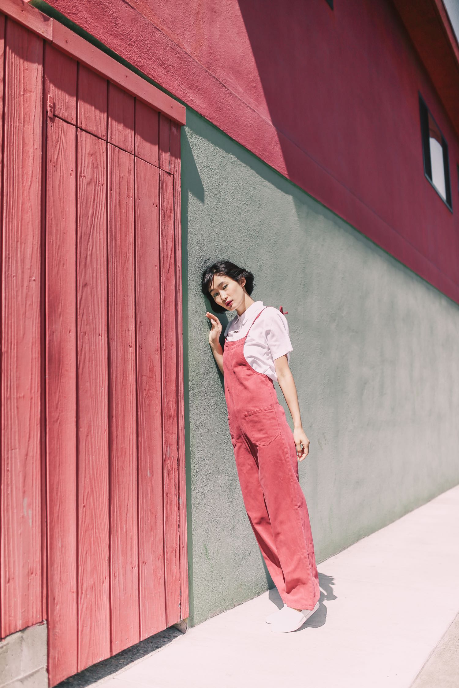
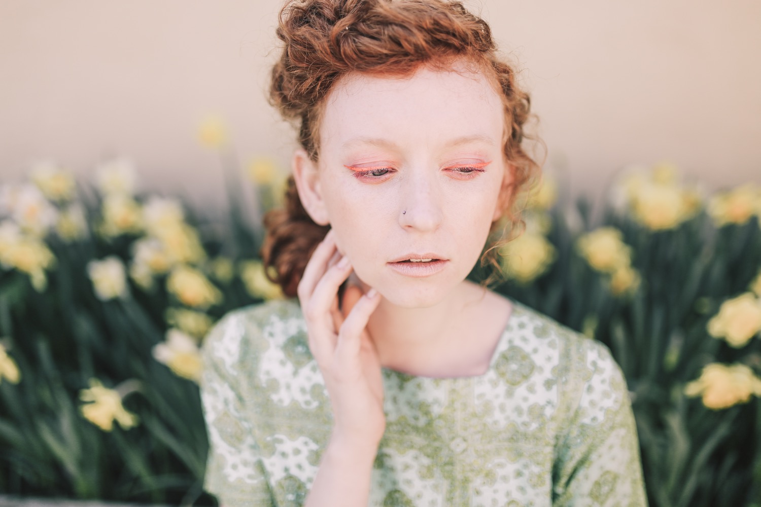
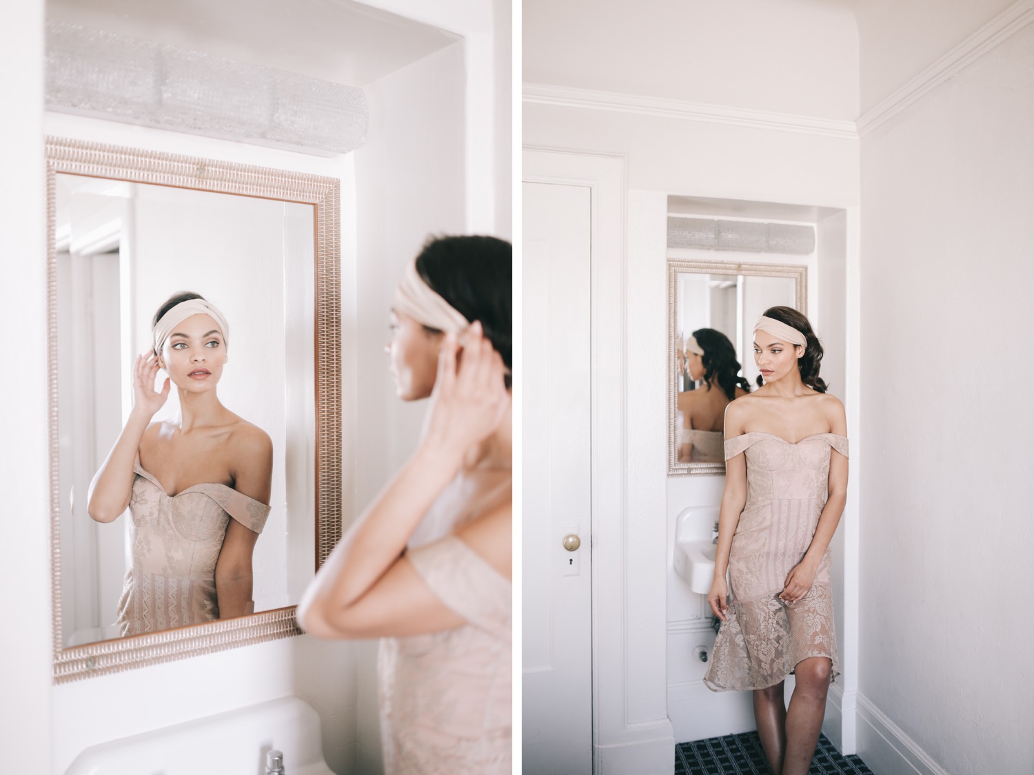
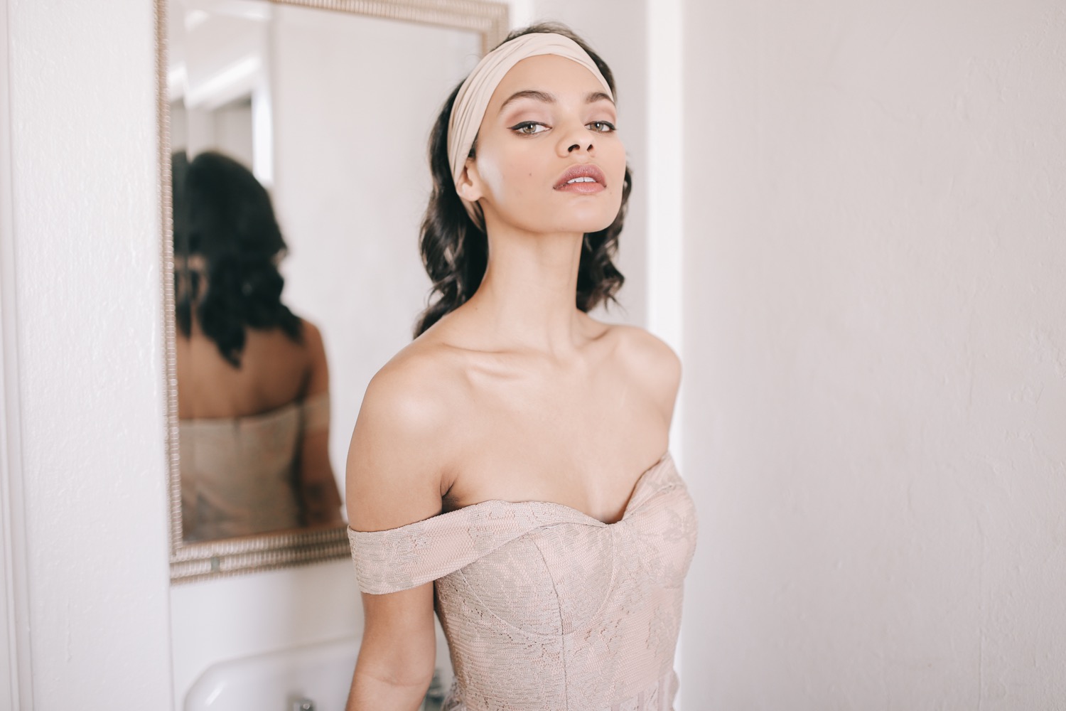
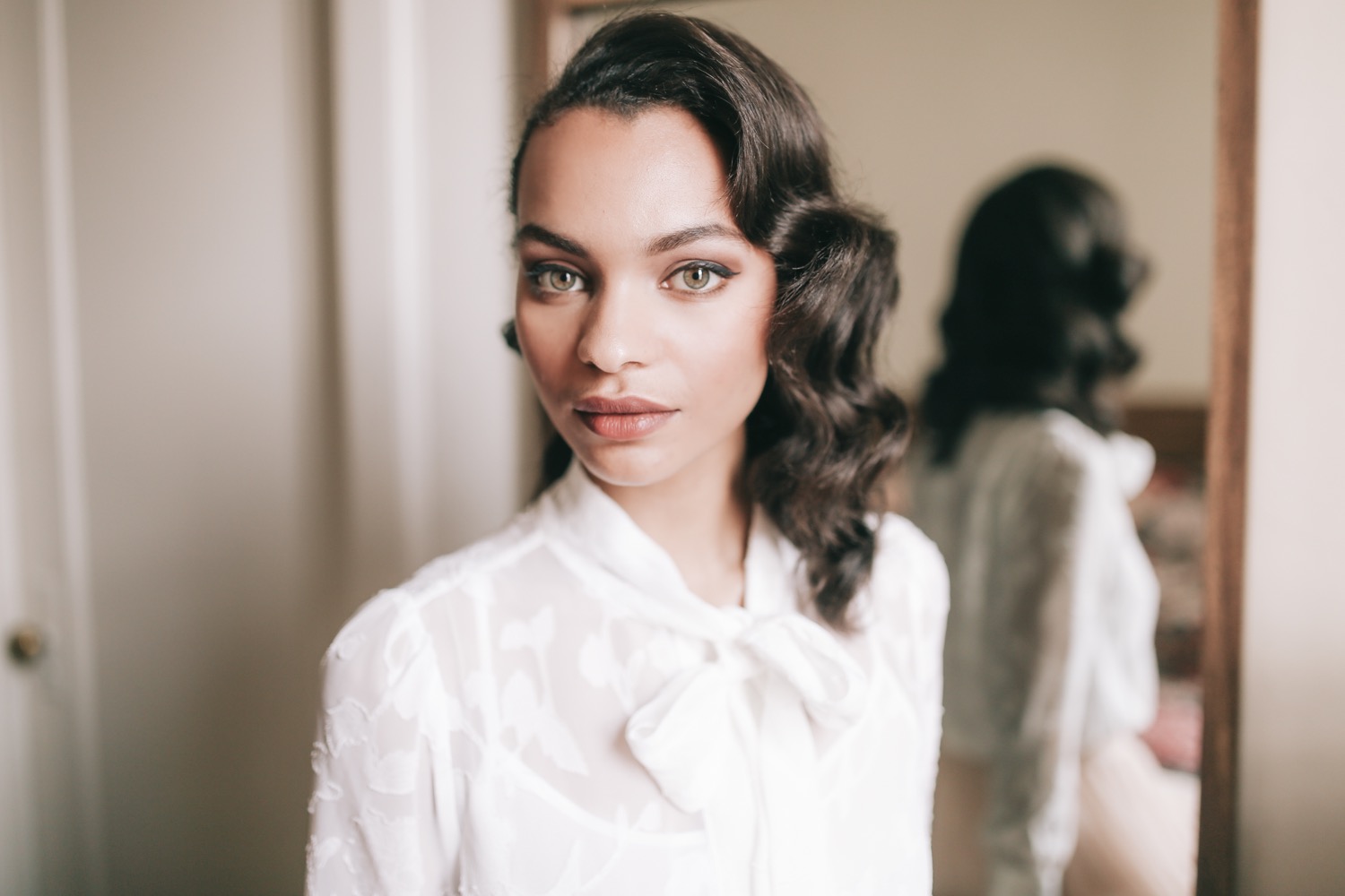
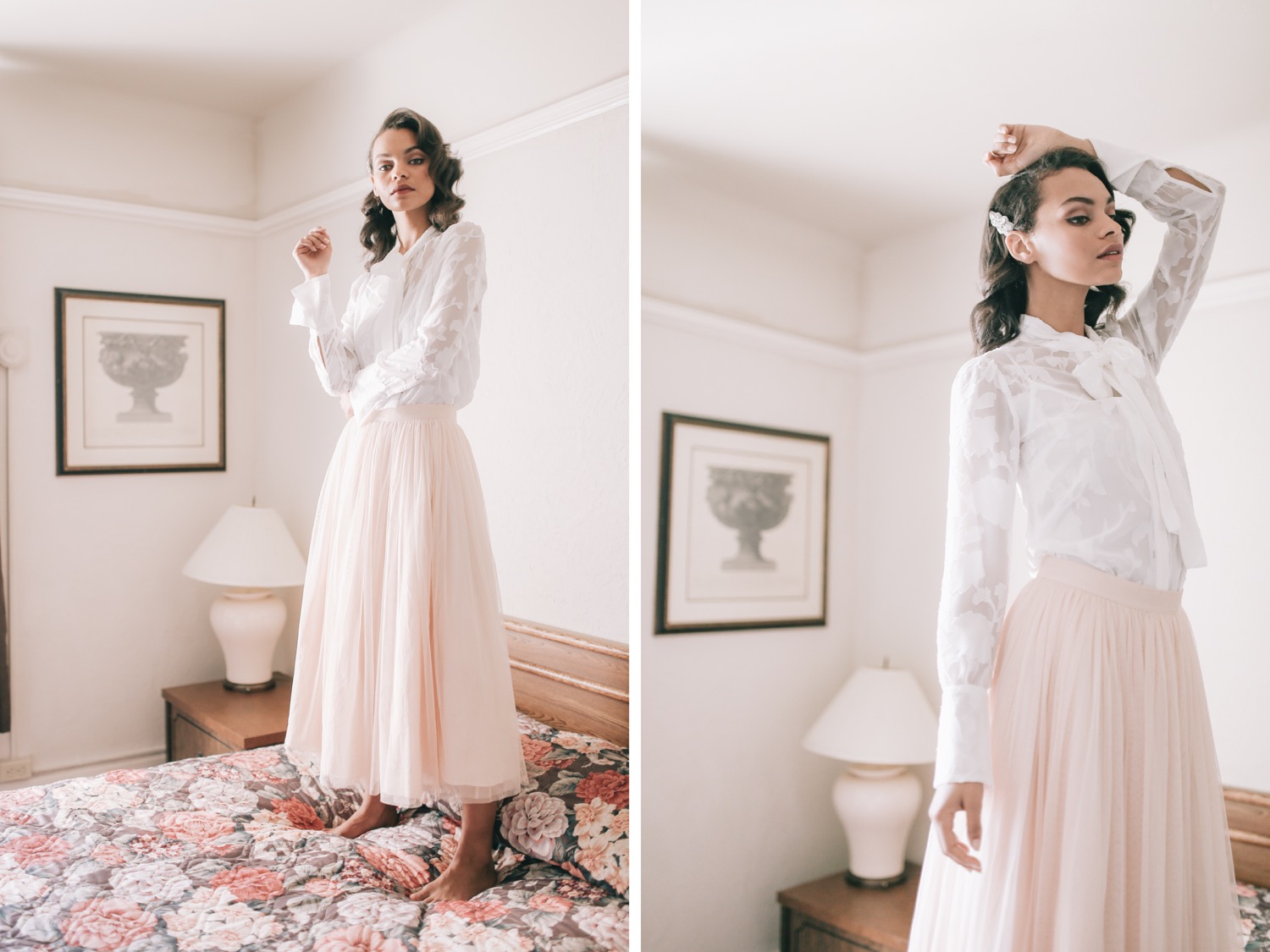
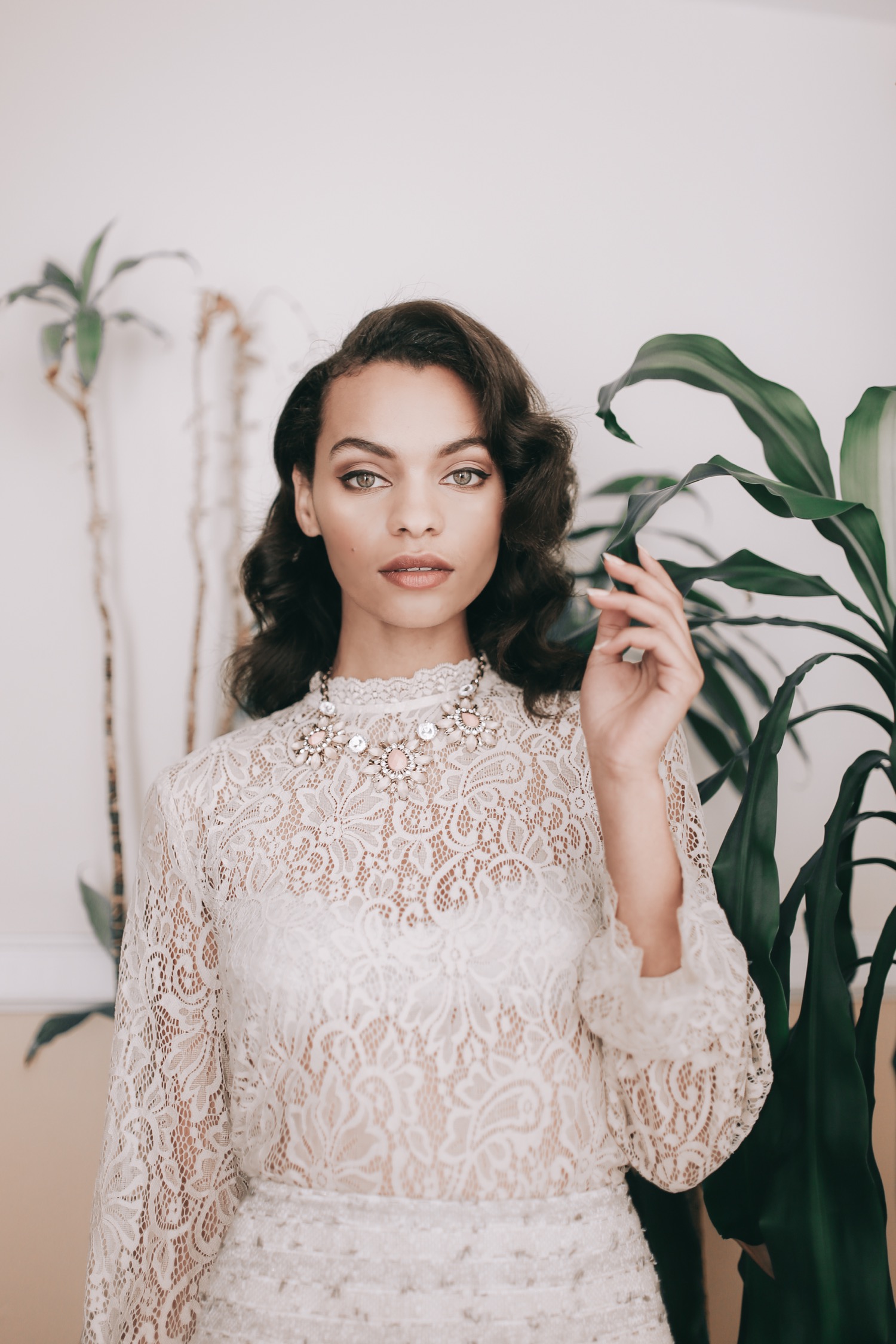
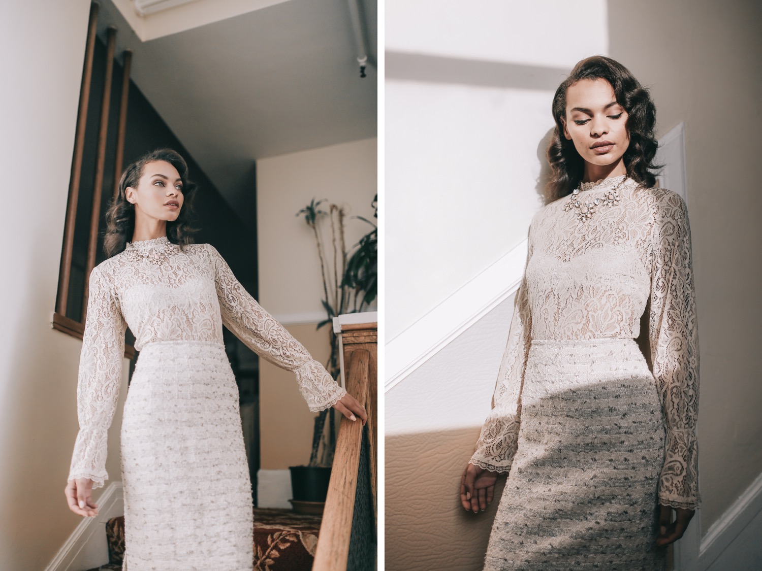
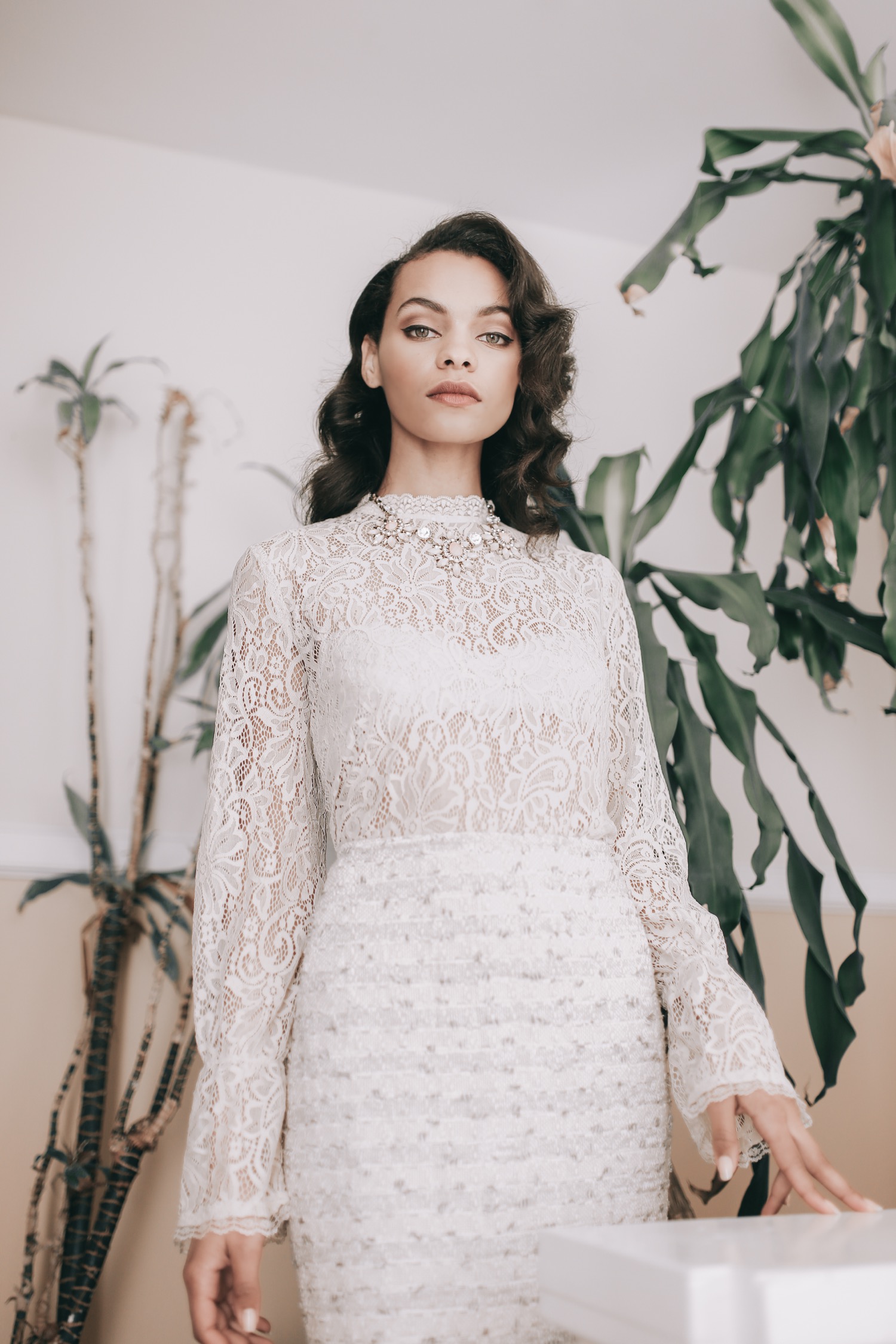
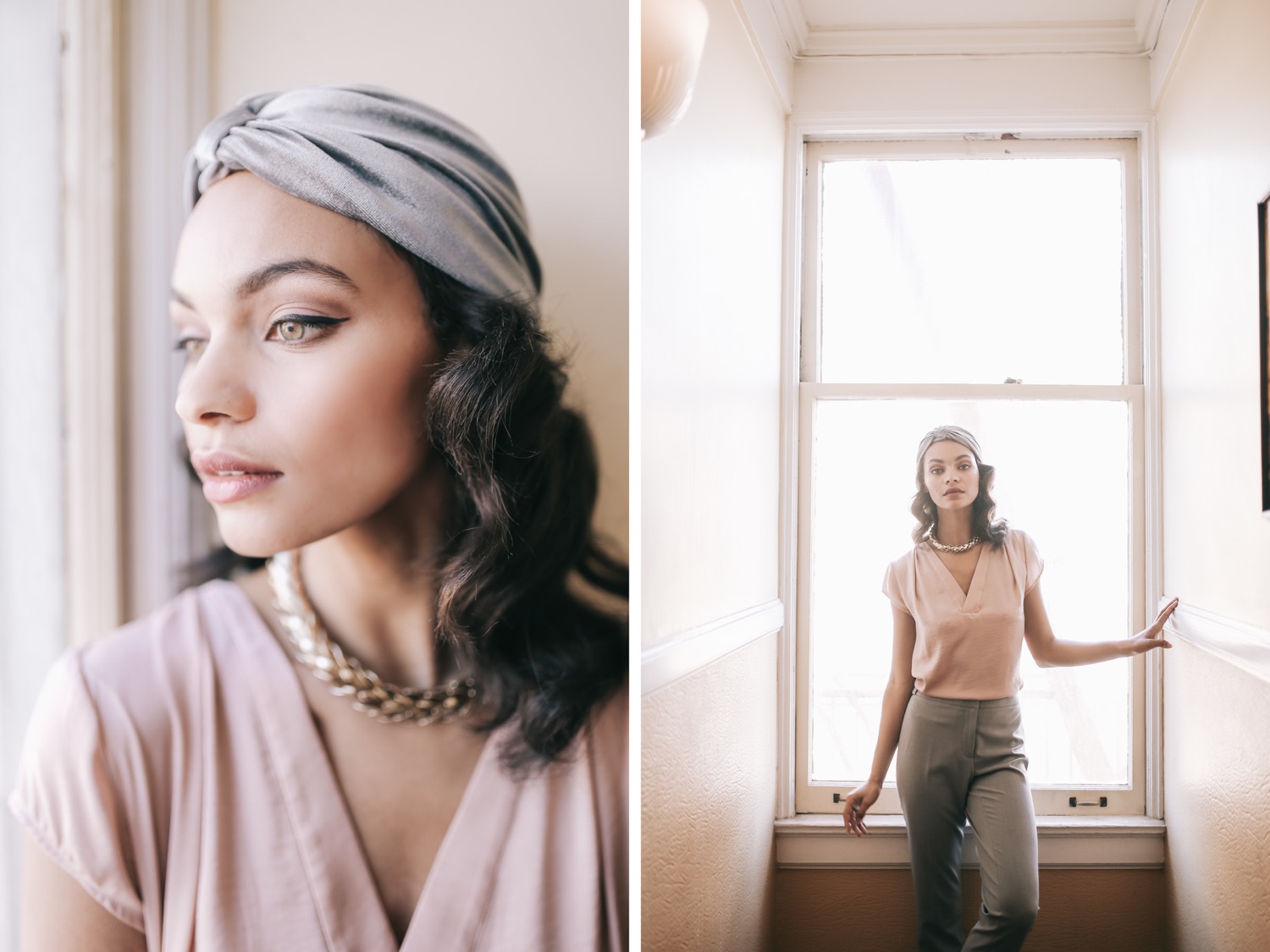
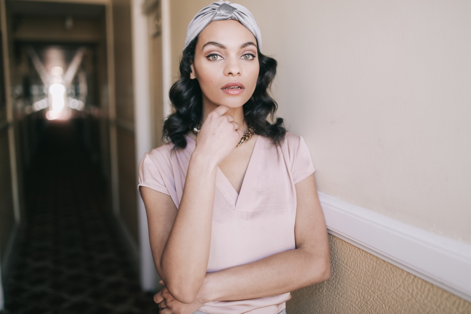
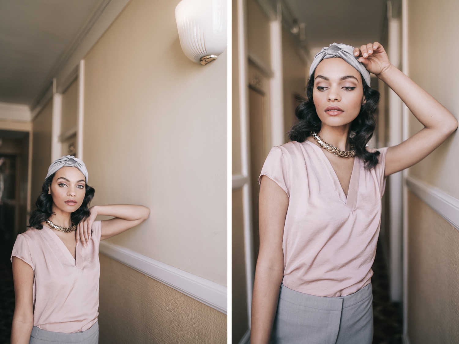
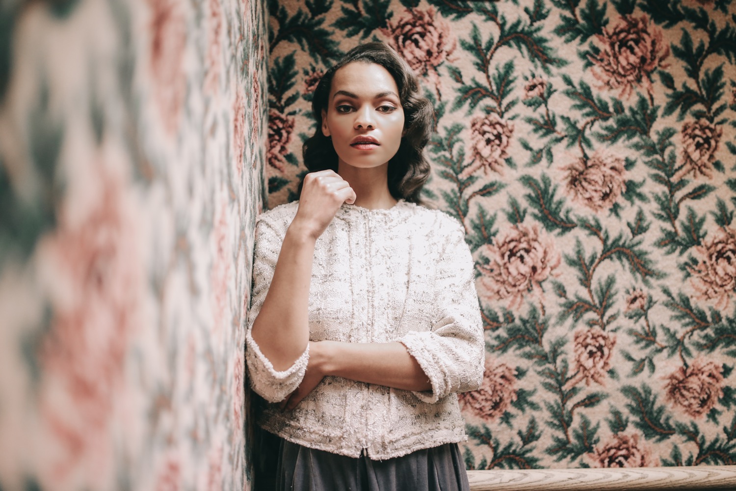
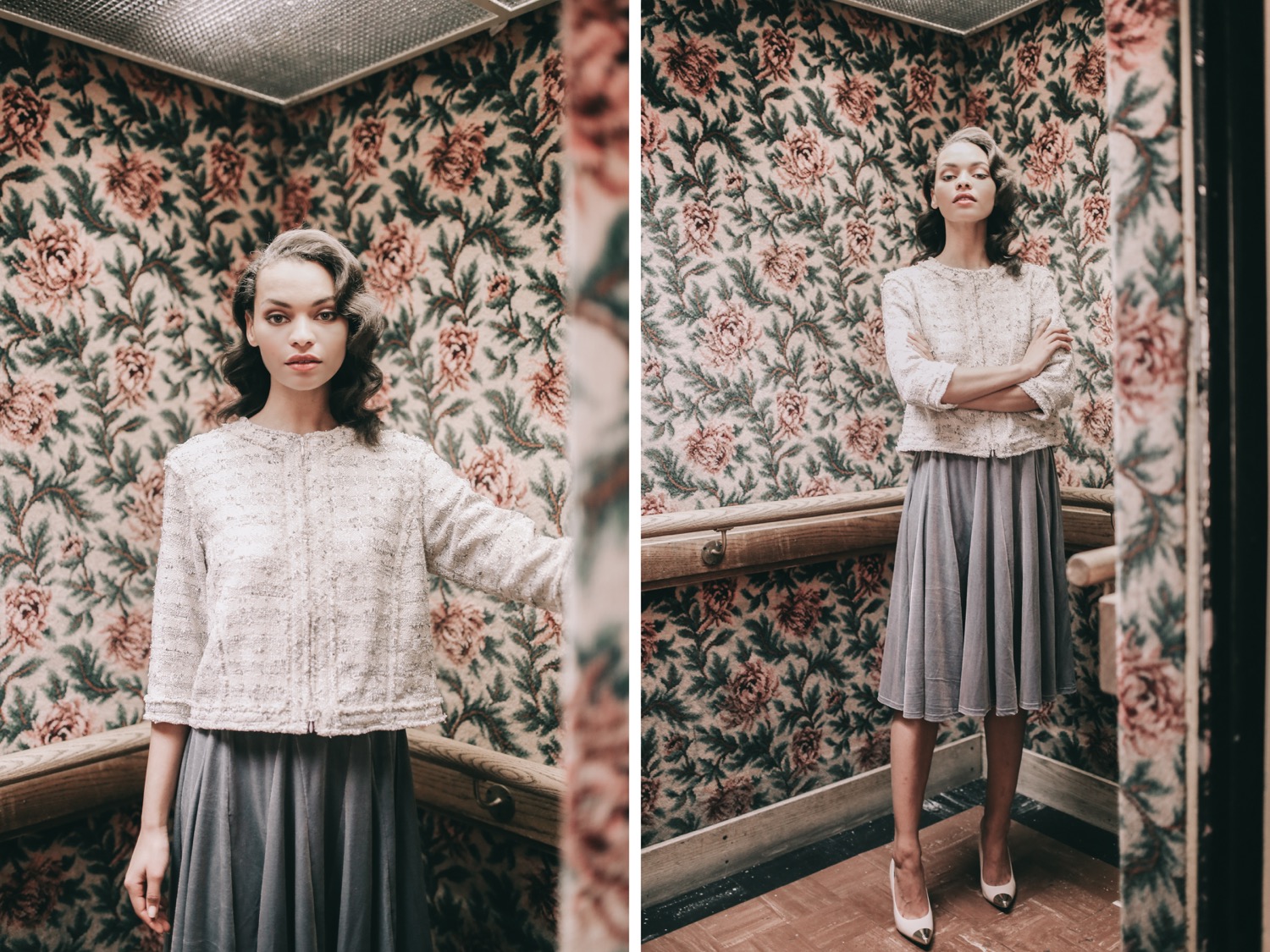
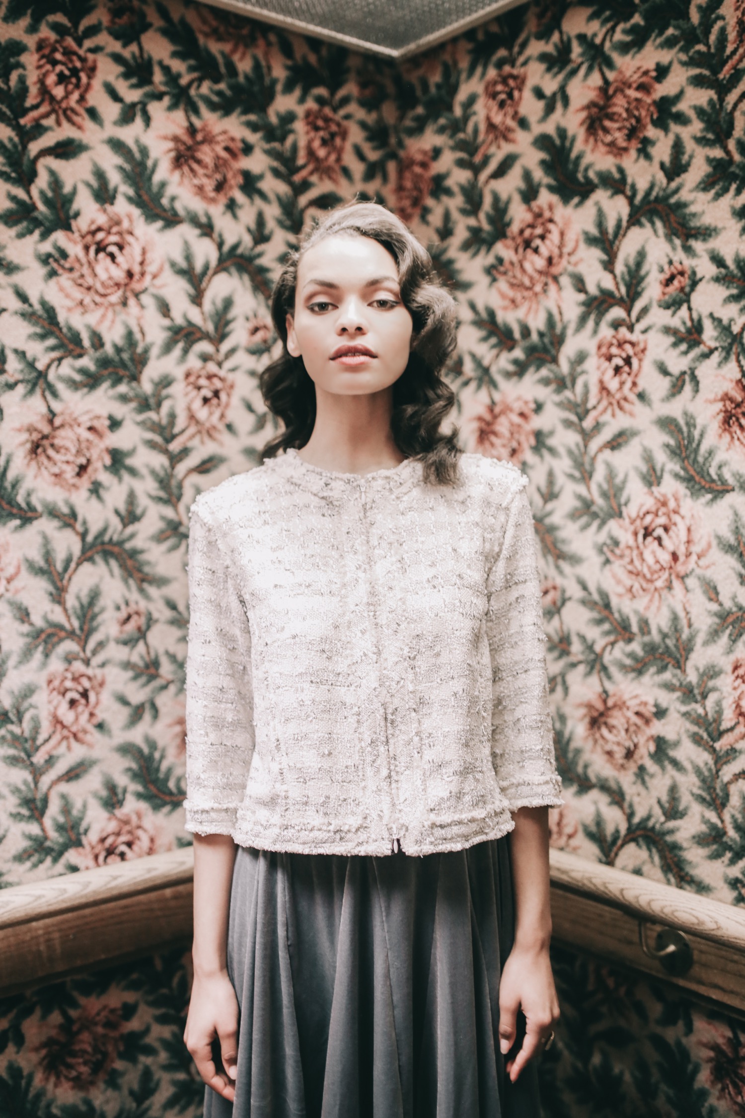
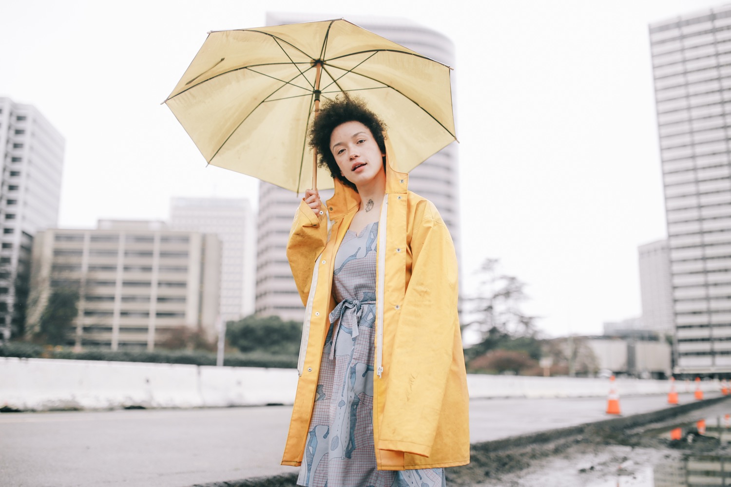
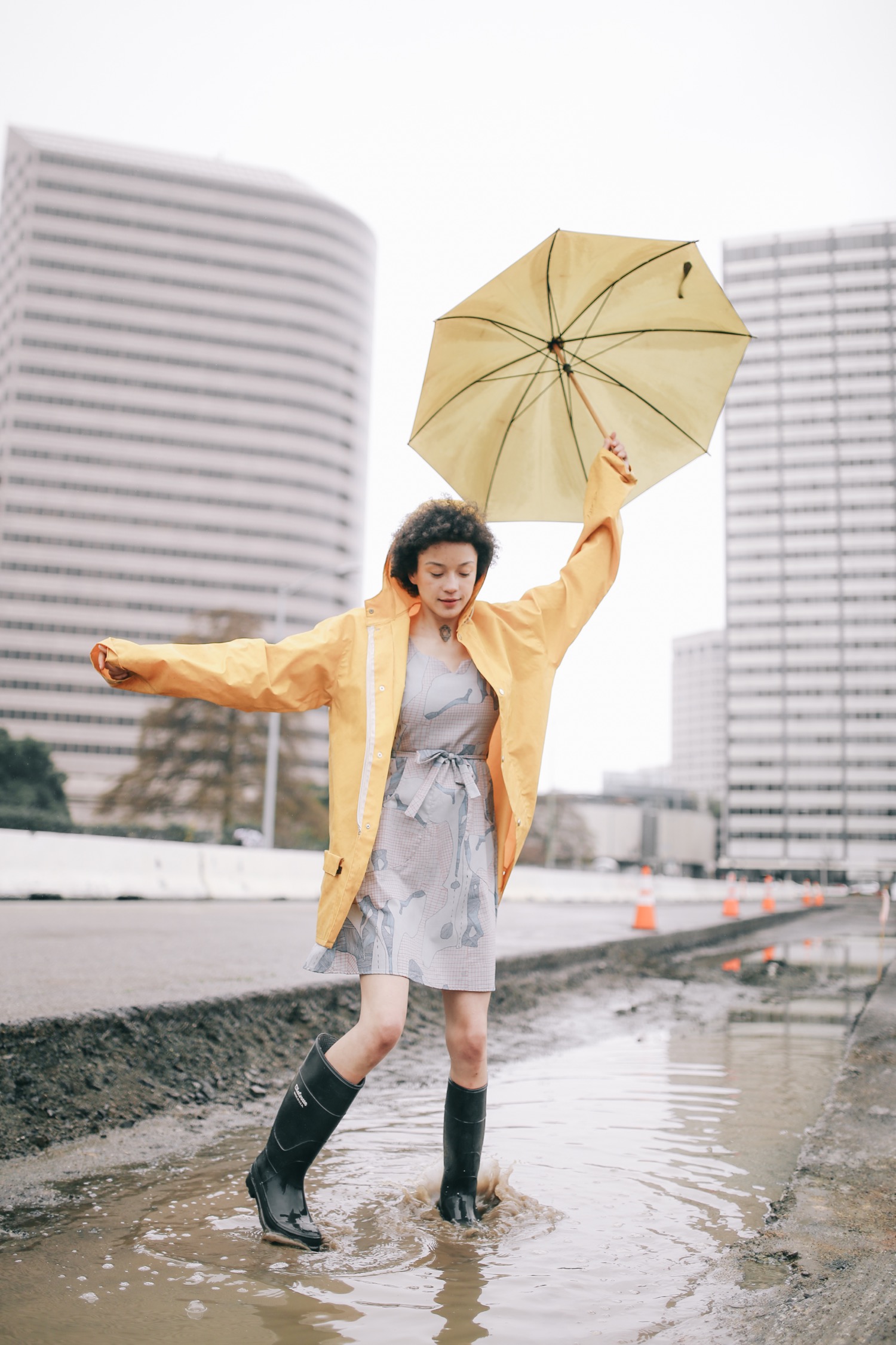
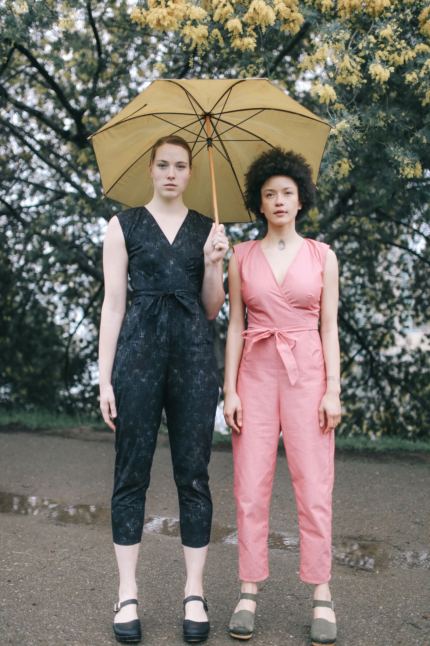
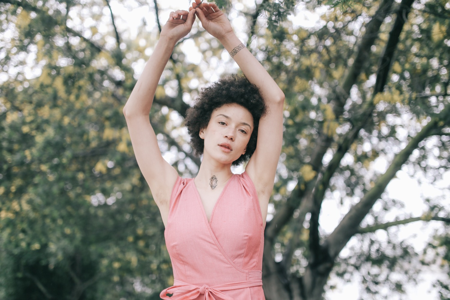
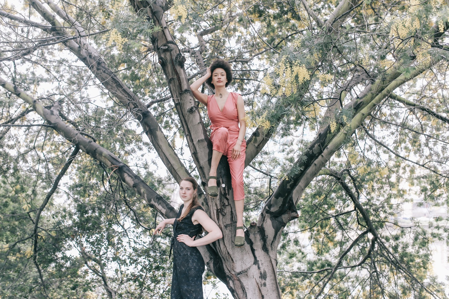
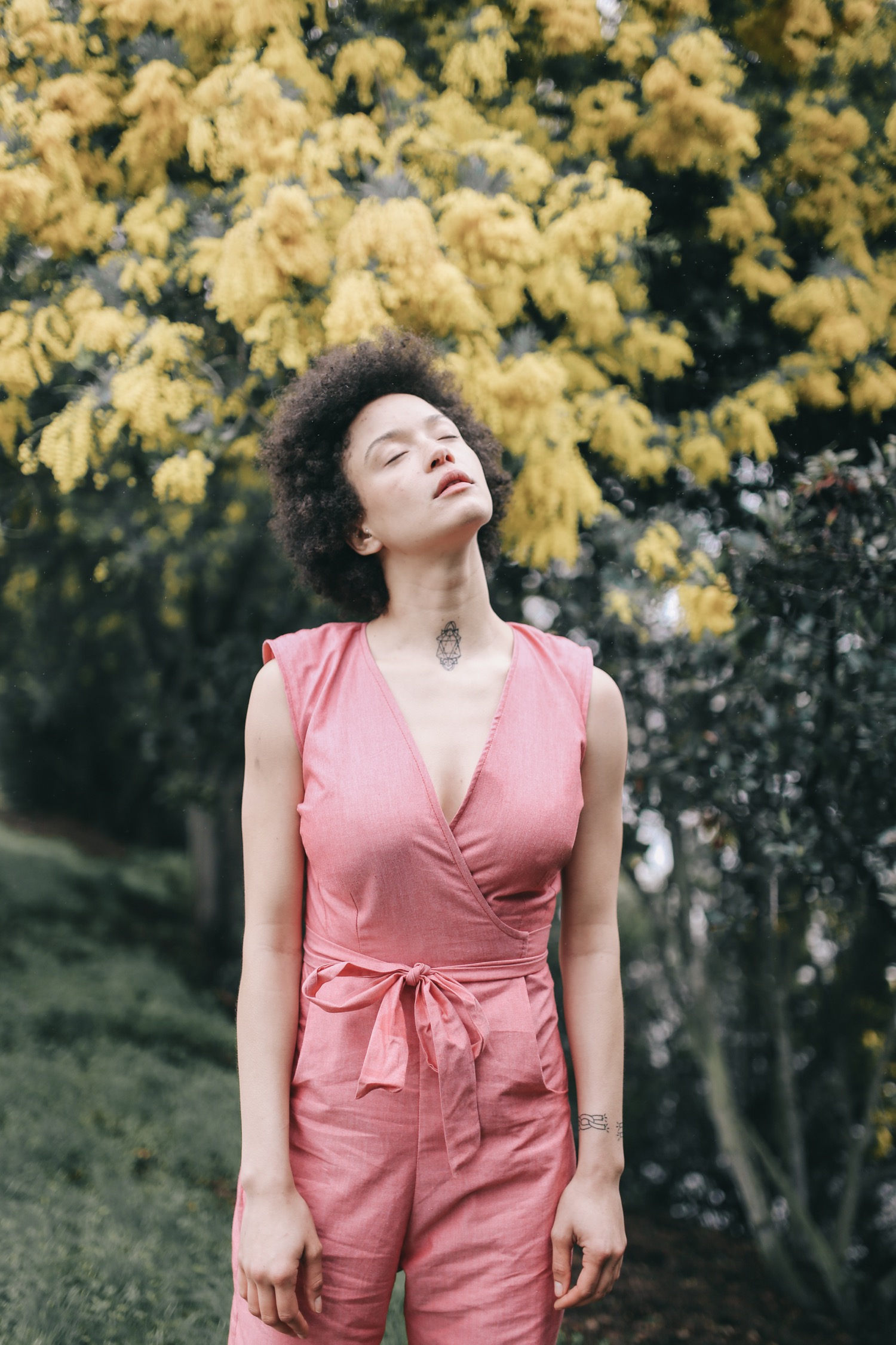
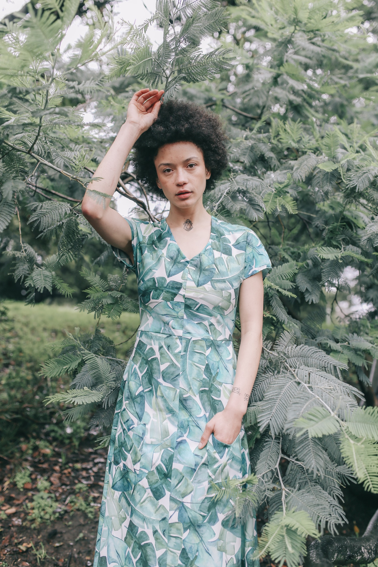
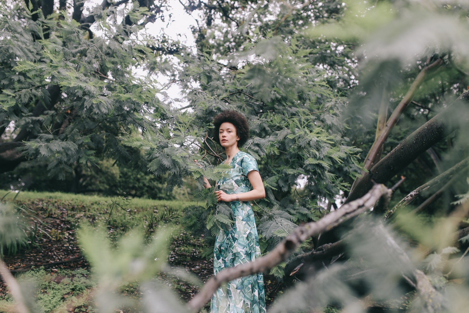
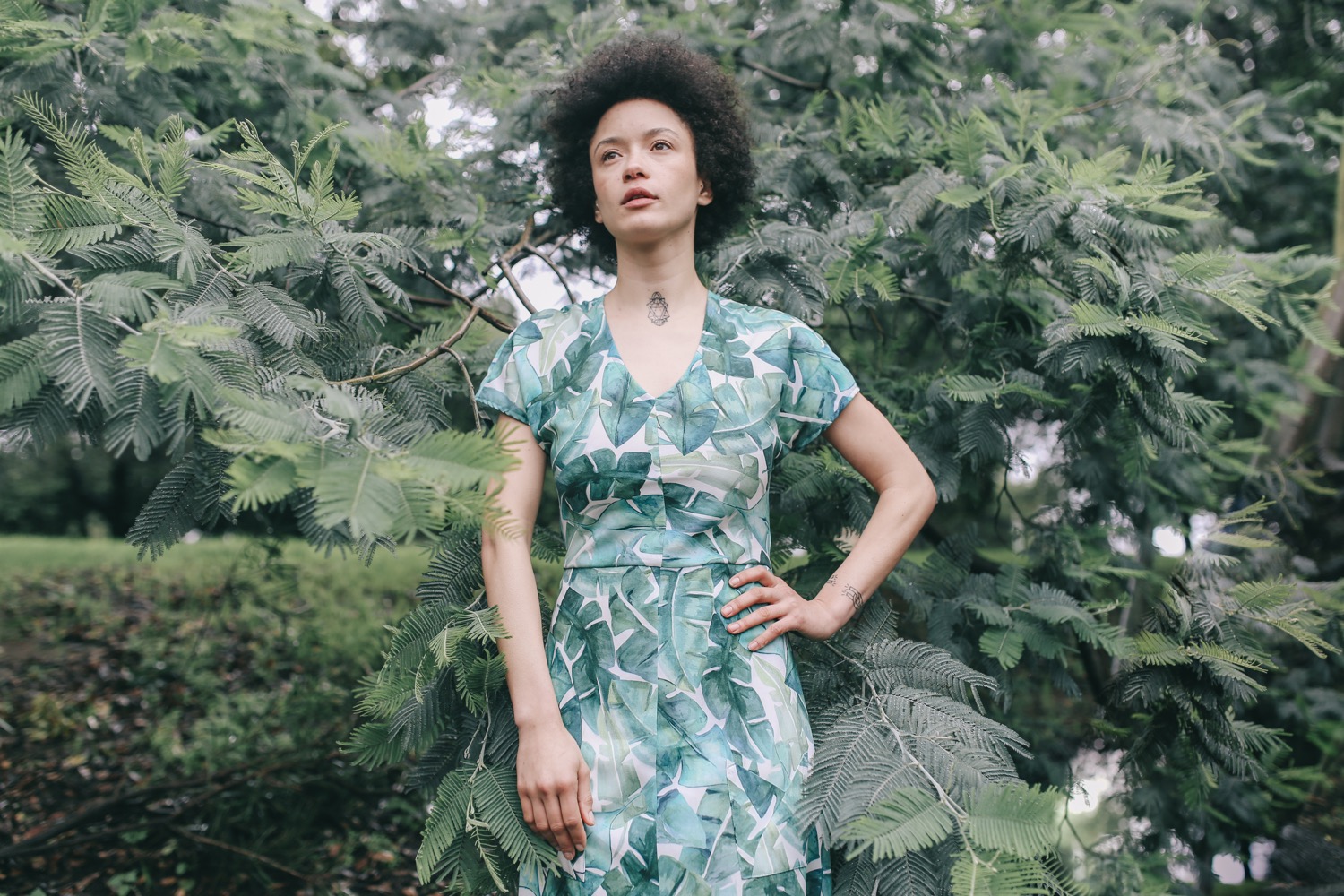
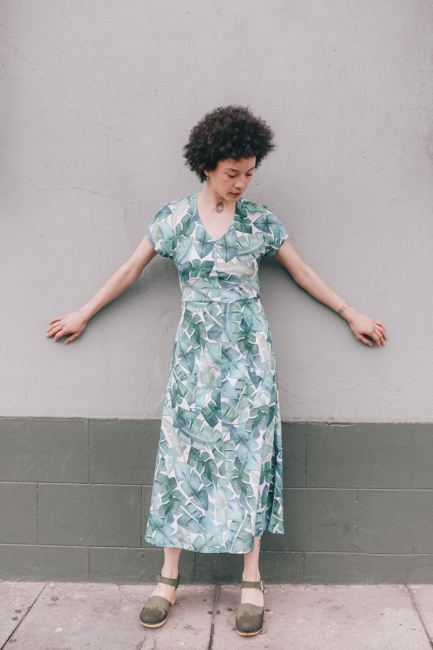
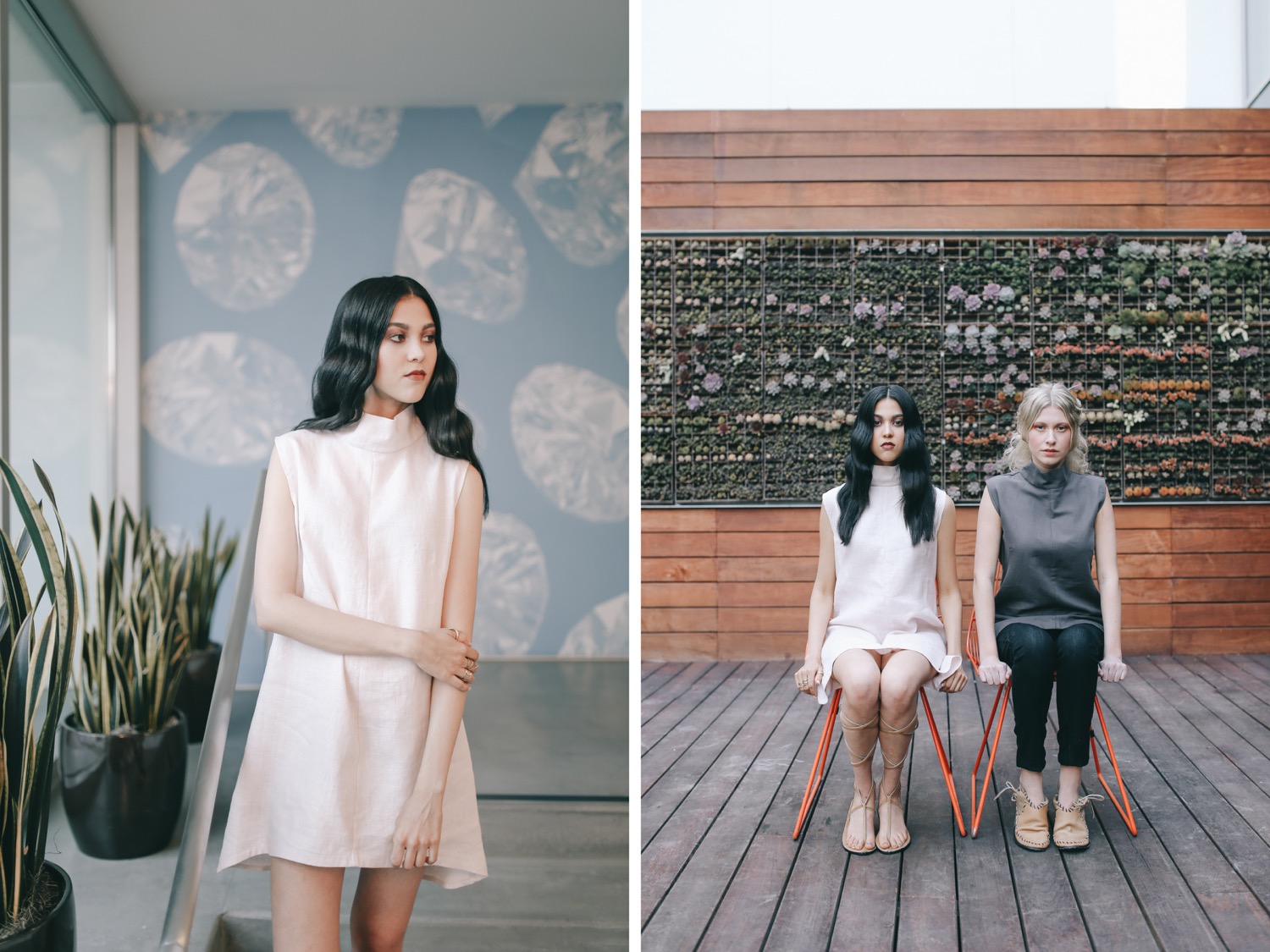
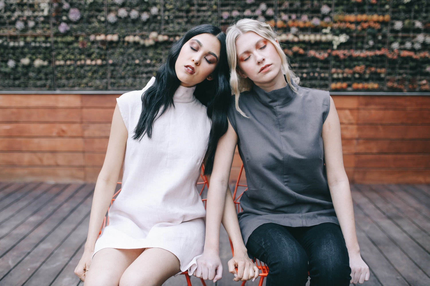
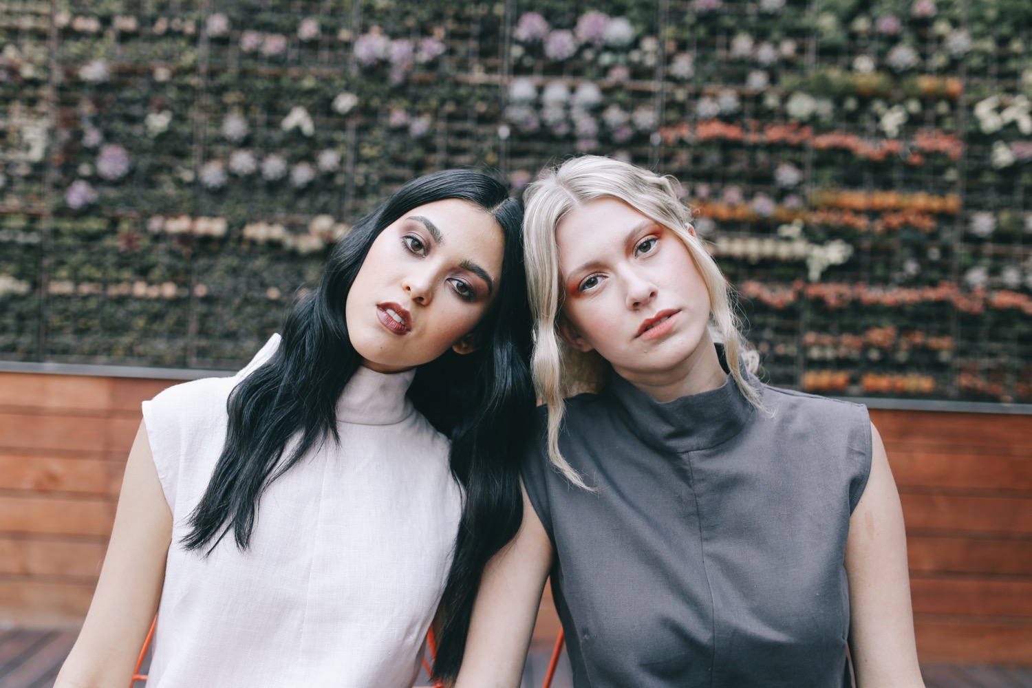
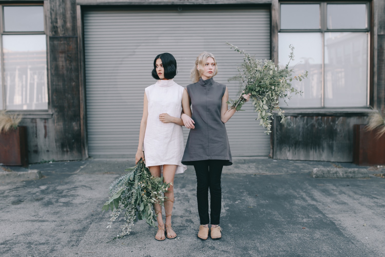
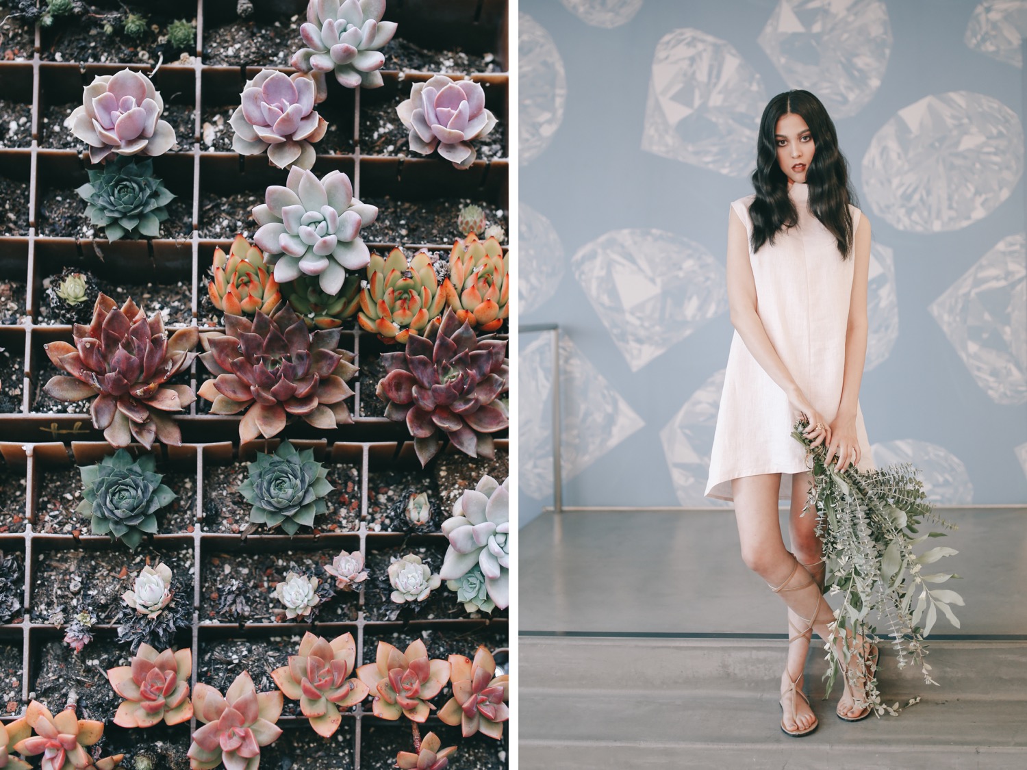
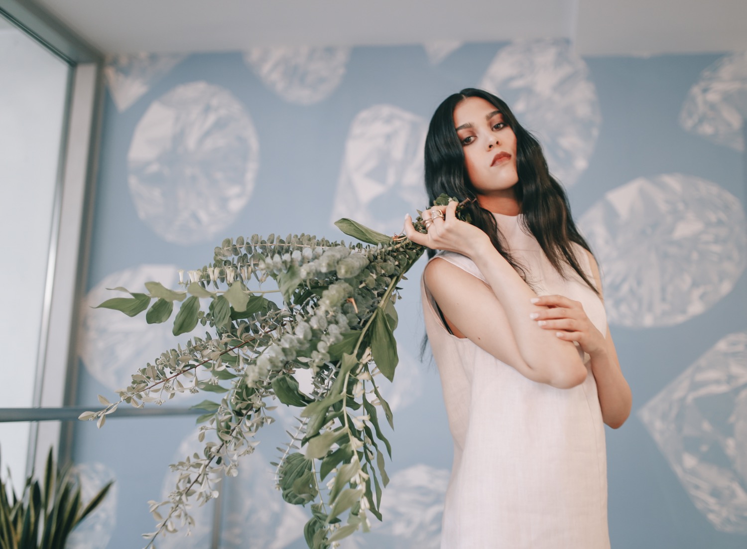
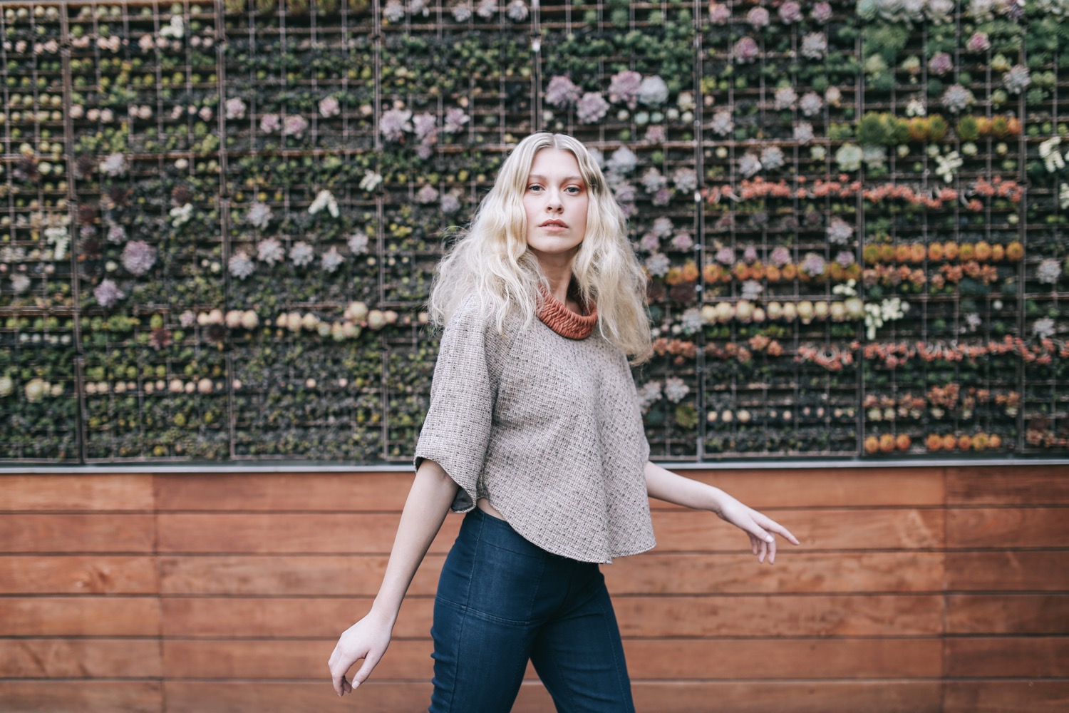
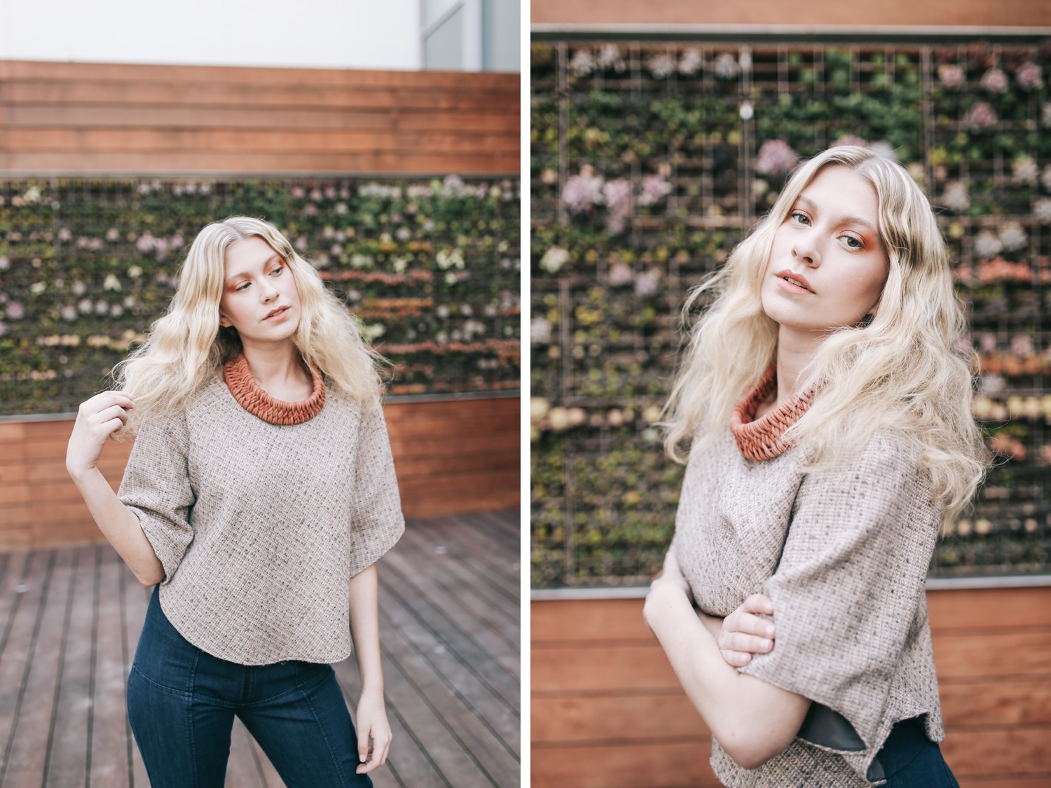
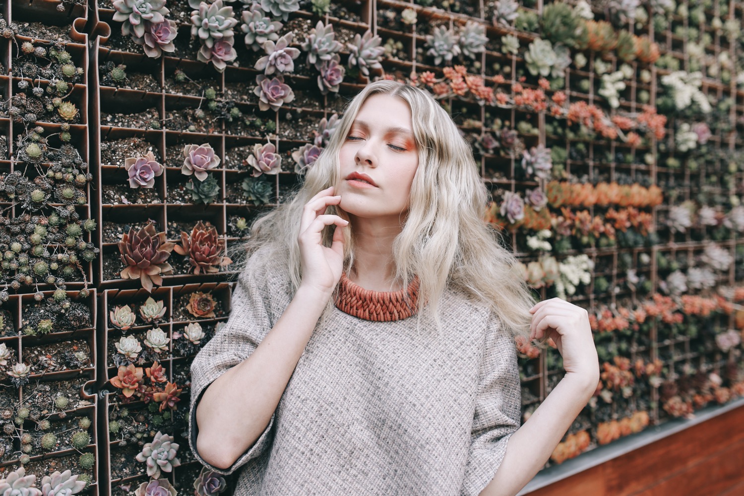
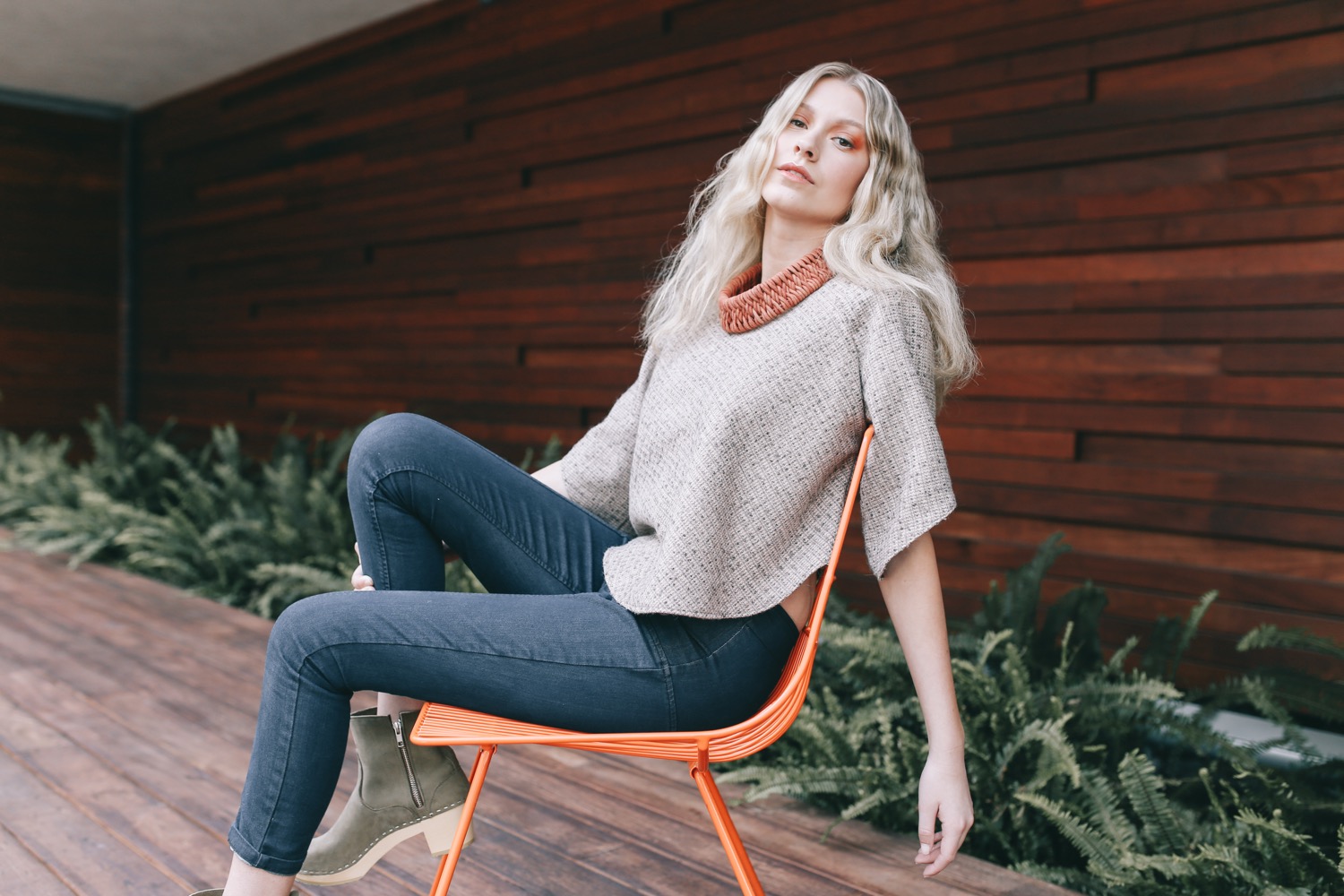
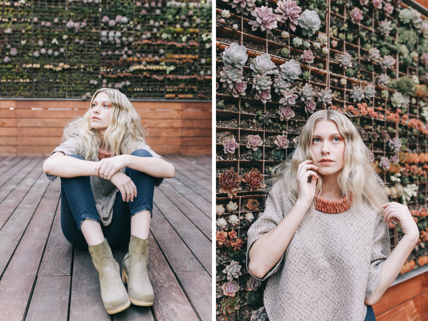
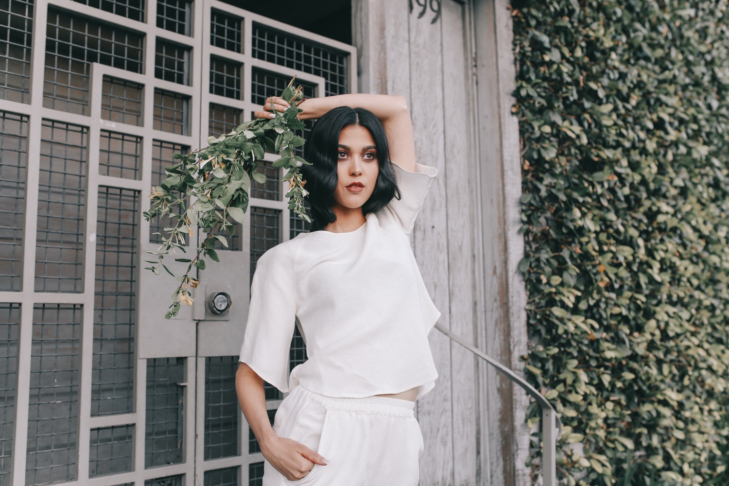
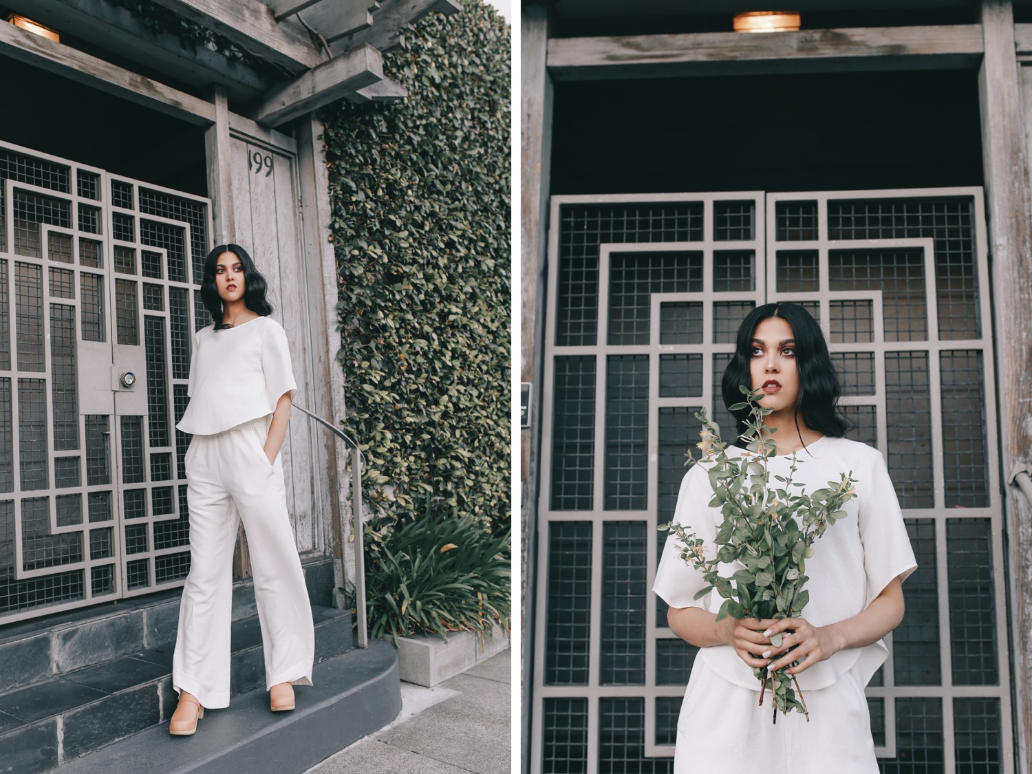
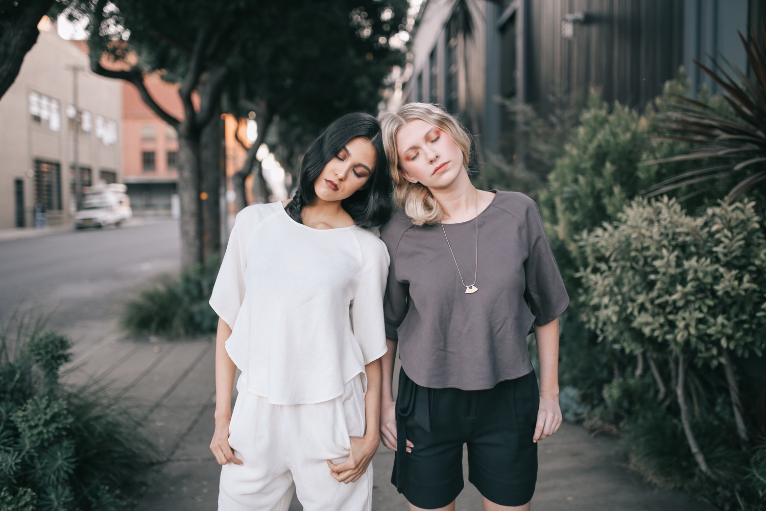
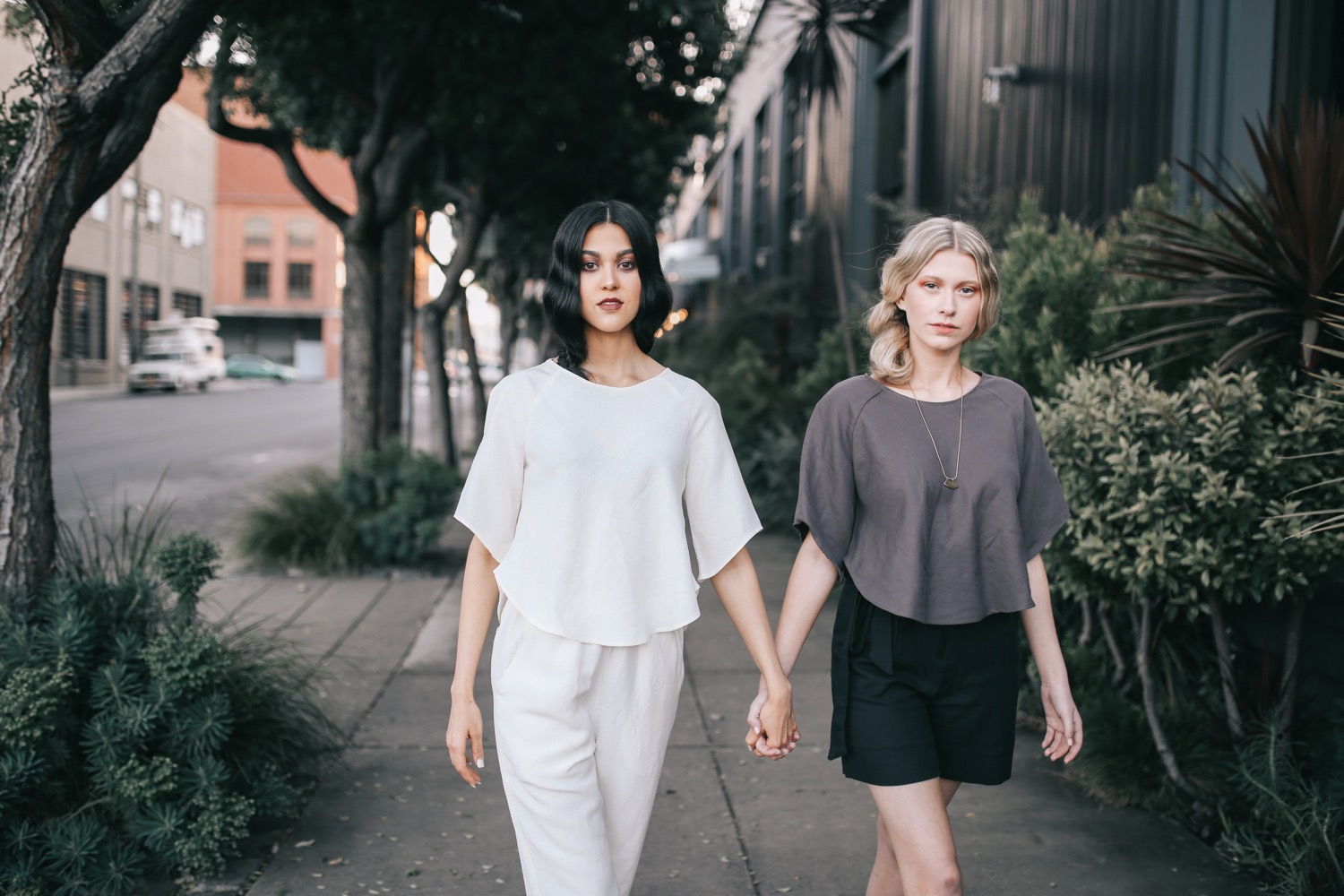
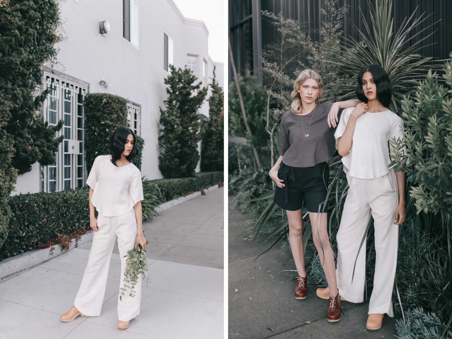
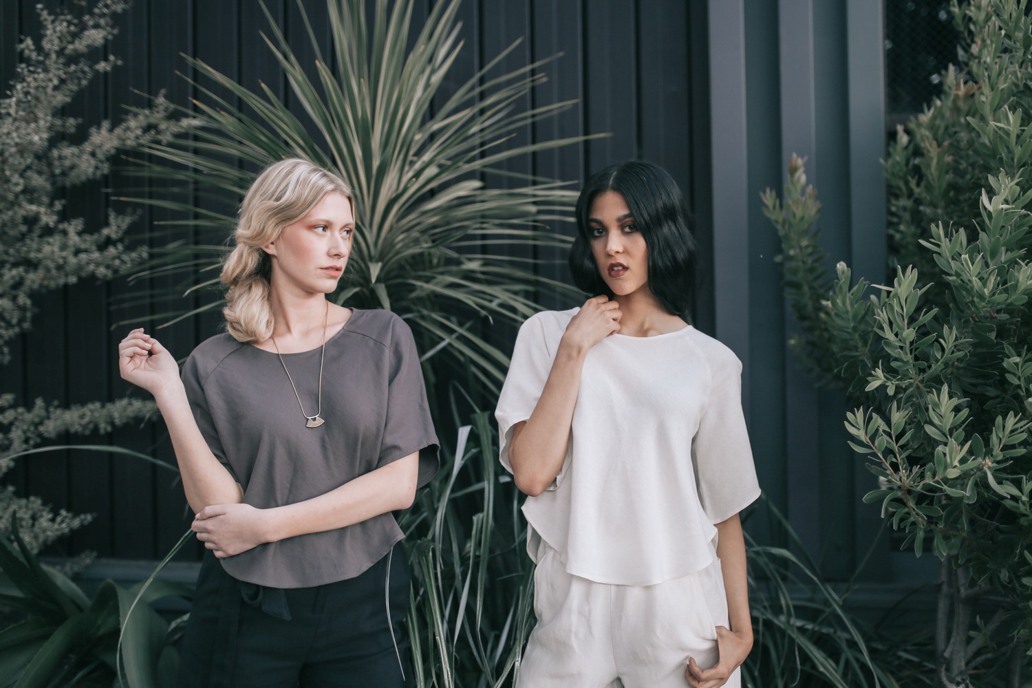
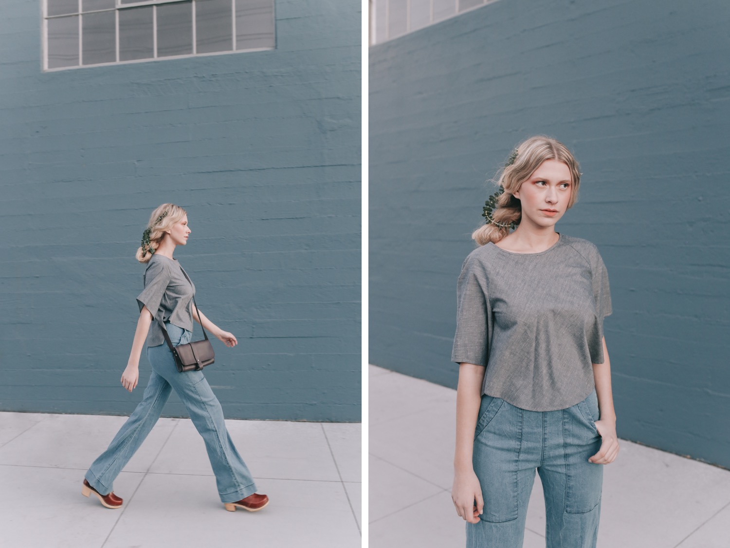
You can see this editorial published in the Atlas Magazine Revival Issue! (Page 136)Model: Sophia Jackson (Scout SF) Hair & Makeup: Amy Lawson Styling: Jeneffer Jones Edited with Pop! Preset




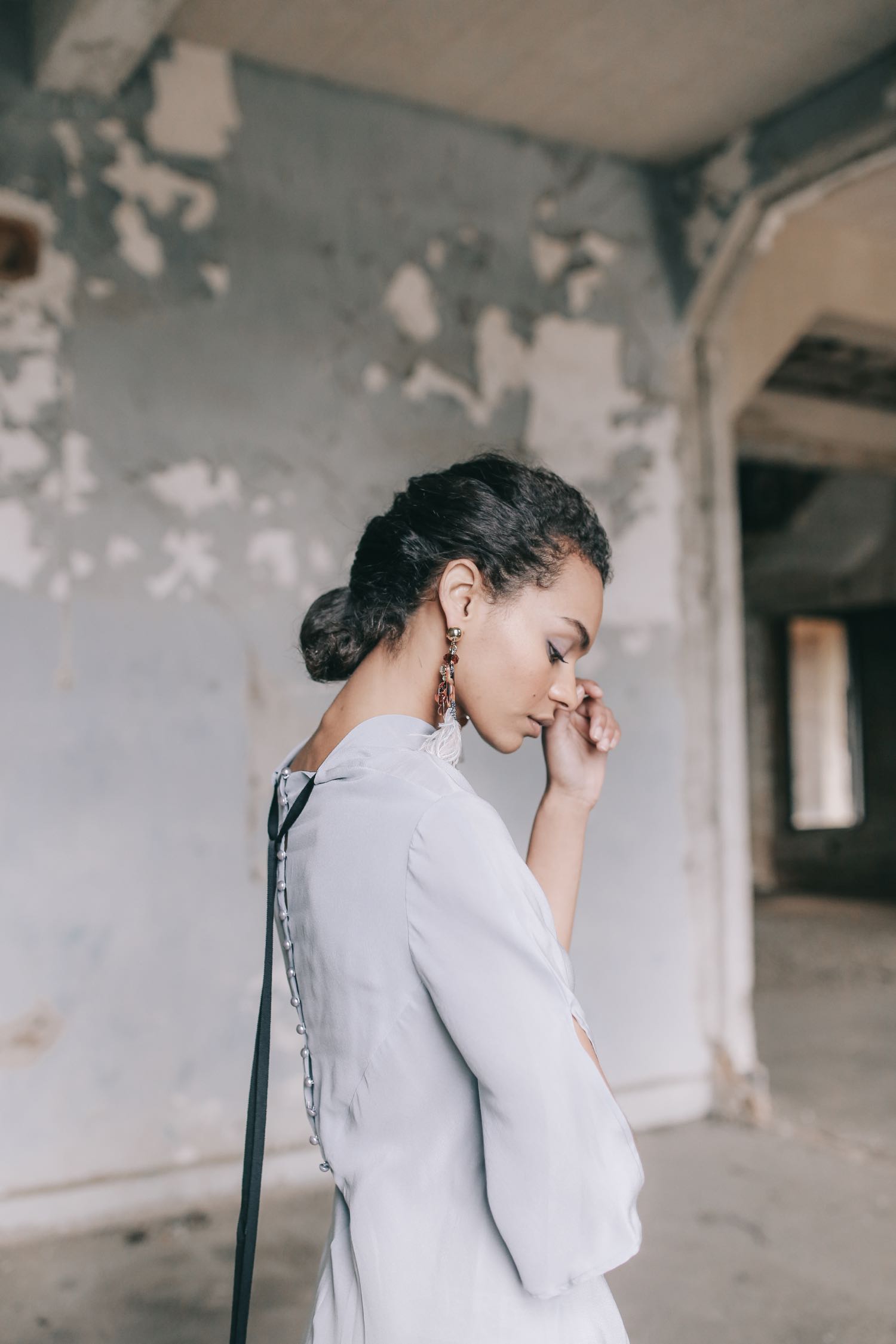
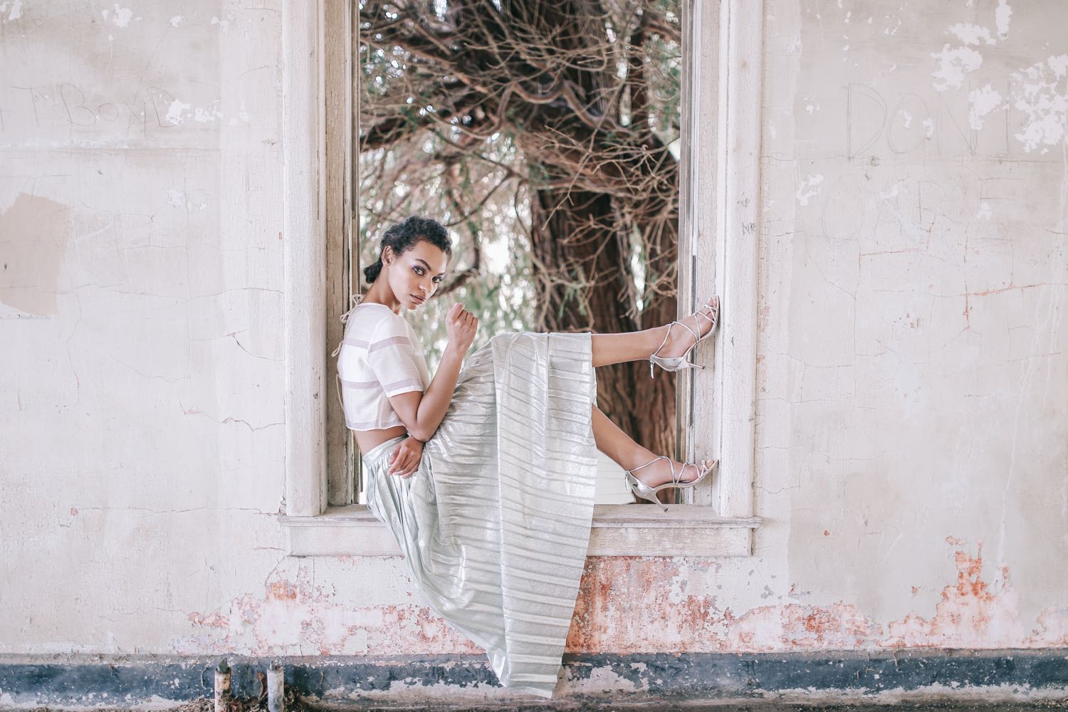


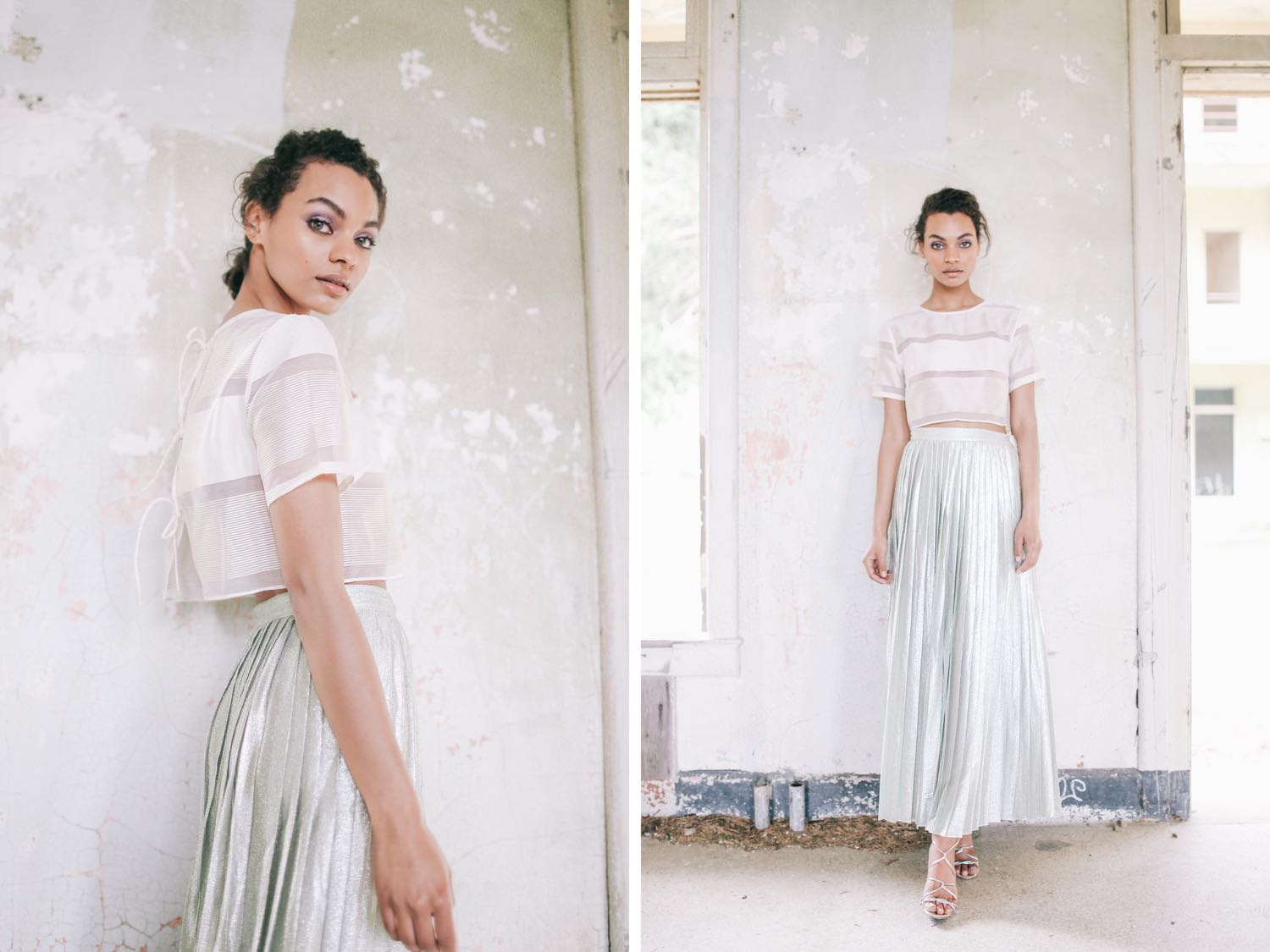

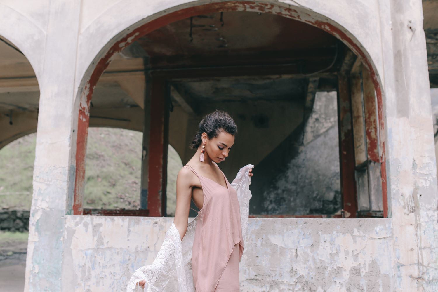


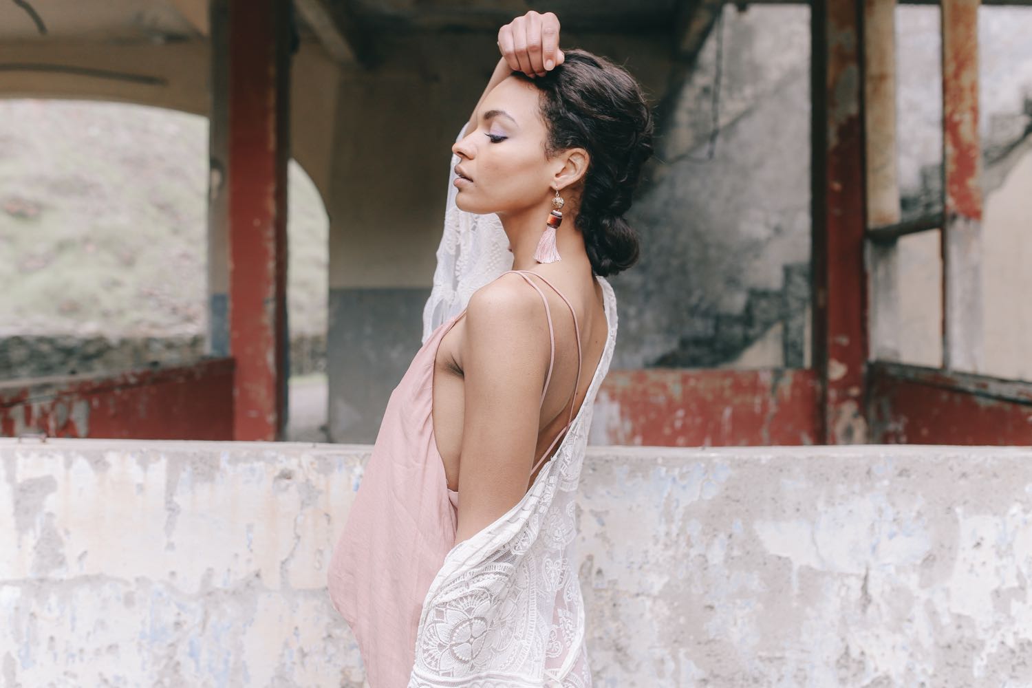


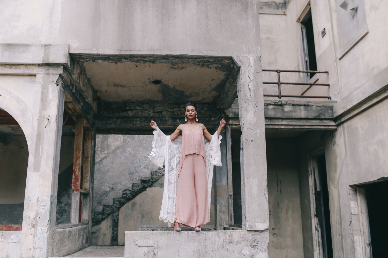
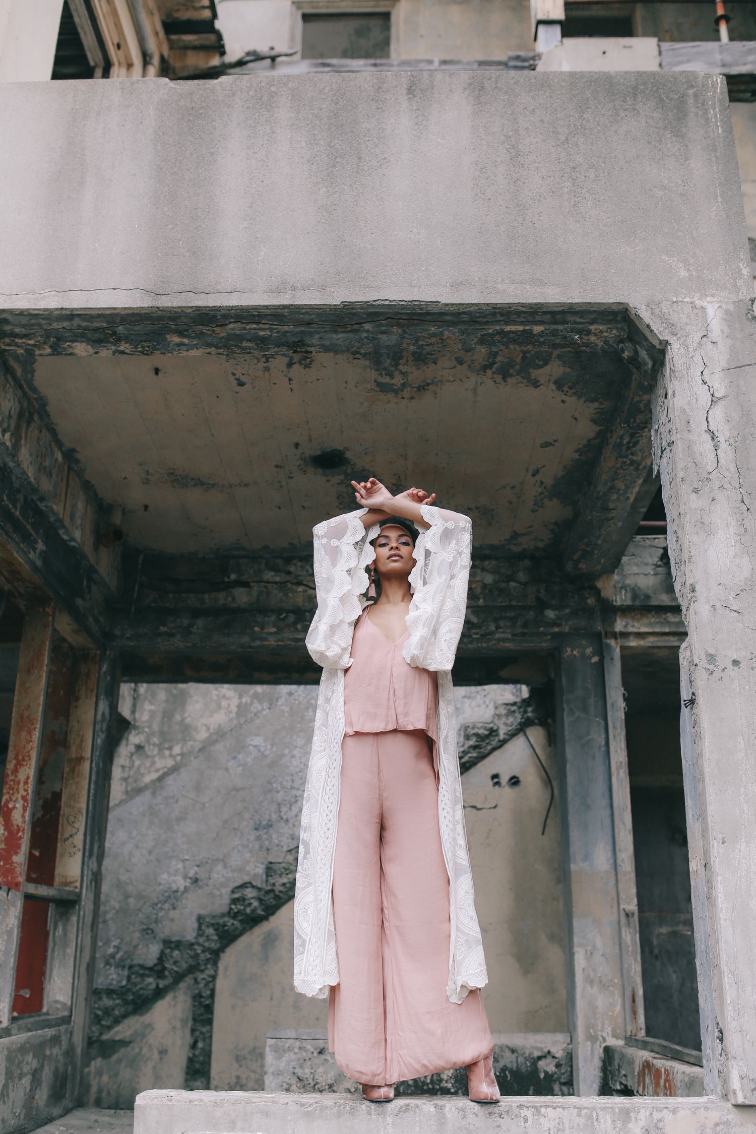


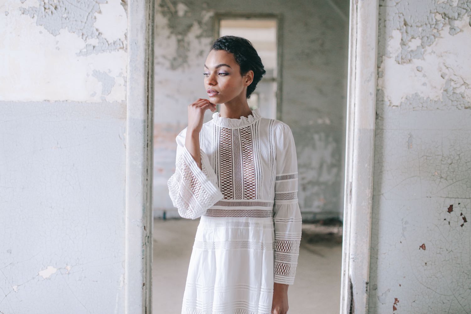


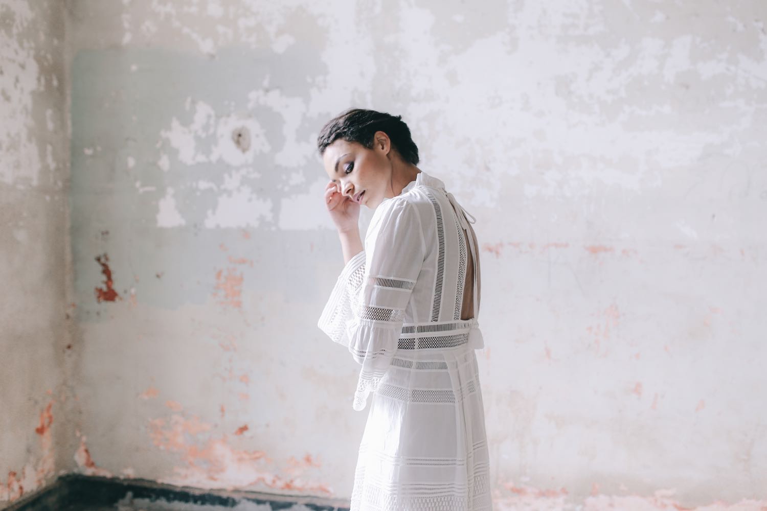


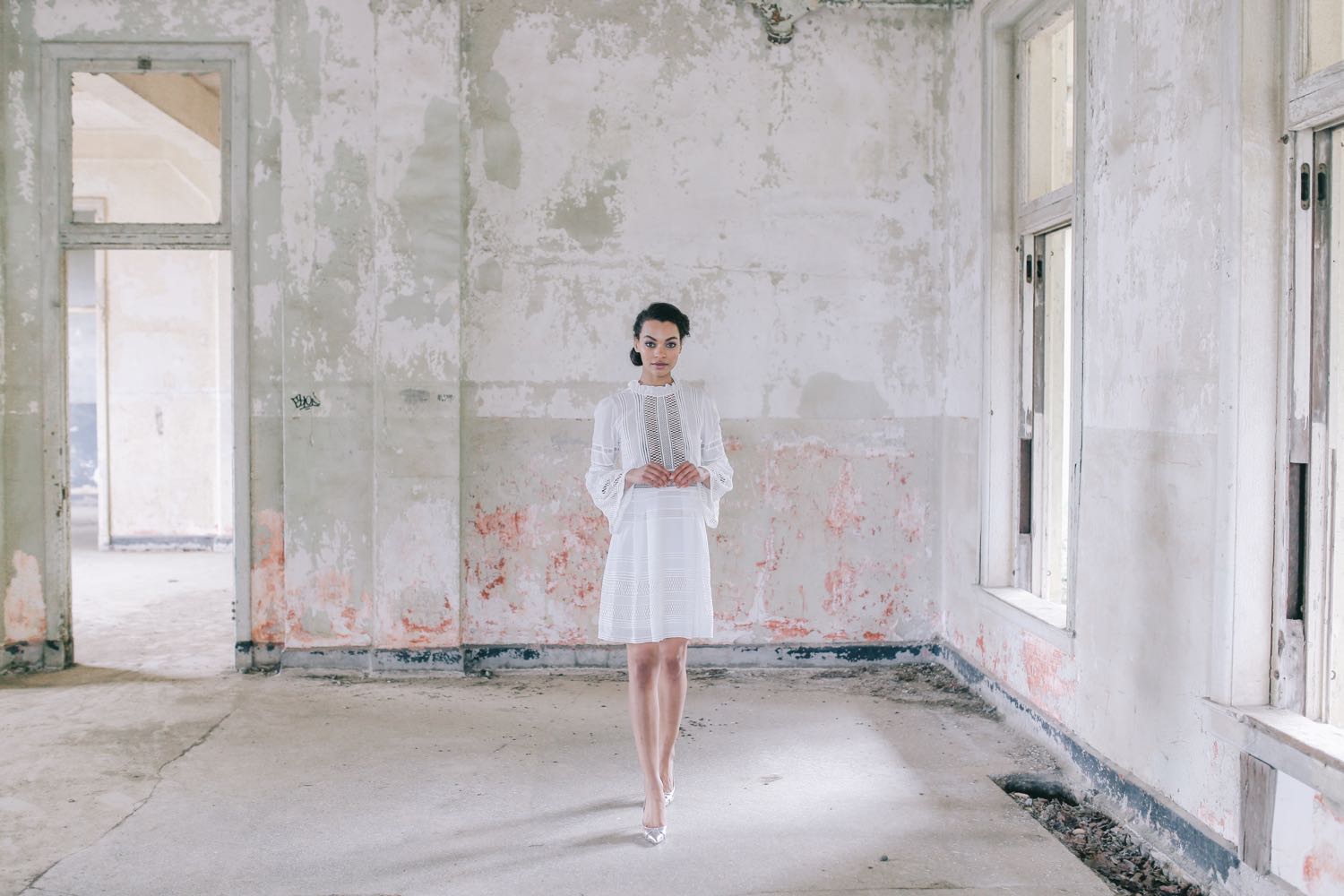


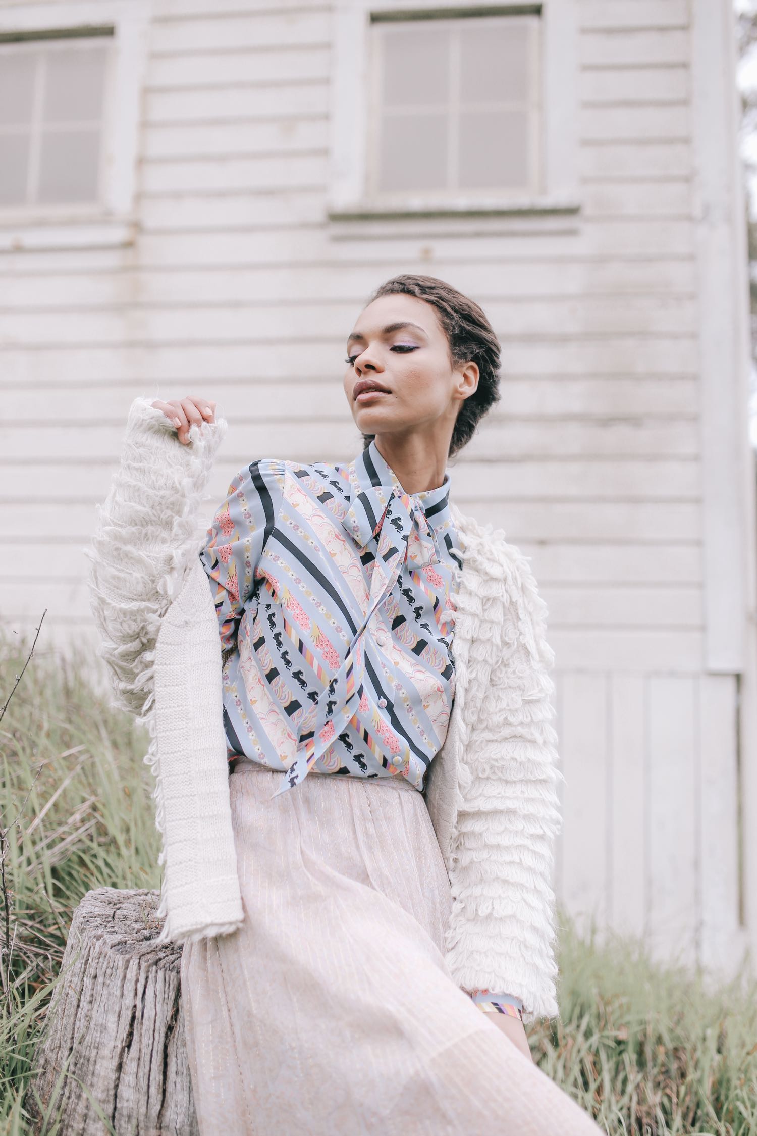


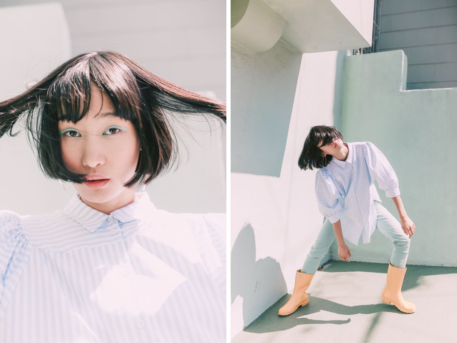
You can see this editorial published in the Atlas Magazine Revival Issue! (Page 136)Model: Sophia Jackson (Scout SF) Hair & Makeup: Amy Lawson Styling: Jeneffer Jones Edited with Pop! Preset


Editing styles come and go. Your aesthetic preferences are constantly evolving. But no matter what year it is, or what you’re shooting, you always have the opportunity to make your work stand out.
Here are my thoughts on creating one-of-a-kind images:

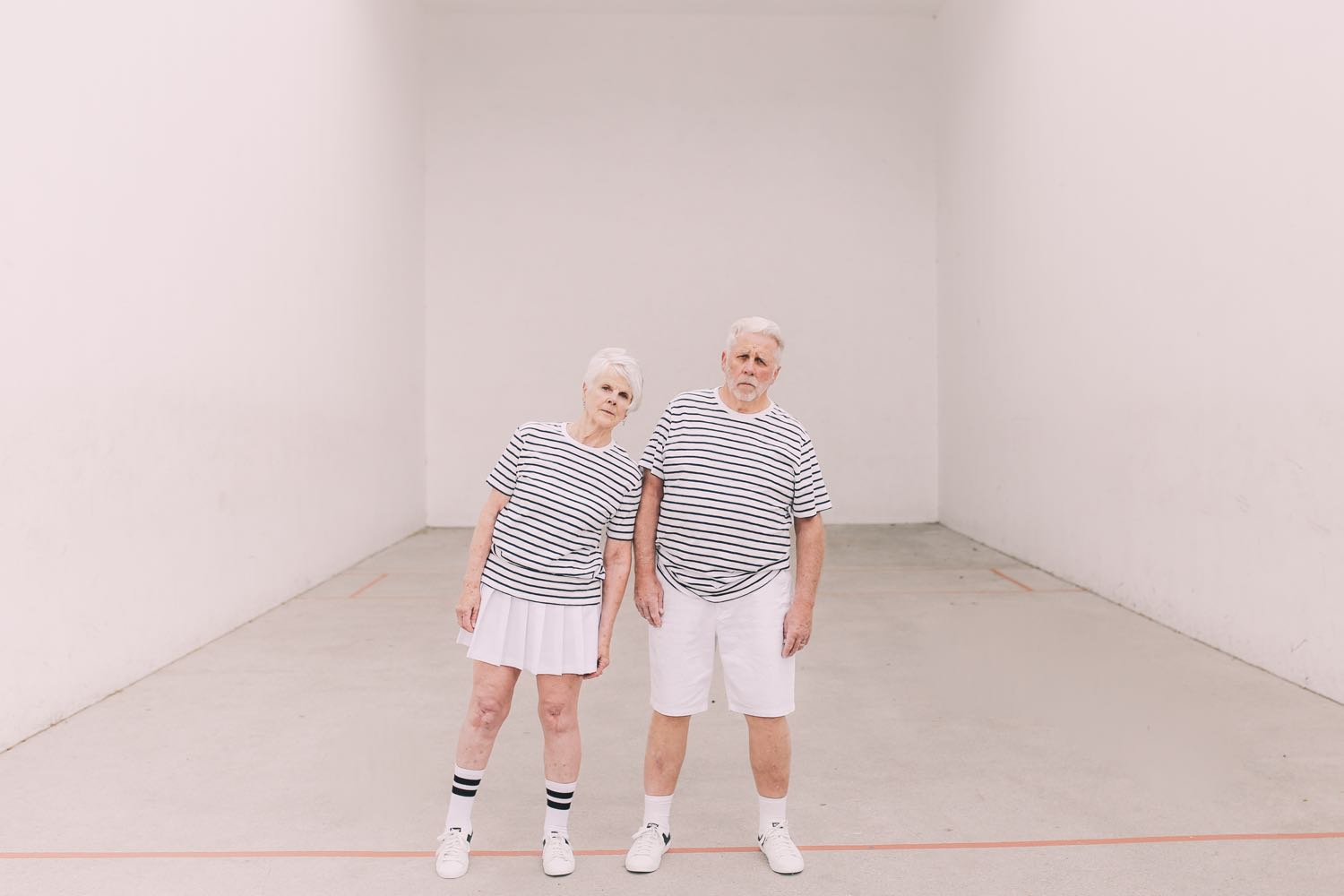
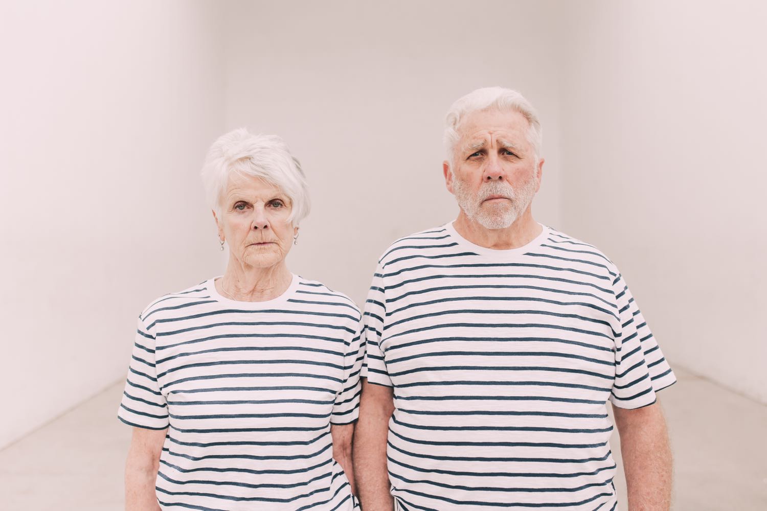
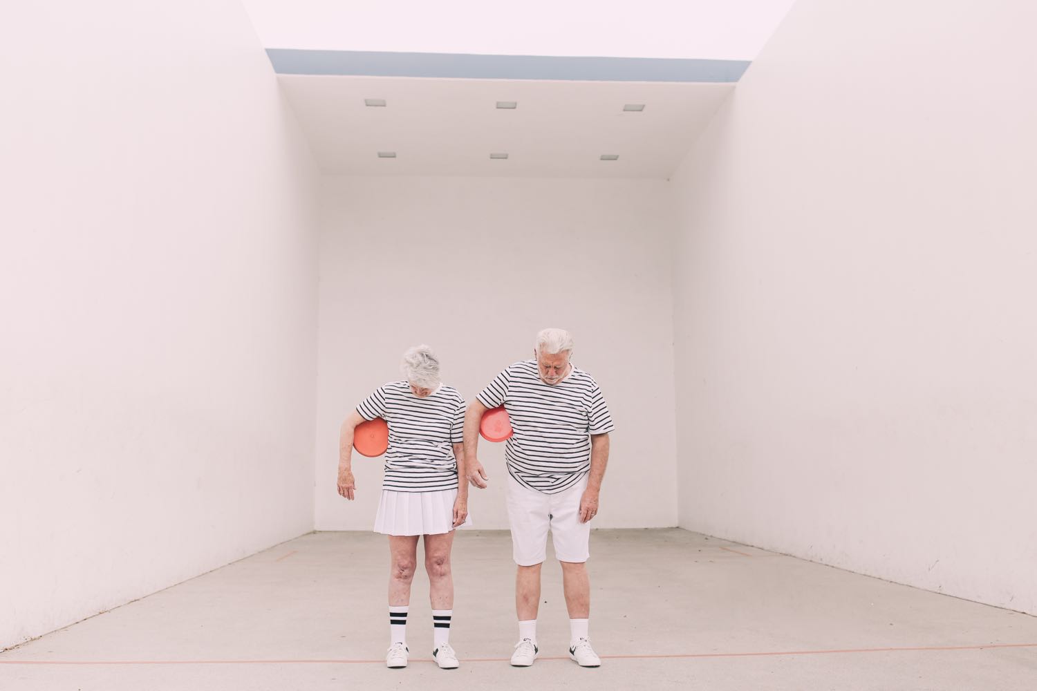
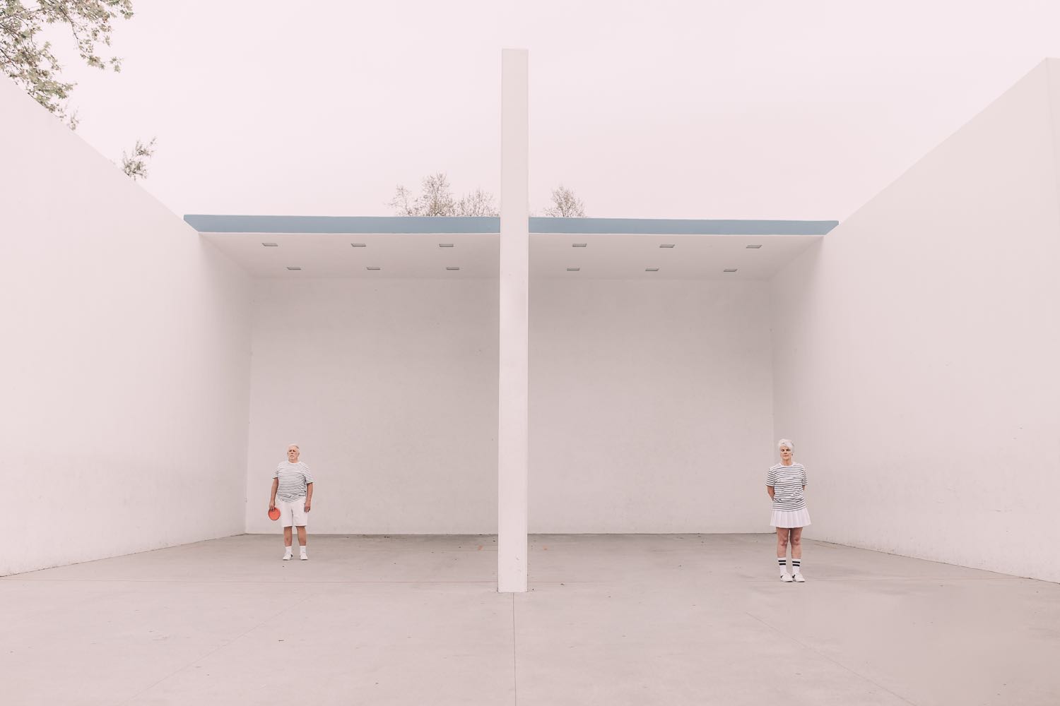
1) Pick an unusual topic or theme. This doesn’t mean that you need to specialize in photographing hammers sitting on chairs (though you totally could!). Pick something you’re passionate about that also happens to be uncommon, and keep iterating on it, establishing a theme in your work. I happen to spend tons of time with older people, and I think a lot about aging, so a natural pick for me was to shoot older people. This series means something to me, and I think it evokes some kind of emotion those who view it. Find something that no one else is doing and make it happen!

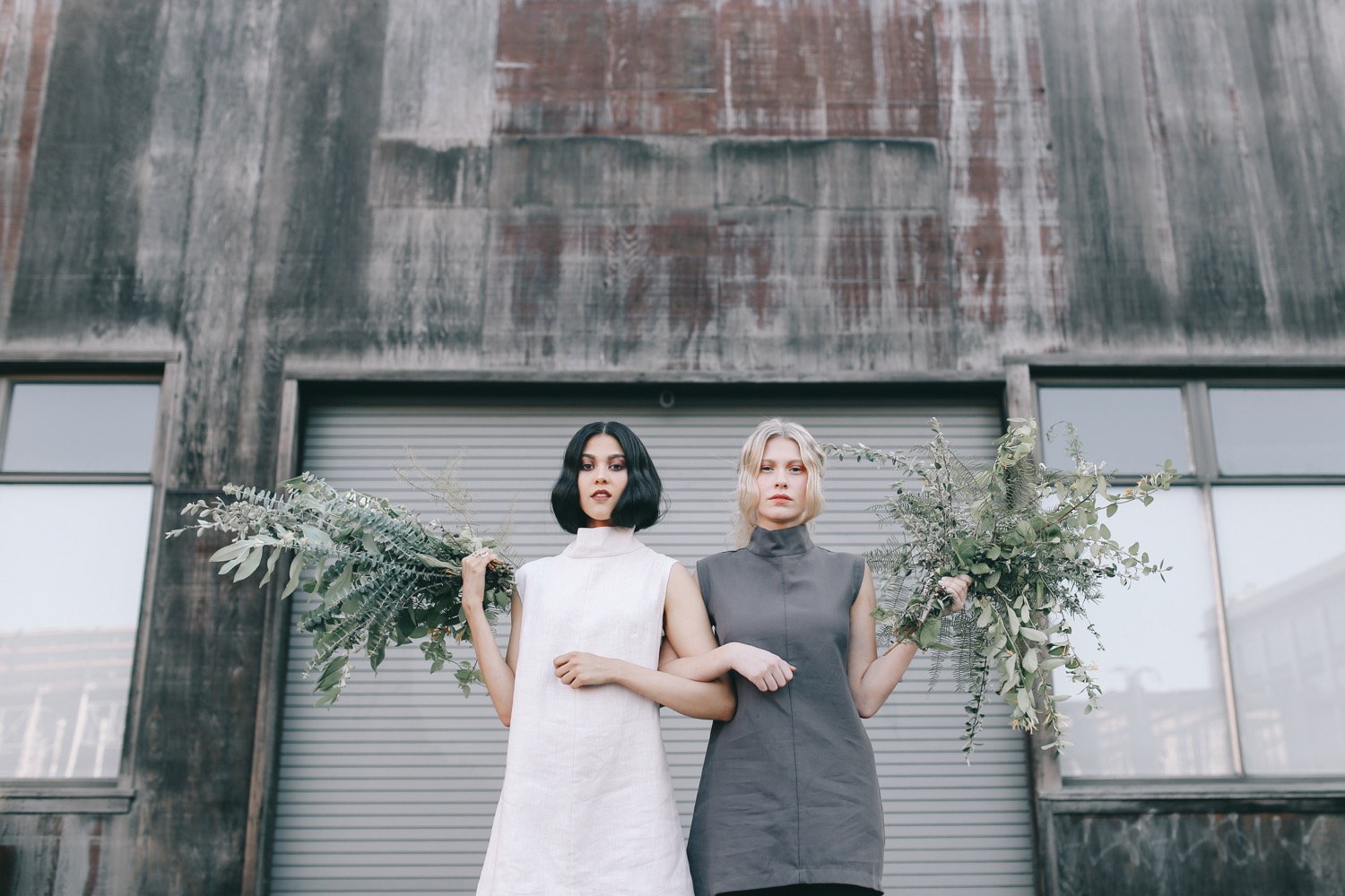
2) Disrupt normalcy. Ask yourself: what would make me stop in my tracks walking out in public? A herd of Scottish cows walking in a line down the middle of the street? 3 models standing on each other’s shoulders? It doesn’t have to be circus-status, but it does have to be something weird. For example, my most popular series to this day, 5 of a Kind, is a basic form of this idea. You typically don’t see 5 similar-looking girls (or quintuplets) dressed in identical outfits just strolling around robotically. The charm of these photos lies in the rarity of this scenario. Even just posing people in perfect symmetry (think Abbey Road cover) is visually striking and unnatural.
3) Pay attention to your colors. Color is a huge part of visual content. Color (or lack thereof) can set the mood and tone of your portfolio/feed. I encourage people to work within a color palette and choose colors they like the most, since that will personalize and streamline their work. Color can make or break your work!

4) Eliminate clutter. Whether that’s making sure the physical scene is clean to begin with, or cloning out background distractions (i.e., spots on pavement, random signs or debris), it’s important to pay extra attention to those little details. It will help draw the viewer’s eye to the subject and enhance your composition.
5) Work hard. This almost goes without saying, but I want you to internalize what this means. The photographers who are willing to go above and beyond to make their visions come to life are the ones whose work will stand out. Take location, for example. The photographers who are competing for space at the local park are probably not the ones we all follow on Instagram. It’s the ones who are climbing mountains or driving hours to find the perfect wheat field who are going to make their mark. (Note: I don’t mean to say that great work can’t be made at the local park, or that shooting at the same place over and over is a bad thing. But think about how location can influence your work for the better!) This applies to everything, not just location. Putting time into finding new people to work with, feeding your inspiration, and working hard to make sure every detail is taken care of will all yield impressive results.

6) BE CONSISTENT. I think I bring this up almost every time I write something, so this time I’m going to shout it. Shoot well, and often. Consistency attracts people to your work because they don’t have to work hard to figure out what you do. Since being consistent is so hard to do, being consistent will automatically make your work stand out. (Psst, in case you can’t already tell how obsessed I am with consistency, check out my free guide to building a consistent body of work.)
If I could tell you one thing: Create images that depict something you don’t see everyday. Whether that’s a clutterless street, a perfectly colorful outfit, or faux-quintuplets, you’ll draw people to your work by disrupting routine and temporarily drawing them out of the real world.
You may recognize some of what I’m saying from my Instagram tips post. See the correlation? Making your work stand out will contribute to your success on Instagram.
What do you think helps make your work stand out?

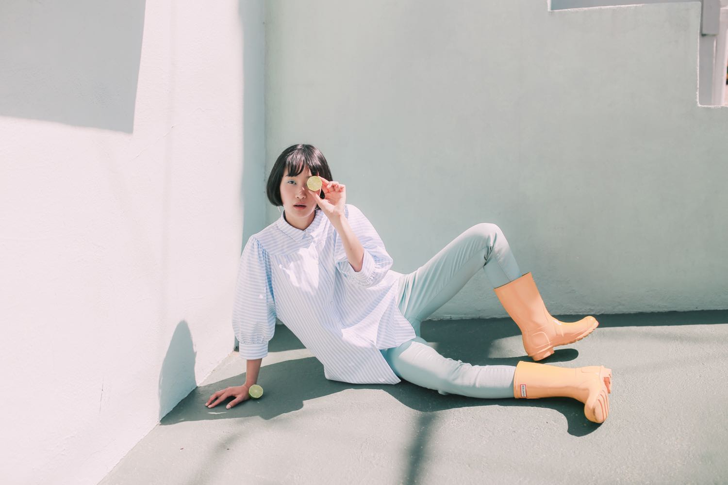
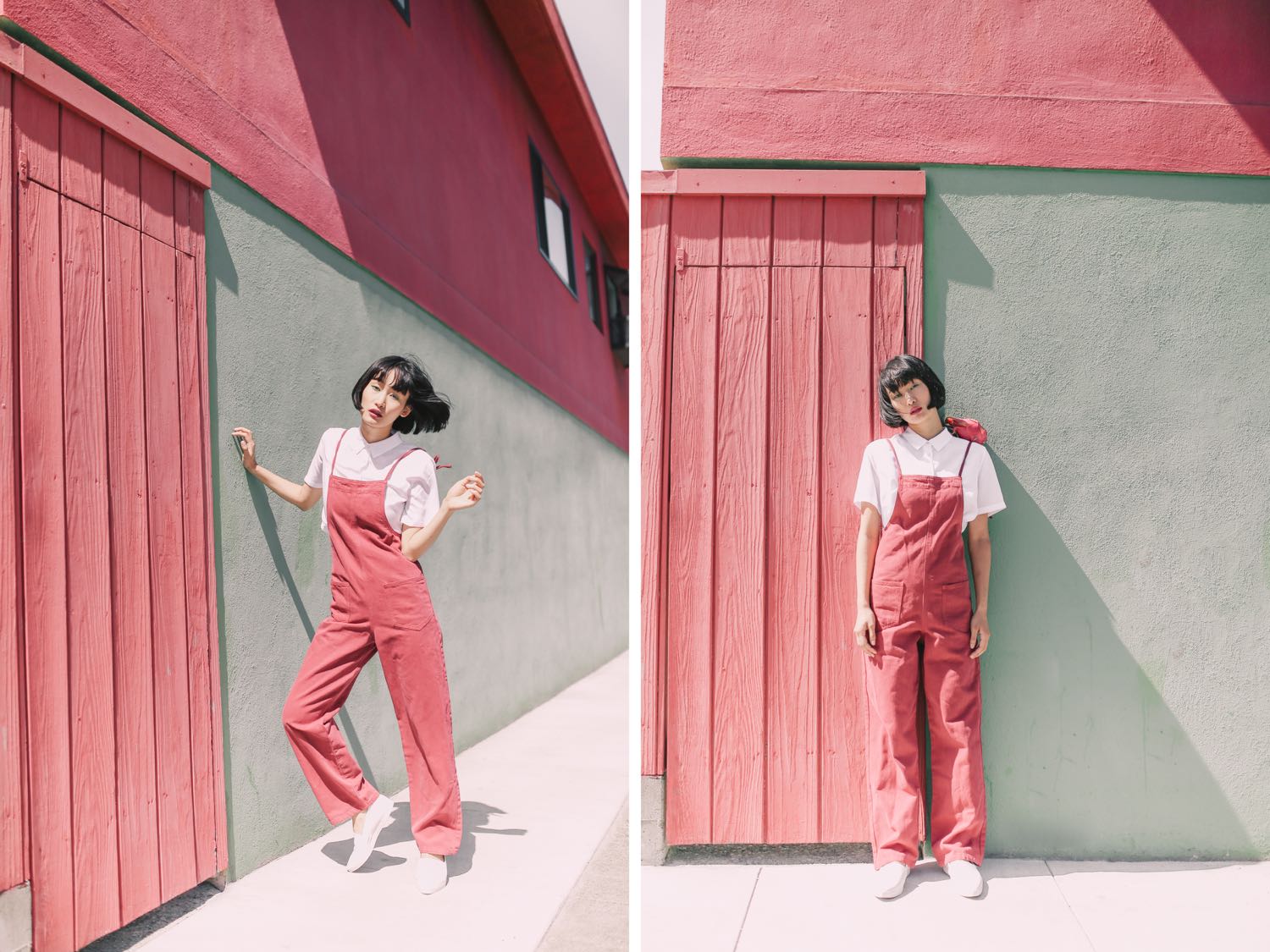
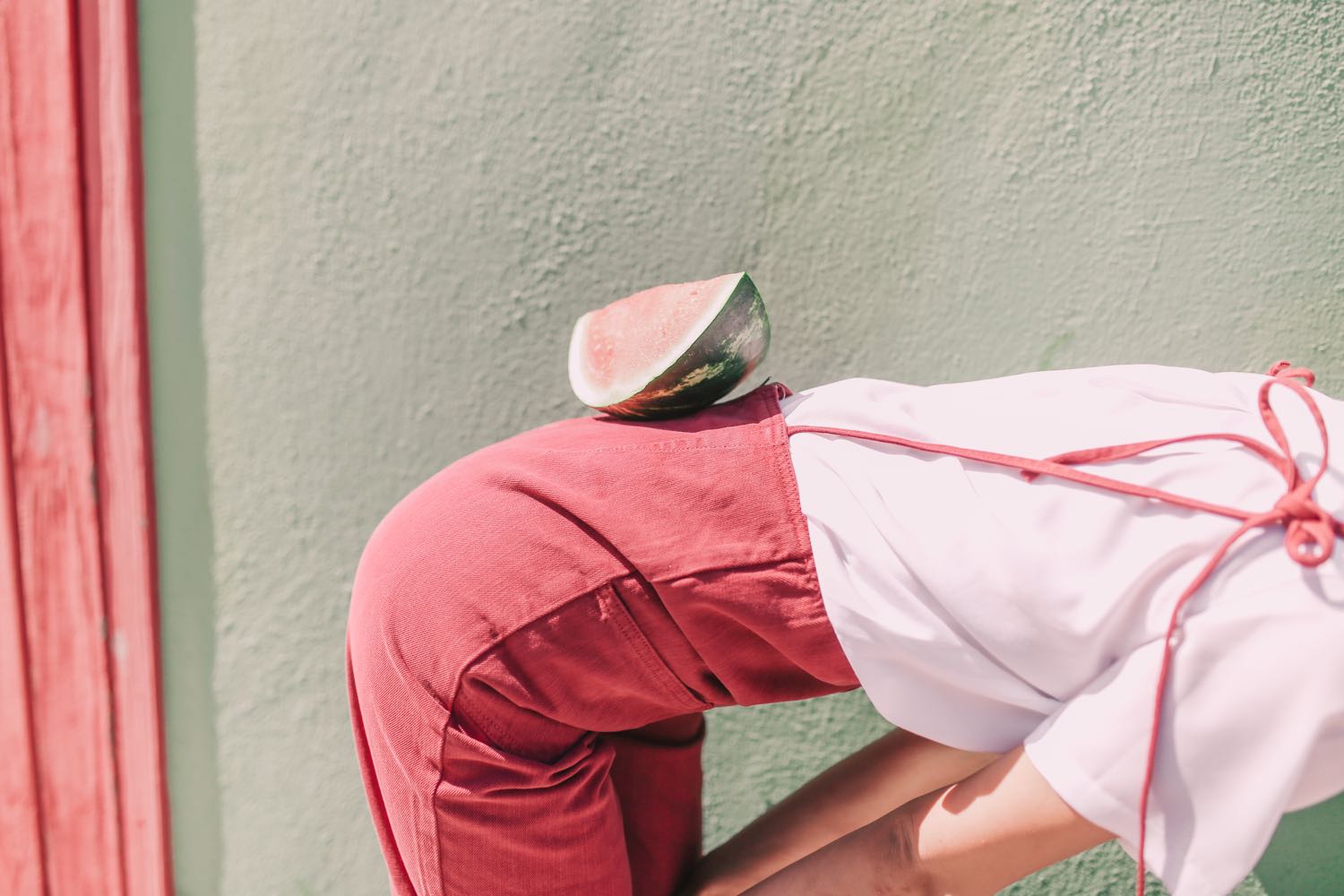
Model: Miki HaminoHair & Makeup: Amy Lawson
Styled by me
Edited with Pop! Preset


















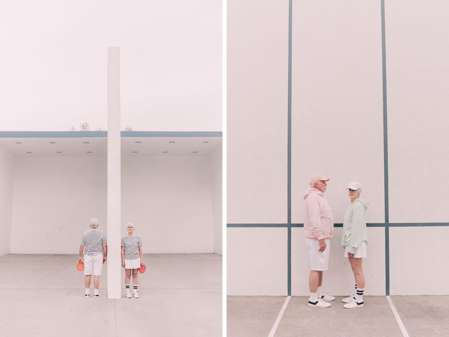
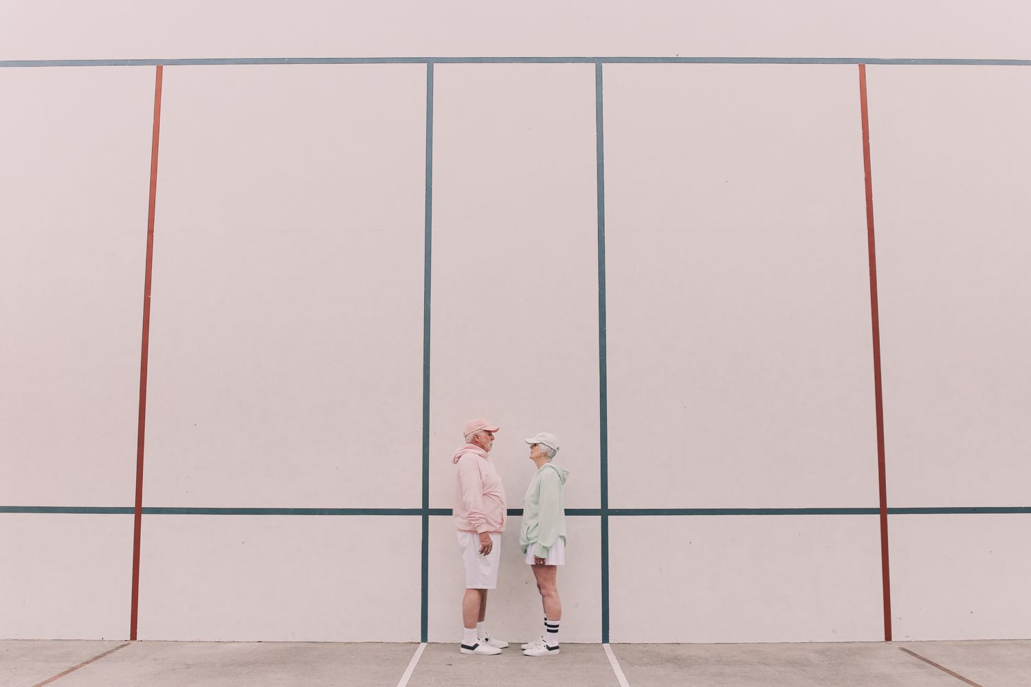
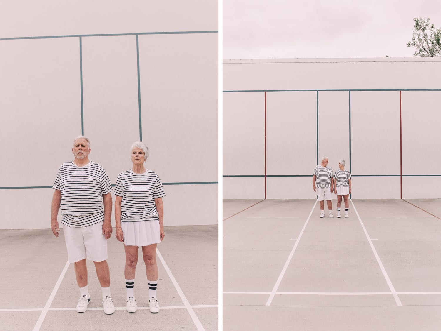
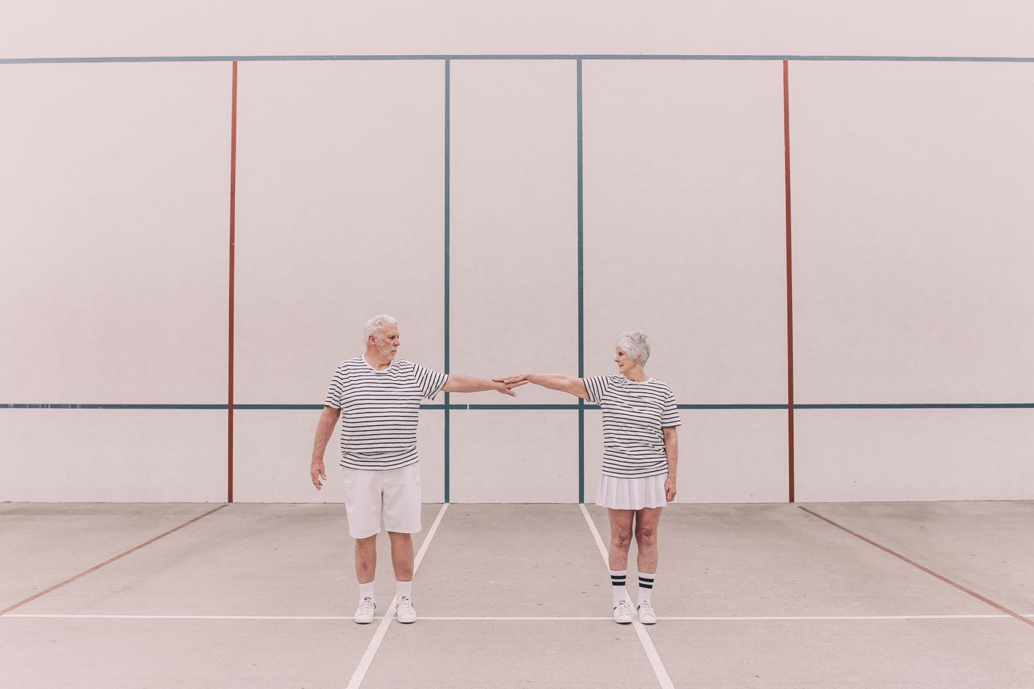
The first in a new series that aims to explore what it means to age and challenge the notion that youth = beauty. I came across a video of a 102-year-old woman in a hospital bed who was watching a video of herself dancing in the 1930s. At the end of the video, they asked her, "How does it make you feel to see yourself dancing?" Her response: It makes me wish I could get up out of this bed and do it all over again. That comment will stay with me forever.
That's part of what this series is about: internalizing the fleeting nature of time and working to infuse each day with meaning. Age is a collection of experiences; it should be celebrated and valued.
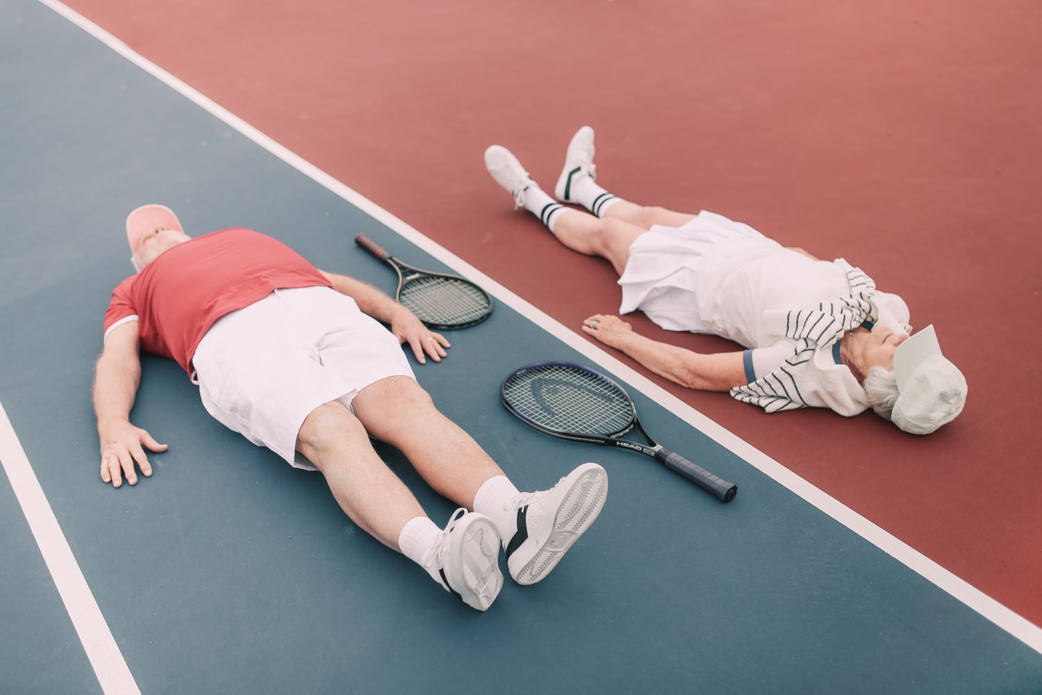
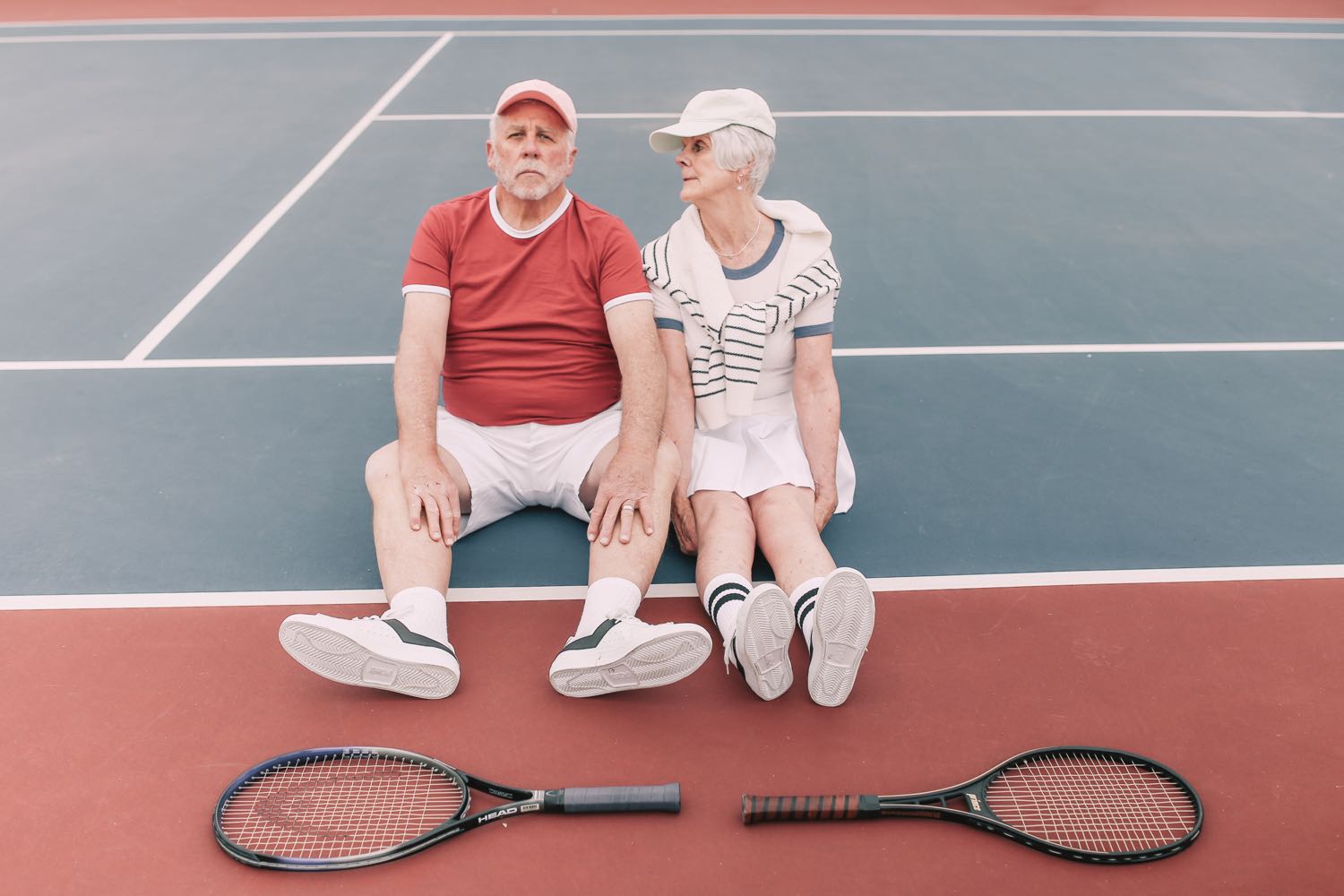


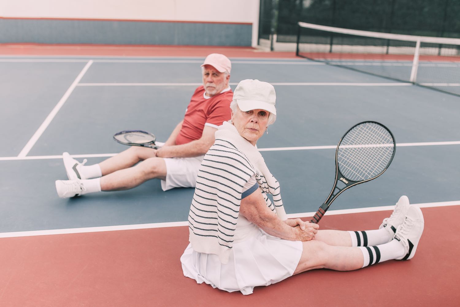
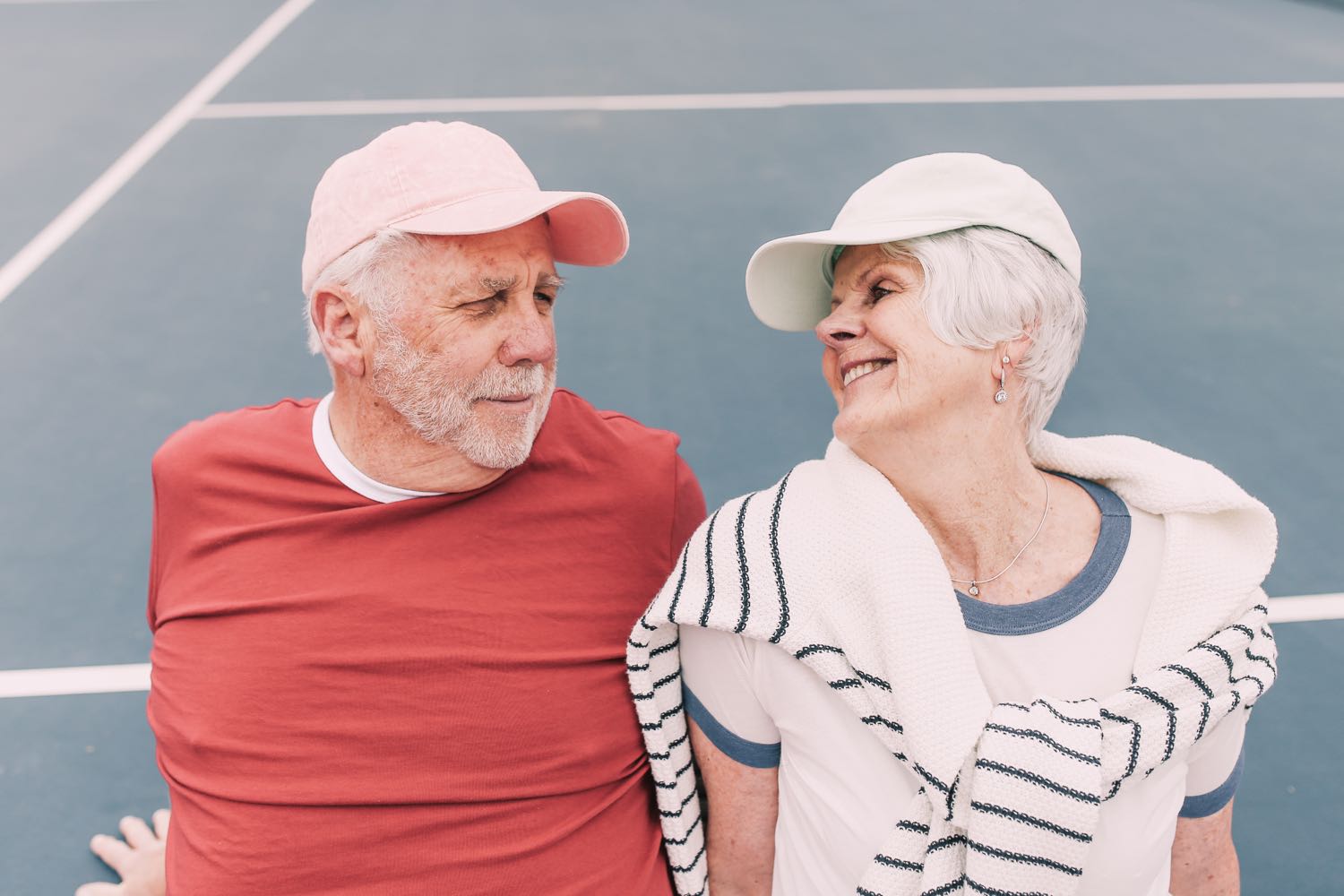





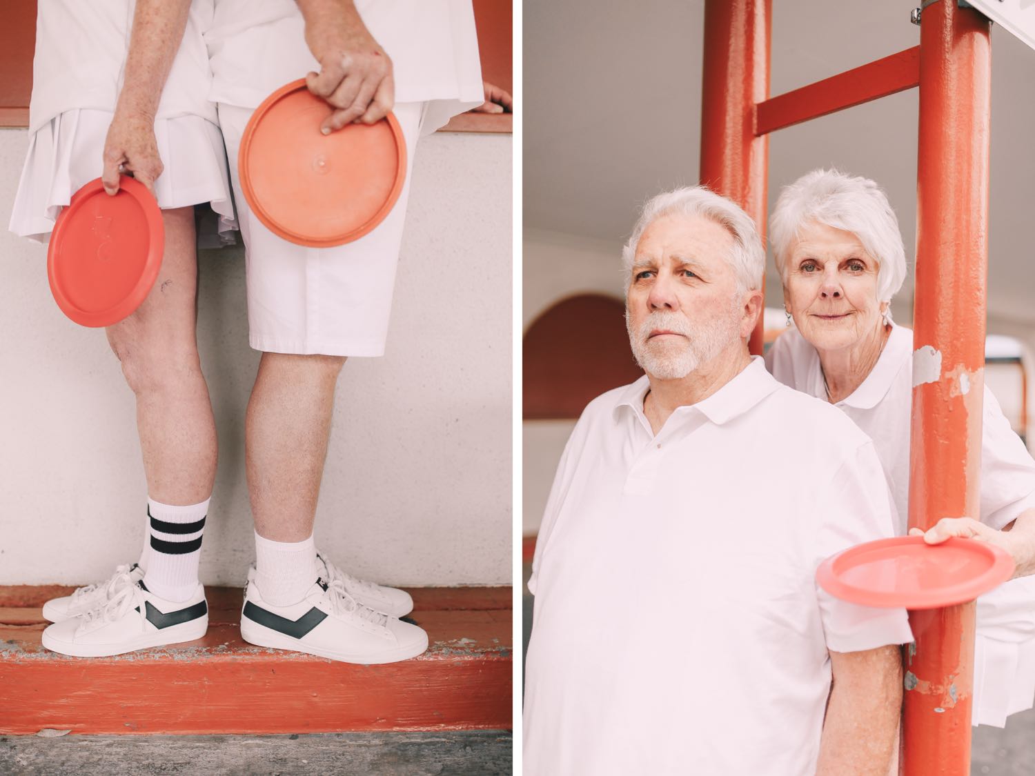

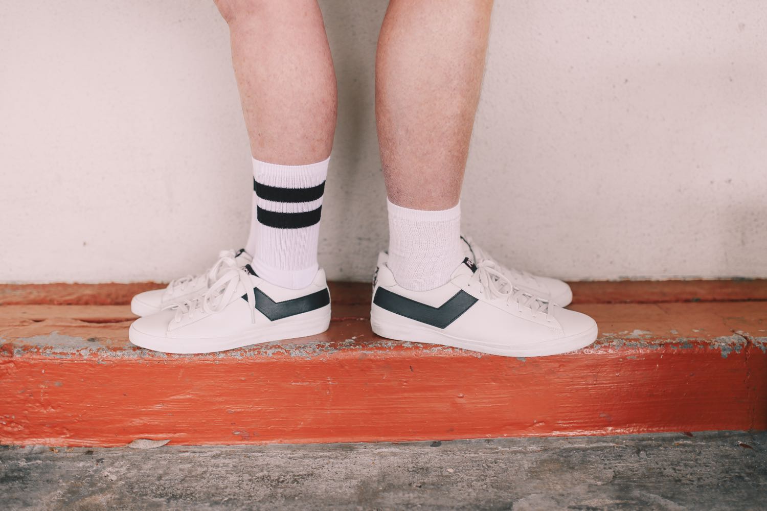


HighlandsModels: Rory Chronister & Wednesday Manners Hair & Makeup: Amy Lawson Styling: Amy Webster Videographer: Ocean Ho (Otion Pictures)


Edited with Pop! Preset


Veronica and I both studied linguistics at UC Santa Barbara, and we spent many days walking around campus codeswitching between Spanish and English. It was an honor to capture the genuine chemistry between these two - a banana slug even made an appearance!

Are you frustrated at your lack of growth on Instagram? I often get asked about how to be successful on Instagram. The truth is, I'm still figuring it out. But I'm happy to share what my experience has been so far.
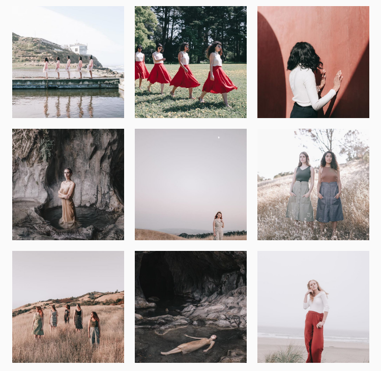
I've had quite the journey on Instagram. Back in 2012, I reluctantly agreed to start posting on it based on a recommendation from a friend. In late 2014, my feed got more serious as I started to hone in on my style and really focus on growth. In May 2016, Instagram featured one of my photos on their feed, which garnered me a nice boost in followers and engagement (still under 6,000 with the boost at the time).
Later in 2016, Instagram started following me. This seems to be the new version of being a "suggested user." While this has significantly helped my follower growth, unfortunately it has decreased my engagement rate (number of likes & comments per photo).
The problem is, many bots are programmed to follow the users Instagram is following, so it makes my audience less authentic. I'm not trying to sound like I'm whining about having nearly 40K followers, but I'm pointing out the fact that you can't always take numbers at face value. There are people with 6,000 followers getting 1,000-2,000 likes per post, which is AMAZING. I have nearly 40K and I only get 400-500 likes on average. Pretty lame, huh?
However, I am happy with how my engagement has grown over the years. I love when people comment, and I love answering them back. It does take a lot of work to keep up those relationships, but I think maintaining that conversation is important!

In order to build an engaged, authentic following, I recommend using these tips as you grow your account.
1) Be consistent. I'm a huge advocate for consistency - consistency in editing style, the type of content you post, and the choices you make when creating your work (i.e., colors, types of light). In fact, I think some of the most successful photographers are the ones that only post photos based around a single theme - for example, @thebroccolitree only posts photos of the same tree captured at different times. I imagine that taking these photos must get boring after a while, but it's a successful concept: the people who follow @thebroccolitree LOVE seeing pictures of that tree, and they know that what they see is what they get. The intent behind the feed is transparent. (Read more about consistency by downloading my free guide!)
Without taking that concept quite so literally, think about how you can ensure your audience that what they see is what they get. It doesn't mean that you have to have the same subject all the time, but what is an element that can act as a thread of consistency weaving through your work? I use the same yellow hat in a lot of my photos, and I have a color palette that I try not to stray from (learn more about how I work with color here). I try to explore repeated themes throughout my work, such as multiples (5 of a Kind, twins, etc.) and older people (a fairly new series).
Additional examples of consistent feeds: @picturingjuj @thatgoldendog @ulas_merve @niravphotography
2) Plan out your grid. I try to be thoughtful about the order in which I post photos. I use the app UNUM to preview my layout; it's really helpful for seeing the "big picture" when you're trying to figure out how to share a bunch of work. I usually try to alternate composition styles - one close-up, one wide shot, one medium shot, for example. I also try to be conscious of the color palette of the photos that surround each other and not inundate my feed with just one color. Often I'll post 3 photos from a new shoot, and then continue to sprinkle them throughout other photos so that I don't spam my audience with all the photos from one shoot. I like to spread out my work, which is why I use UNUM to see what will look good next to each other.

3) Don't post irrelevant content. There's always been a big debate about whether or not to post personal photos to your Instagram. Personally I believe that you should never post personal photos if they don't fit well with your feed. Don't throw in a grainy picture of your cat in between beautiful editorial images - that will instantly make me not want to follow you. If you recently took fancy self-portraits that do fit in well with your feed, sure, go right ahead! But keep your content in line with what your audience is expecting. You can be personal with people and let them into your lives through your blog, your captions, and other social media venues (i.e., Snapchat, Instagram Stories, Facebook), but try to avoid polluting your Instagram feed with irrelevant photos. You want to treat your Instagram feed like your portfolio - would you put up a picture of your new shower curtain on your front page slider on your website?
4) Focus on creating amazing content. This one's pretty obvious, but I'm not sure how many people really internalize it. Stop worrying about how to grow your Instagram, and start worrying about how to make your work amazing. It doesn't matter if you're posting 5 images a day if all of them are the regurgitated leftovers of old shoots you don't really care about. Focus on quality over quantity. How can you make every shoot AMAZING? What are the wildest ideas in your head that are waiting to come to life? Master whatever it is you love shooting, and push your limits when it comes to imagining what you can create. Don't be afraid to bring your ideas to life. Then share them with the world!
TL;DR Above all, consistently creating great content is your golden ticket to success. Even if Instagram disappears within 10 years, this will always be true. No matter where you're sharing your content, it has to be good, and it has to be consistent for people to pay attention.

I'd like to close by saying that no social media platform is worth obsessing over. A lot of it is a constructed reality that takes us away from things that really matter (i.e., spending time with people, self-development, etc.). However, for many of us, social media is the core of our business: it brings us bookings, acts as a portfolio, and spreads awareness about our work. Just like a normal office job, though, it's necessary to set boundaries that allow us to leave likes and followers behind for a while.
I'm guilty of fretting over my engagement rate, feeling discouraged when a post gets below-average likes, and spending too much time hovering over my phone waiting for notifications. I'm still working on making myself step away from social media more often.
What are your thoughts on social media? Is there anything else you wish you knew about Instagram?
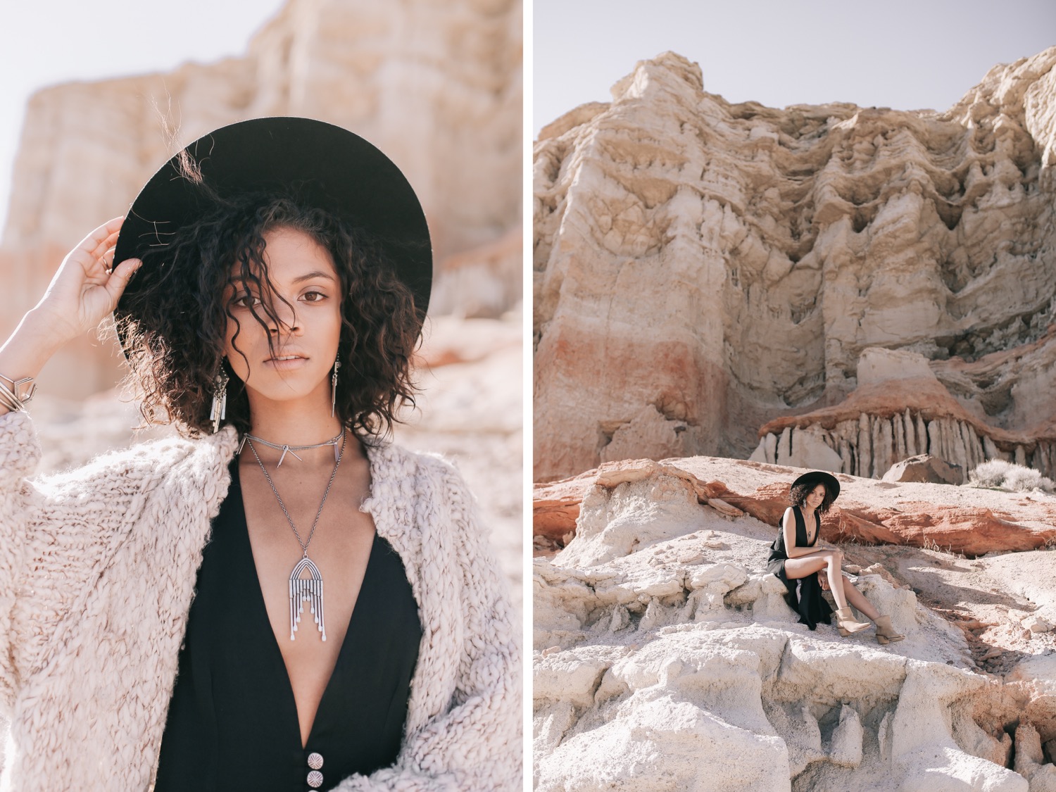
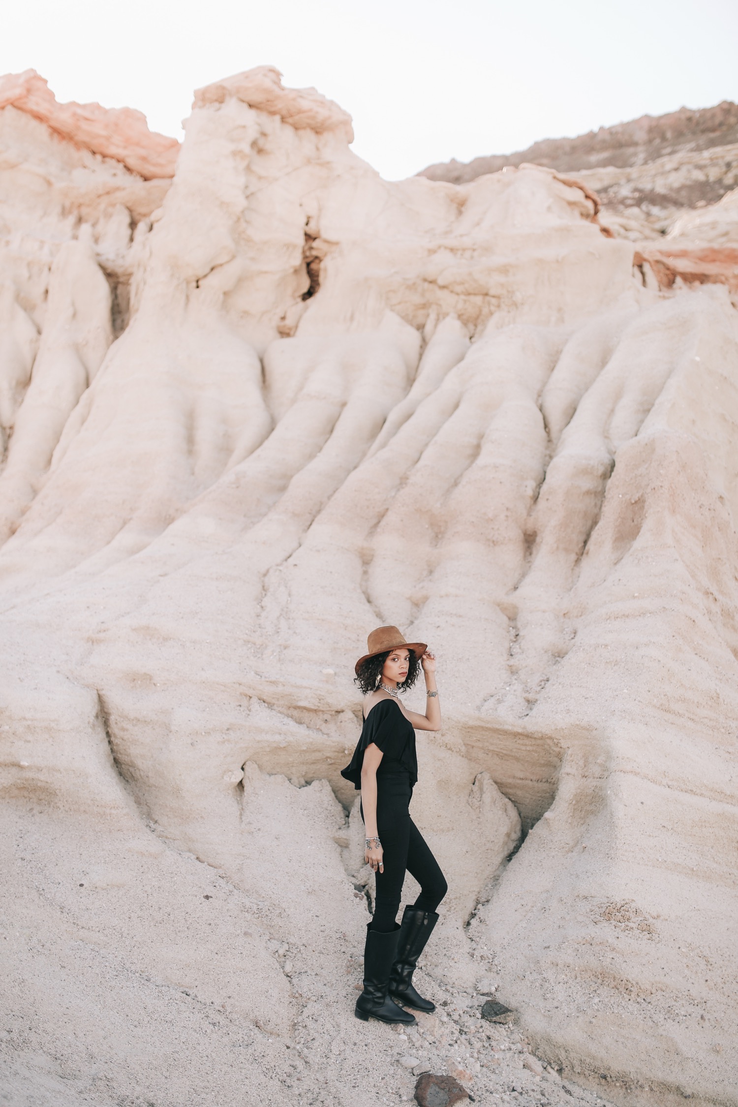
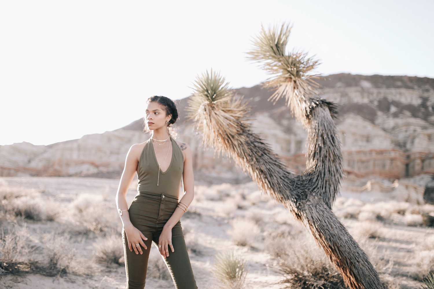
Ever since I'd driven past Red Rock Canyon on my way back from the Eastern Sierras, I'd been wanting to shoot there! With team members from all over the state, this was probably my most intricate long-distance collaboration yet. Jewelry: The2Bandits
Styling: Sara Ruhe of Barnaby Jack Vintage
Hair & Makeup: Olya Tizer
Model: Kelsey B. Anthony (Dollhouse Management)
Published by Atlas Magazine










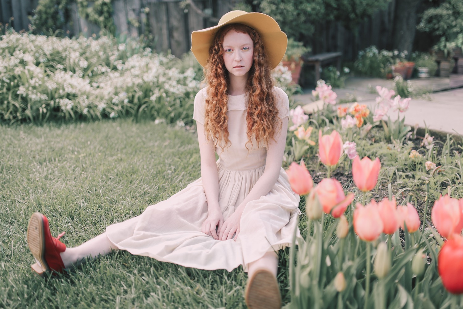
San Jose, California Photographer Here's another example of a last-minute shoot coming together beautifully! This tulip garden is part of a private backyard that opens for 9 days to the public every year. The owner was kind enough to let us shoot in the garden. Model: Wednesday Manners Hair & Makeup: Tara Marshell
Edited with Pop! Preset
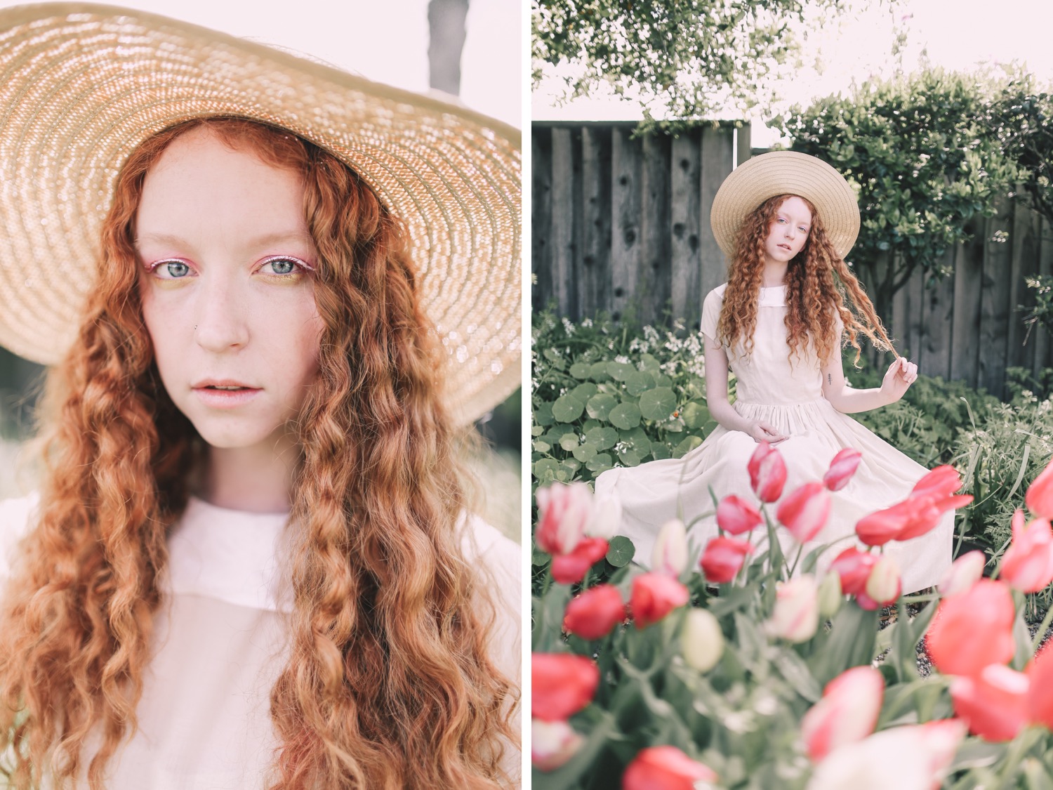
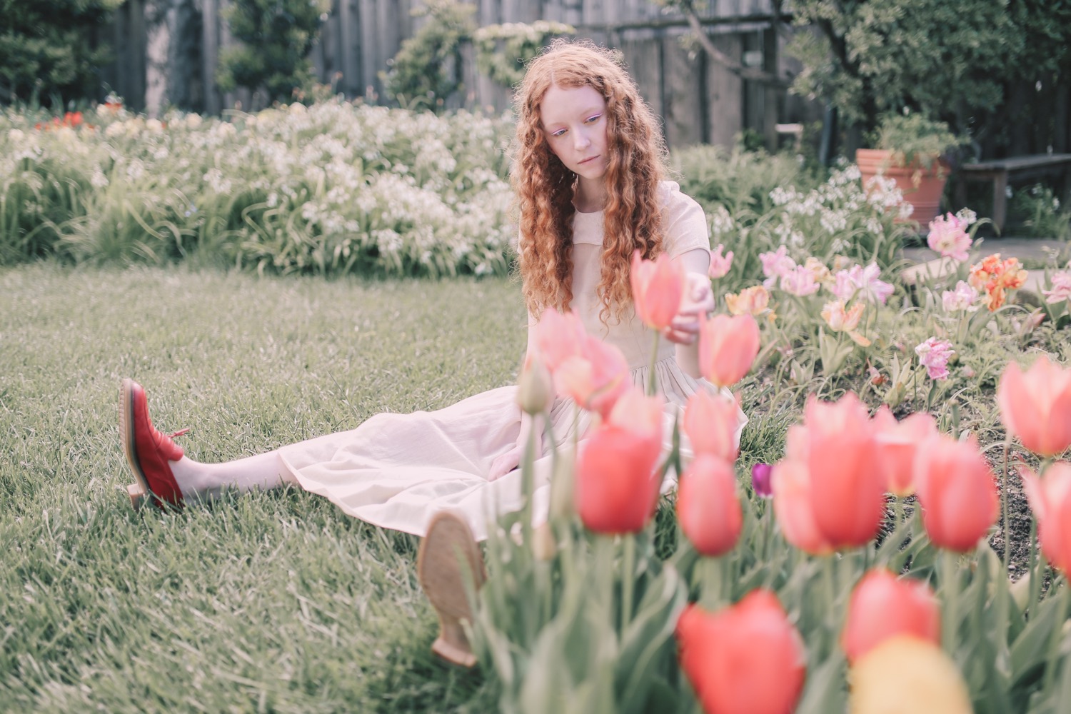


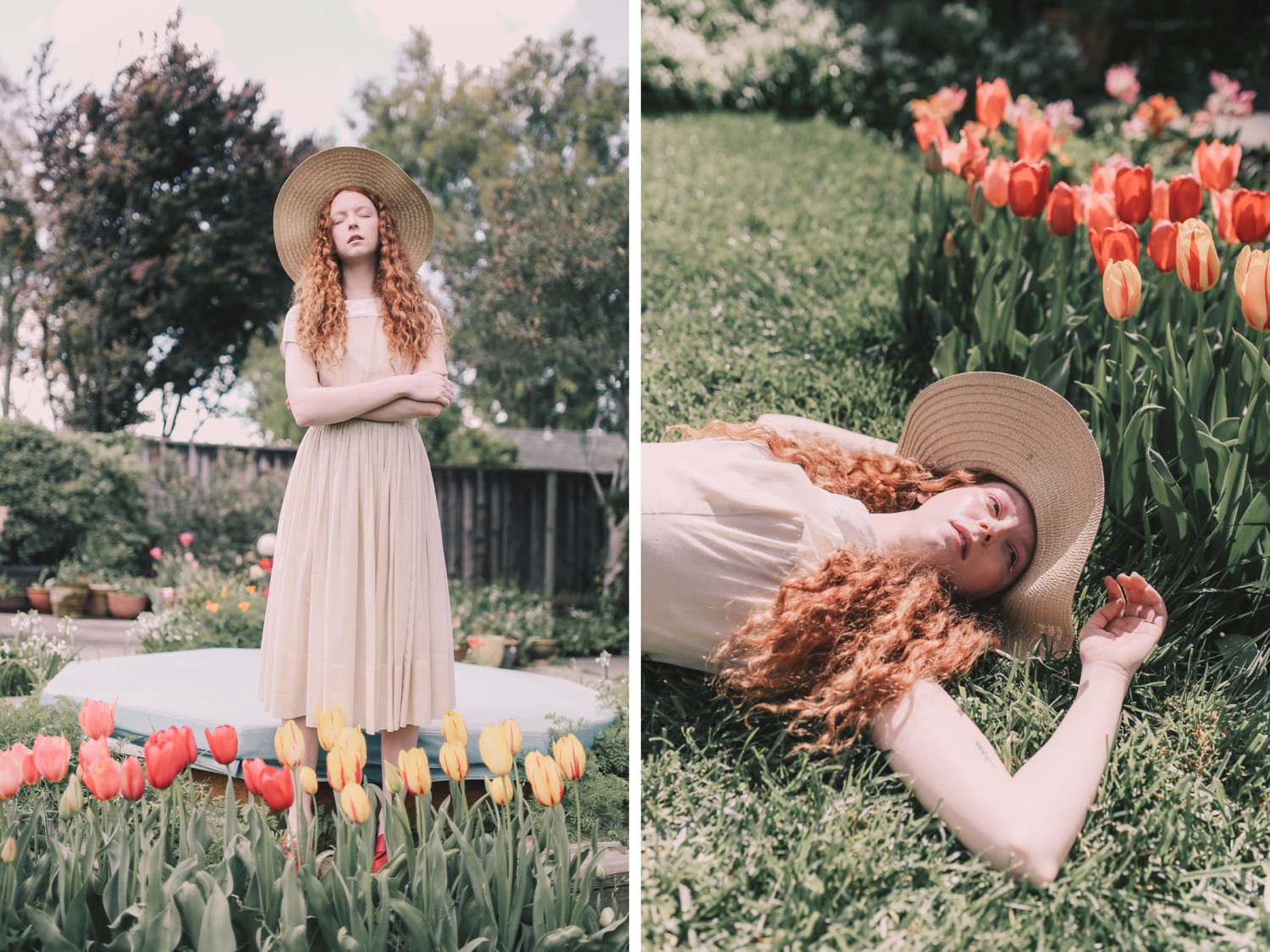

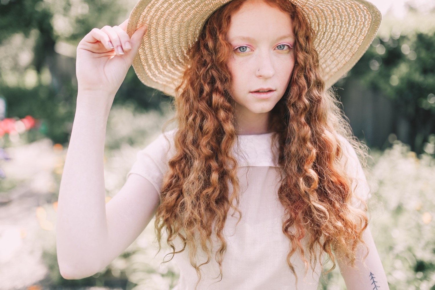
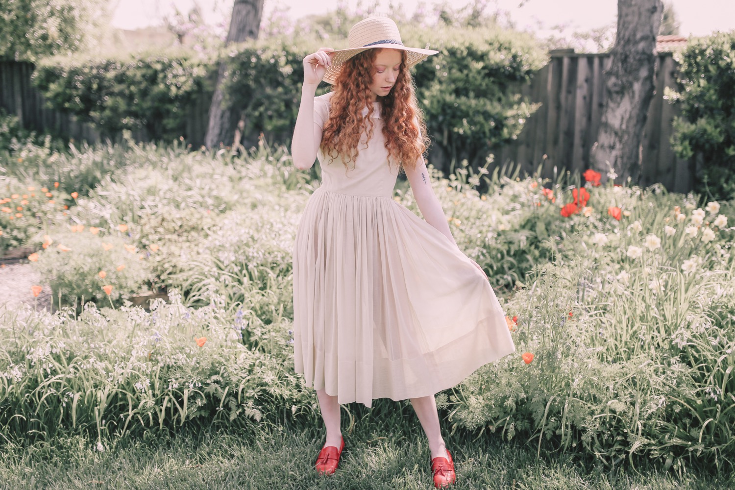

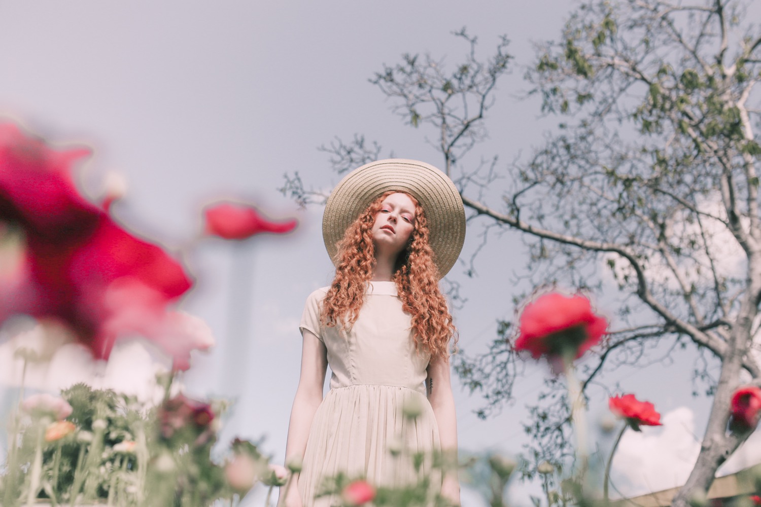
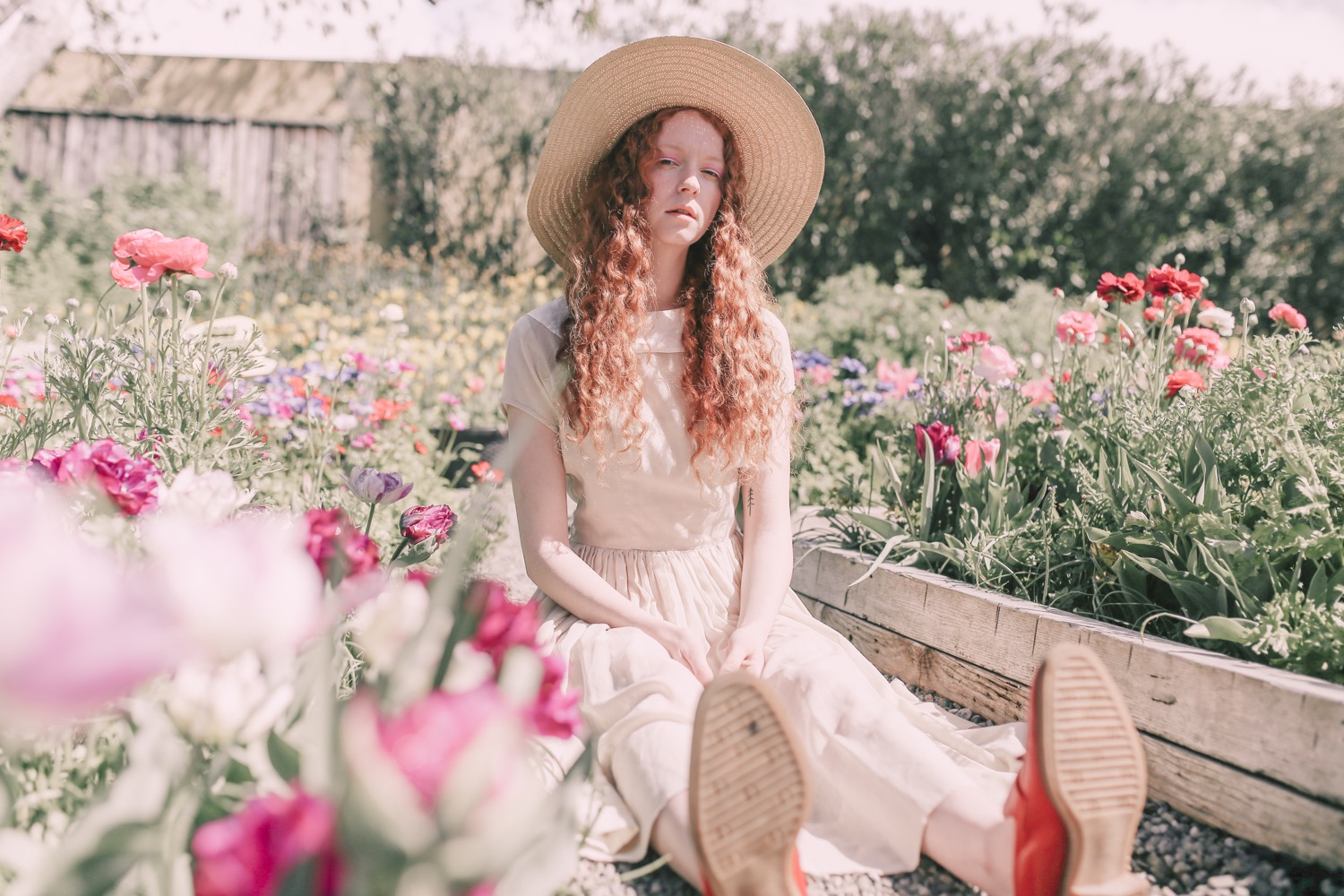
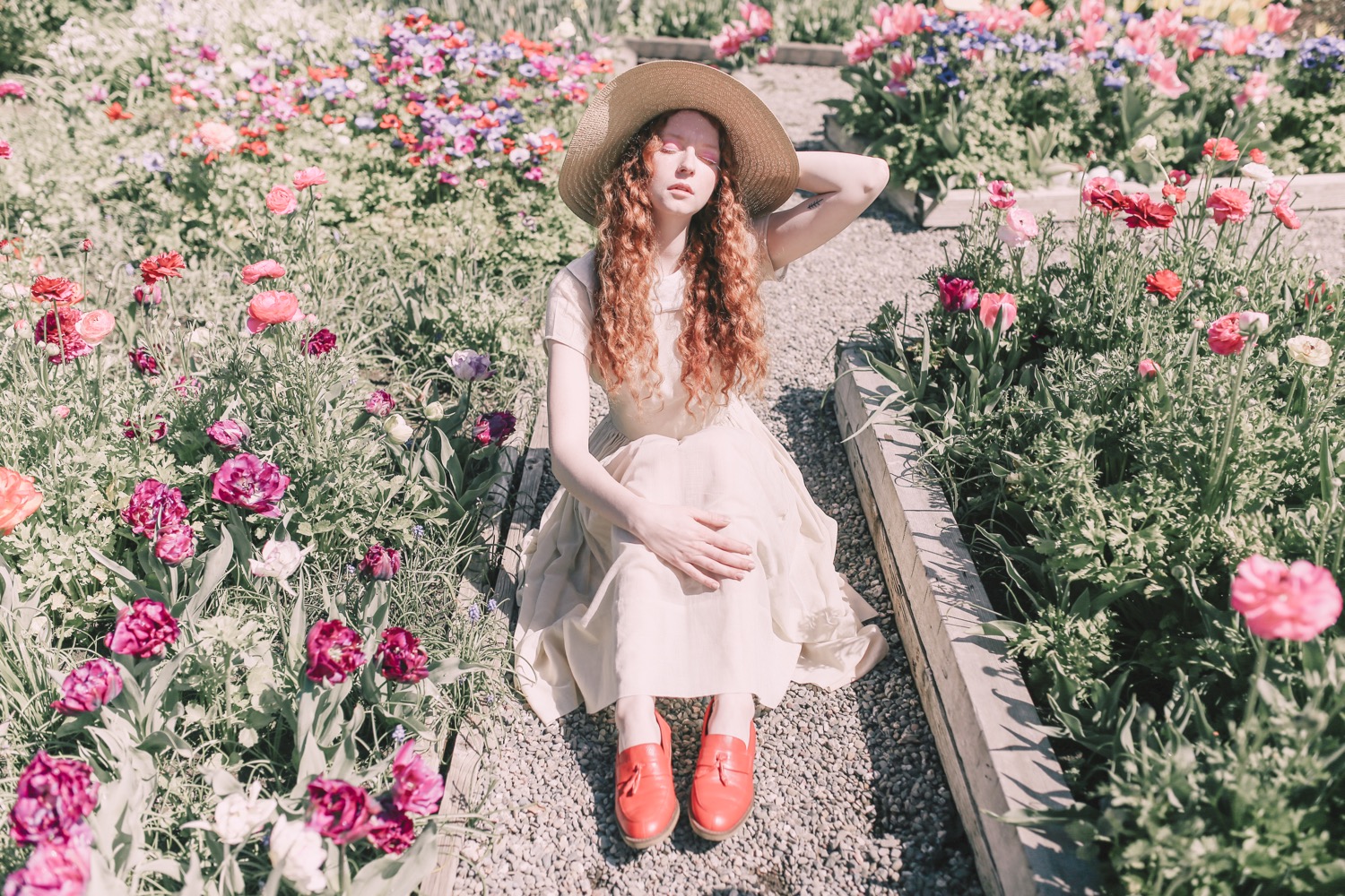


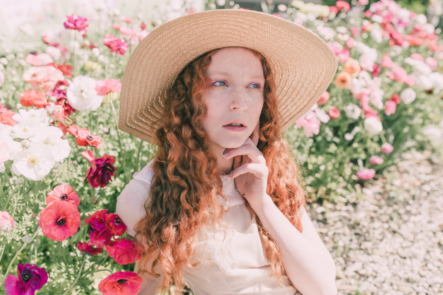

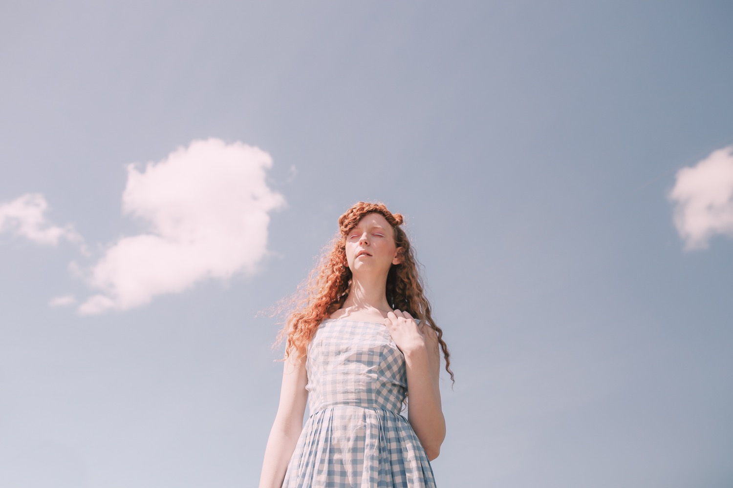
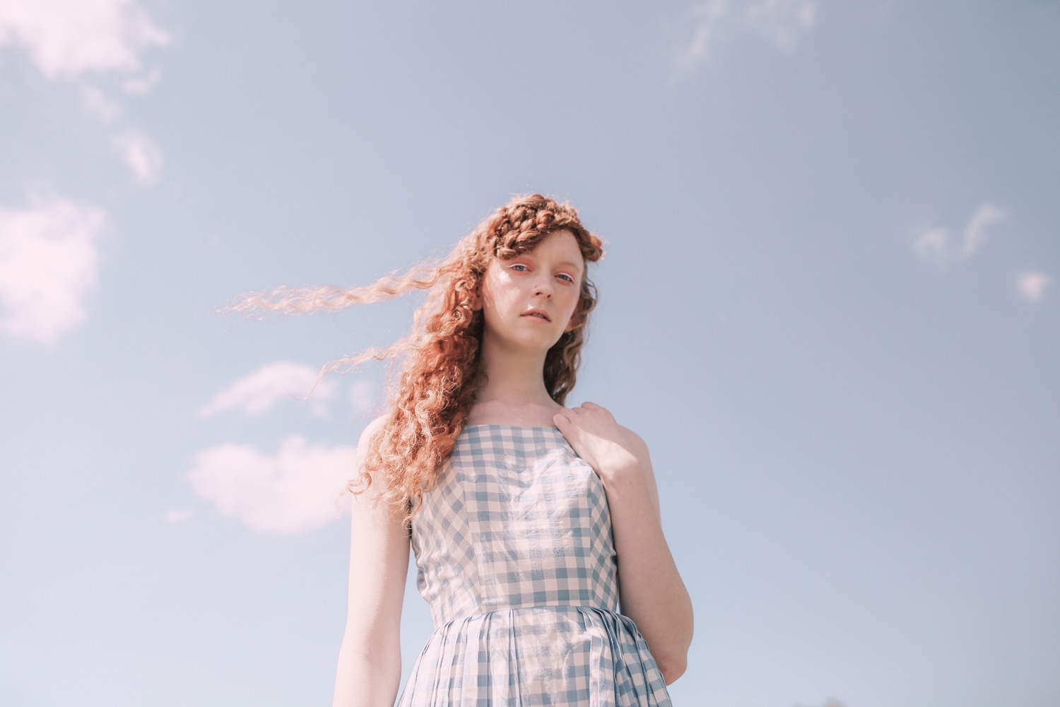
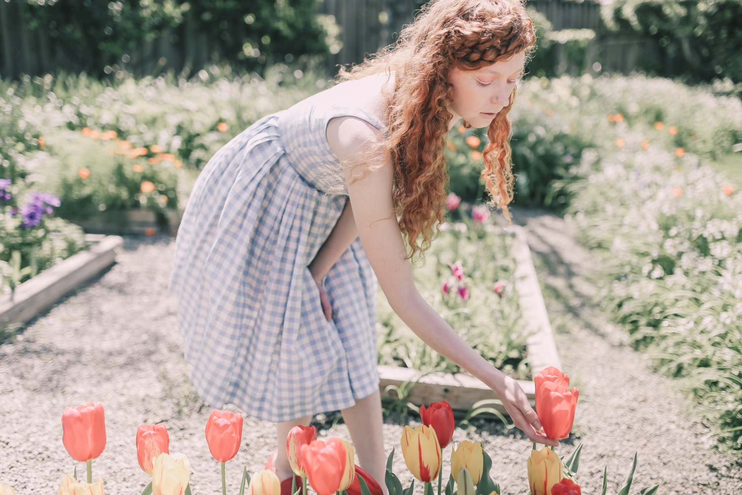

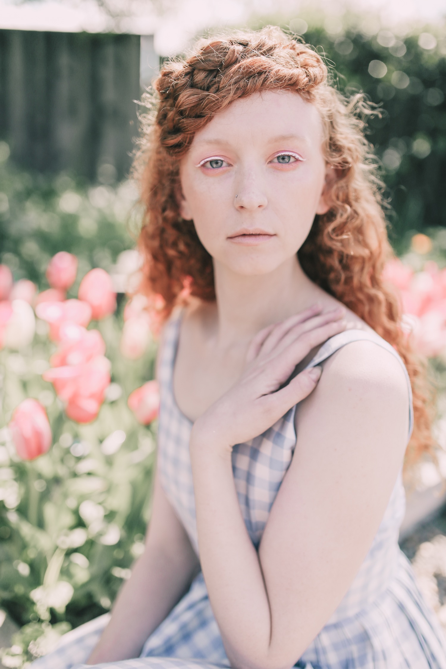
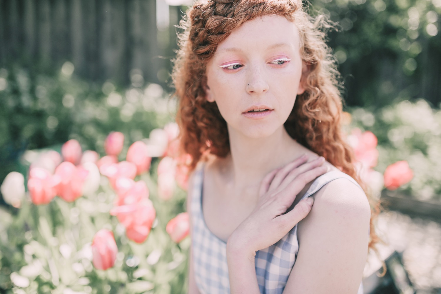
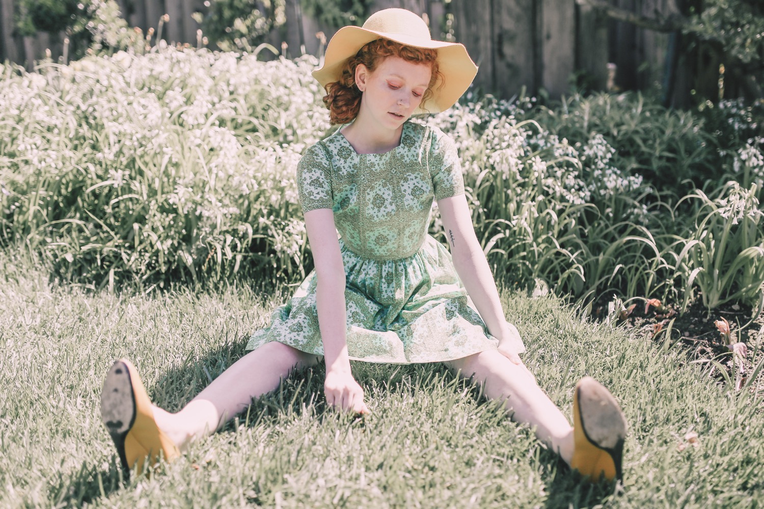
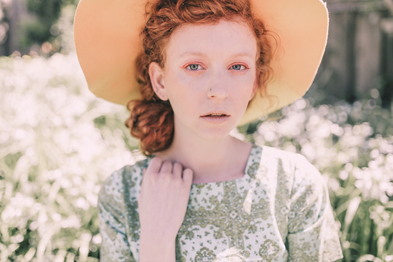

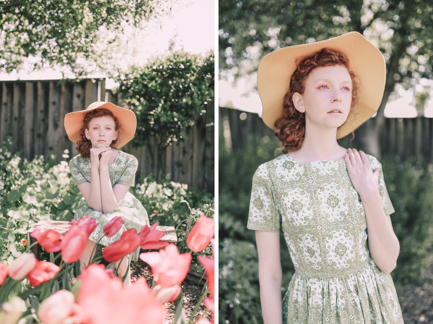
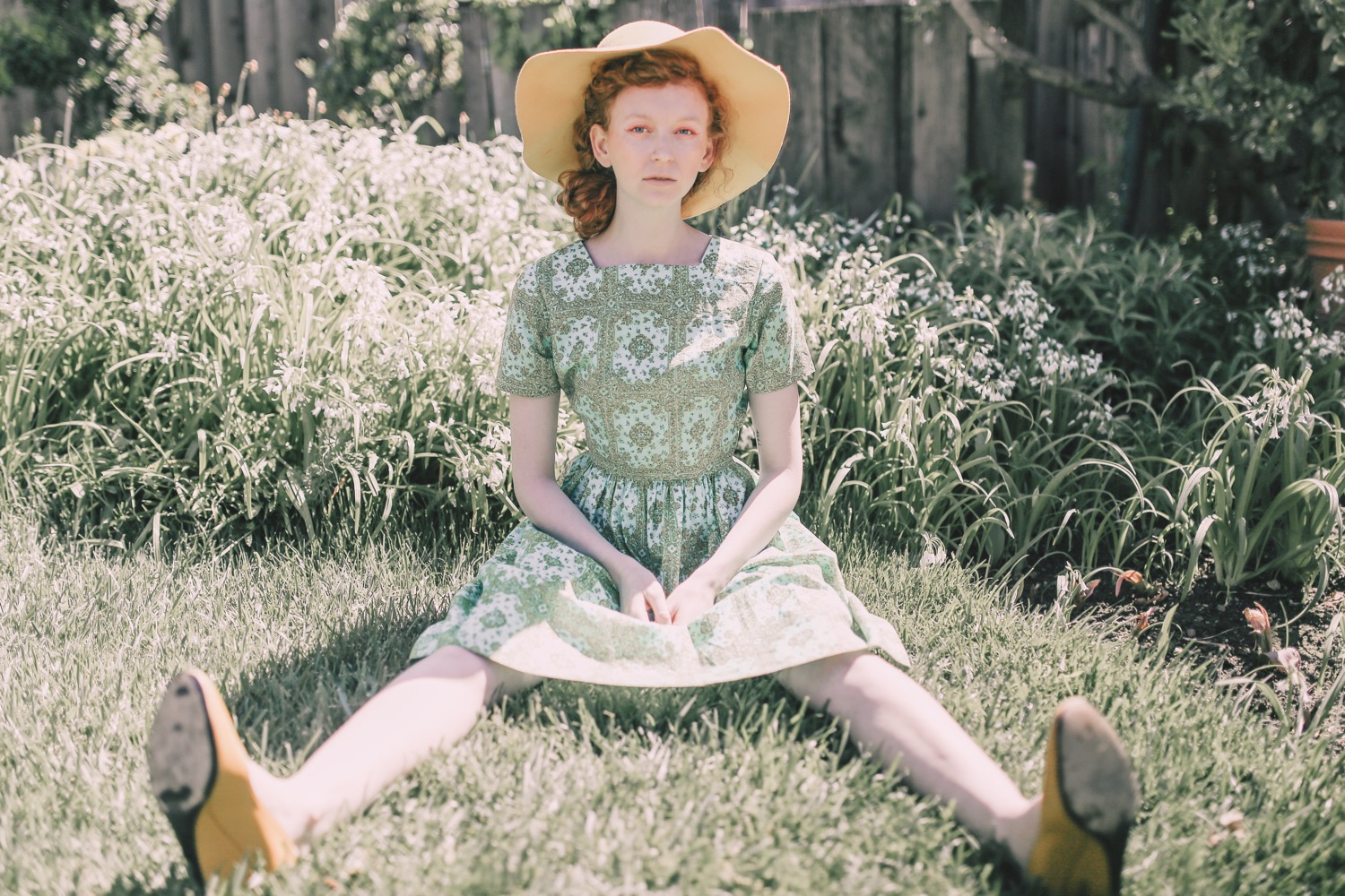


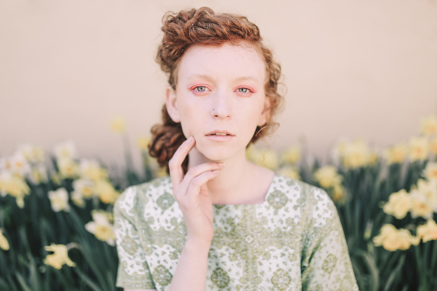
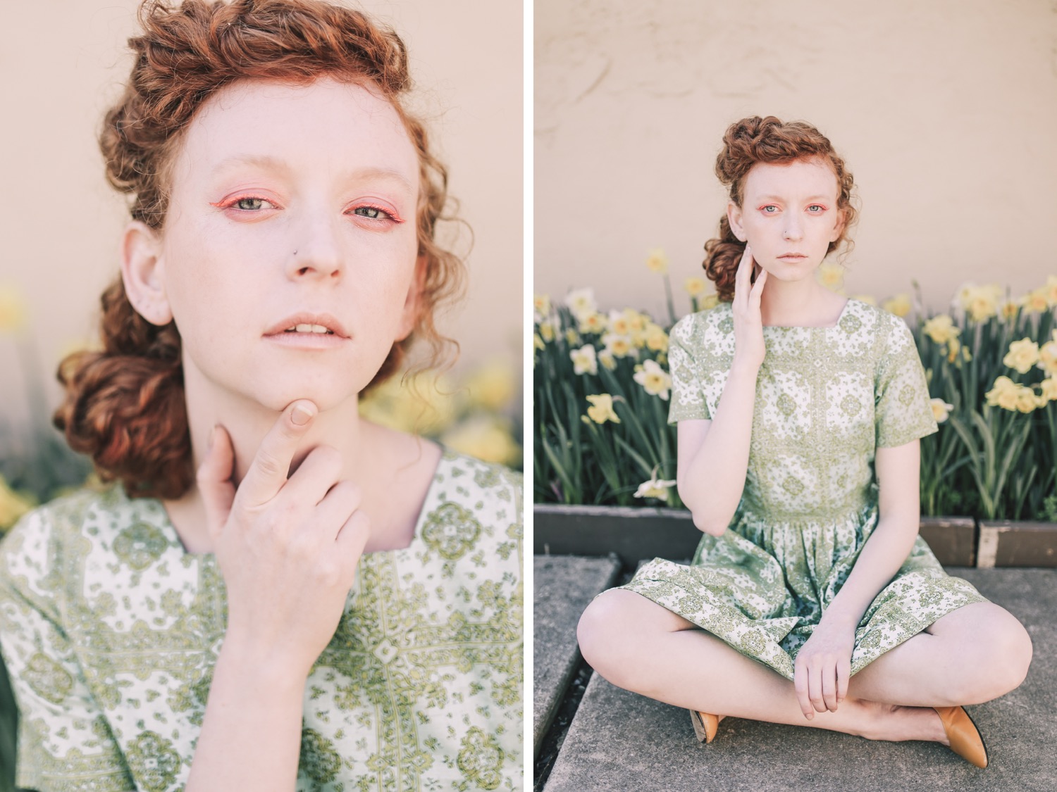
See how I edited some of these shots with Pop! Preset on my YouTube channel!

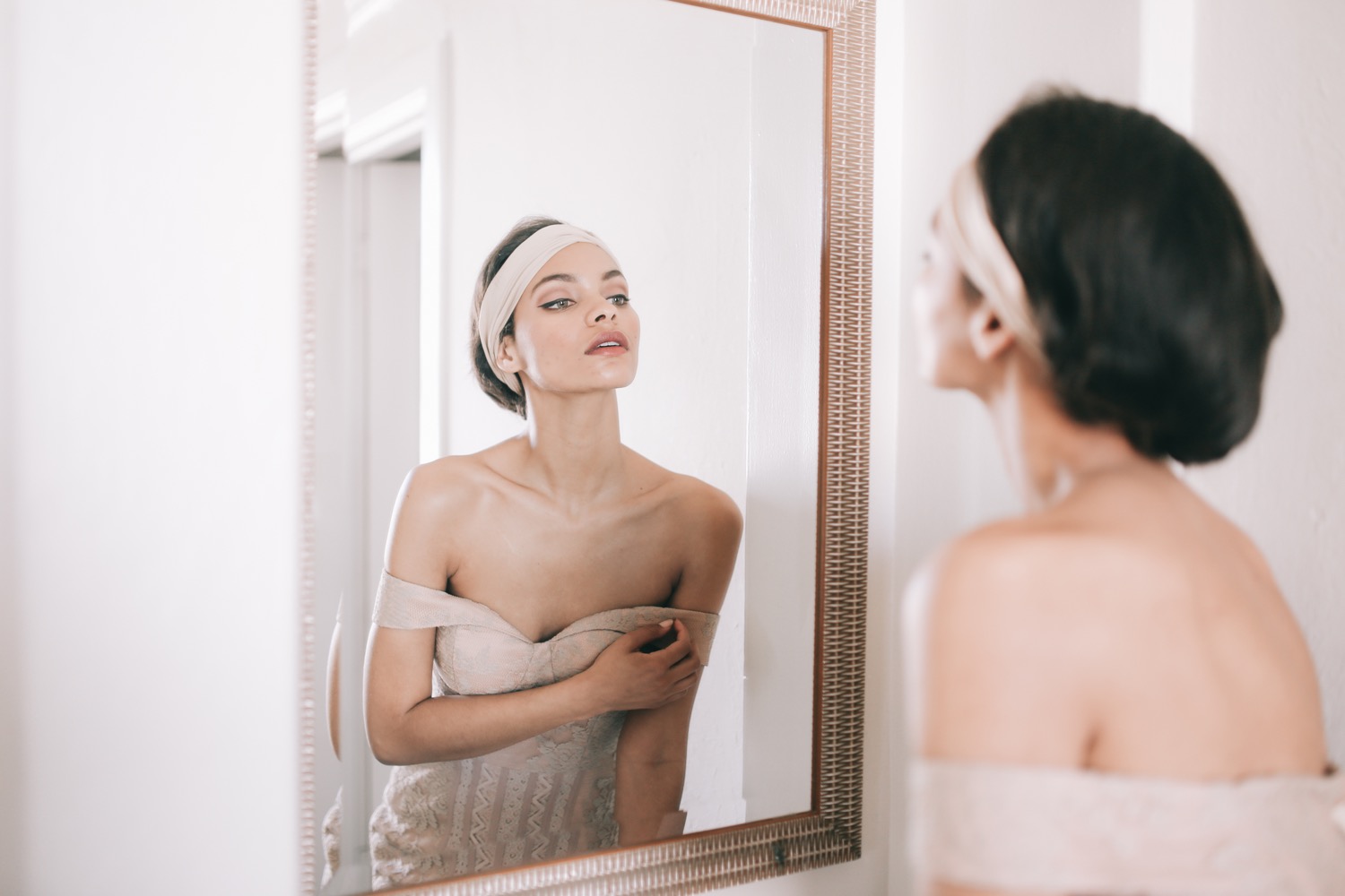
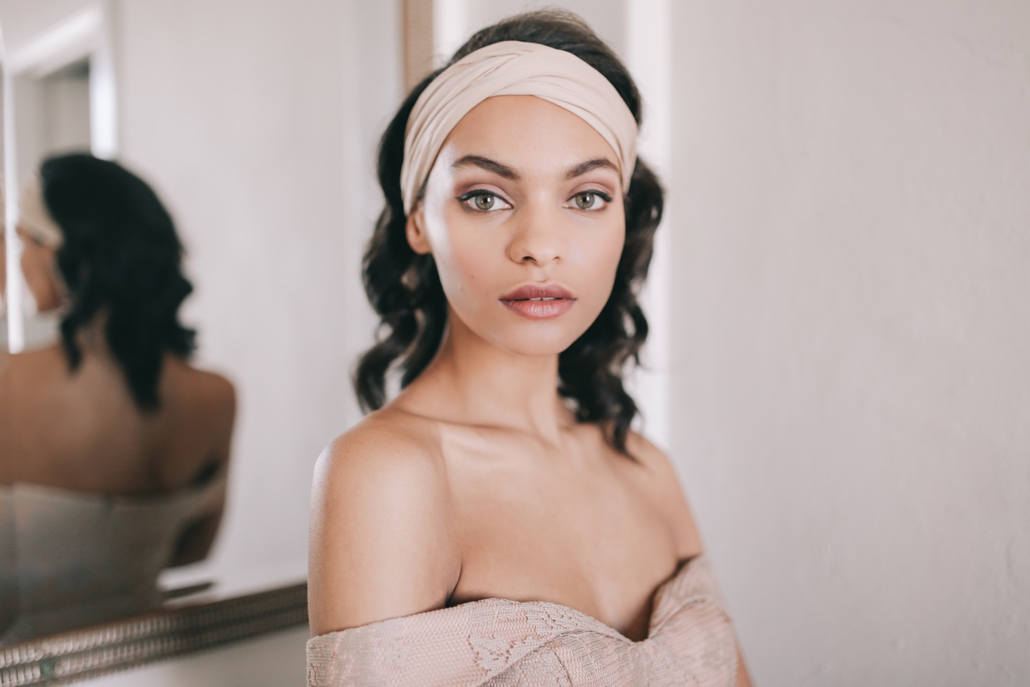
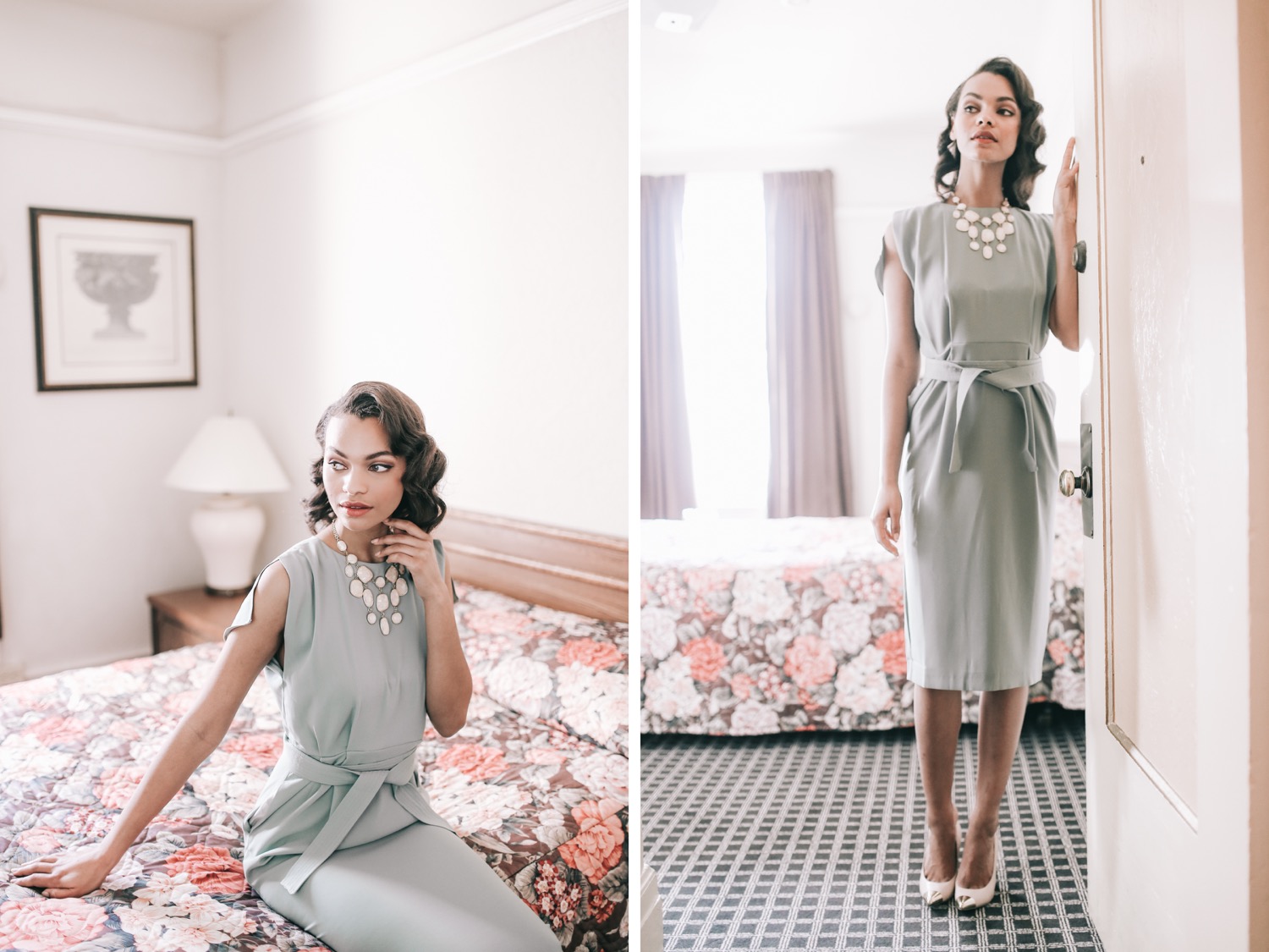
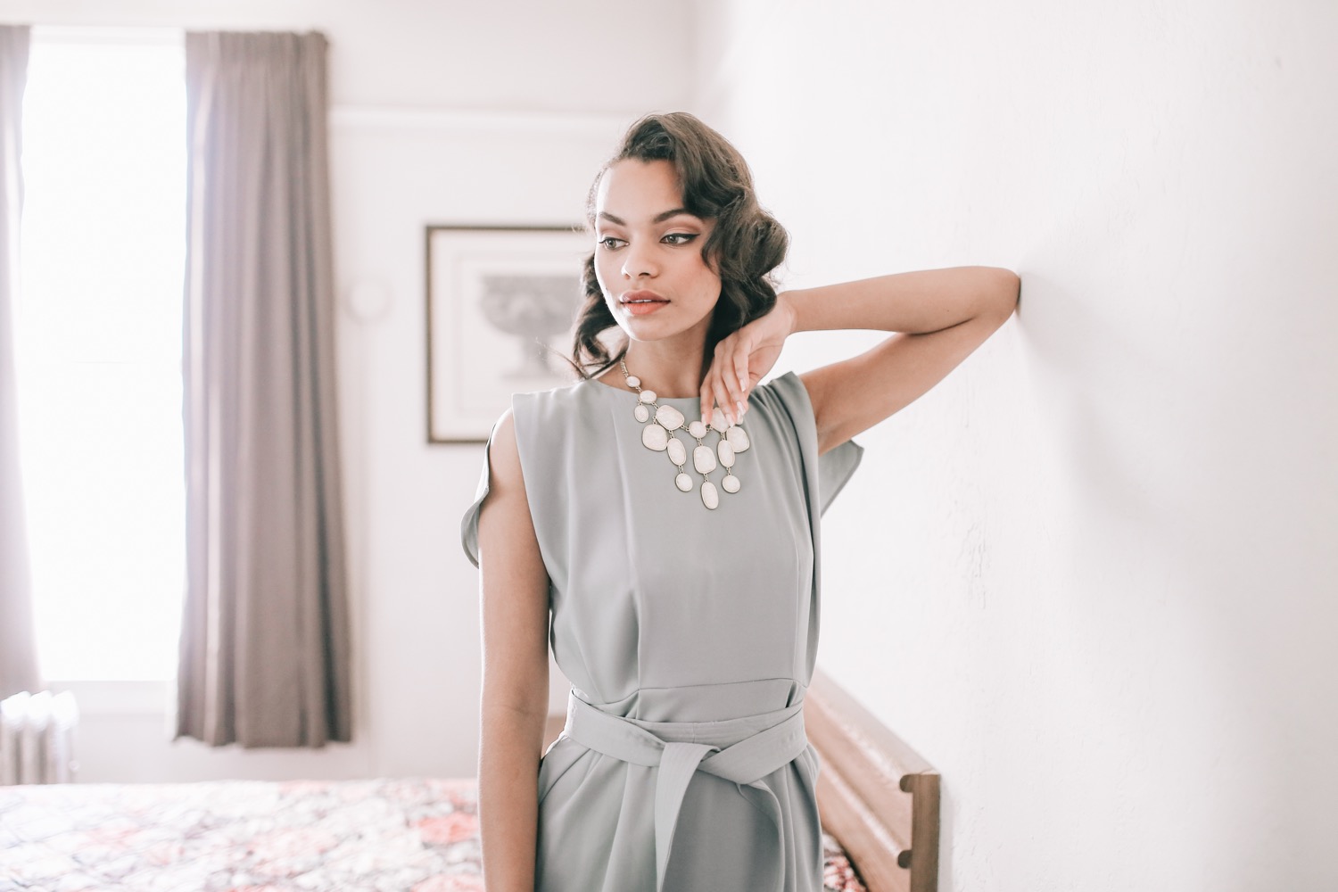
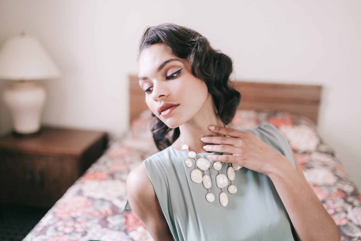
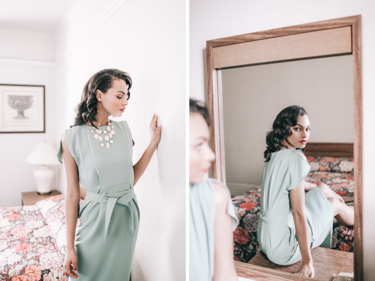
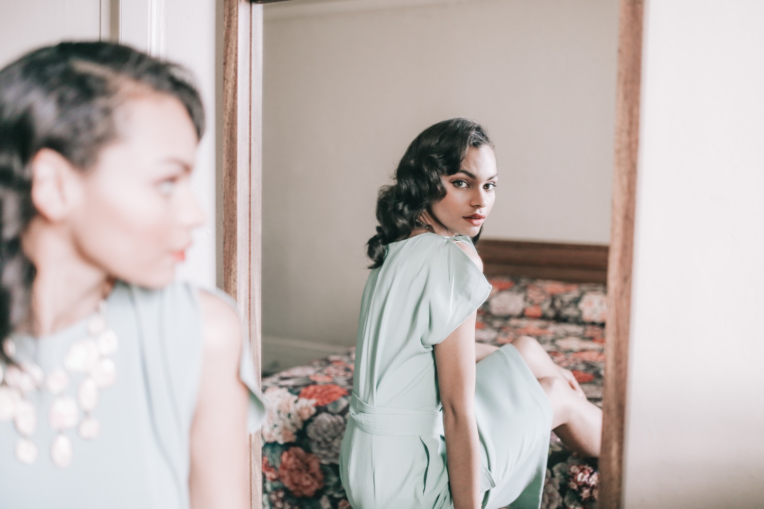
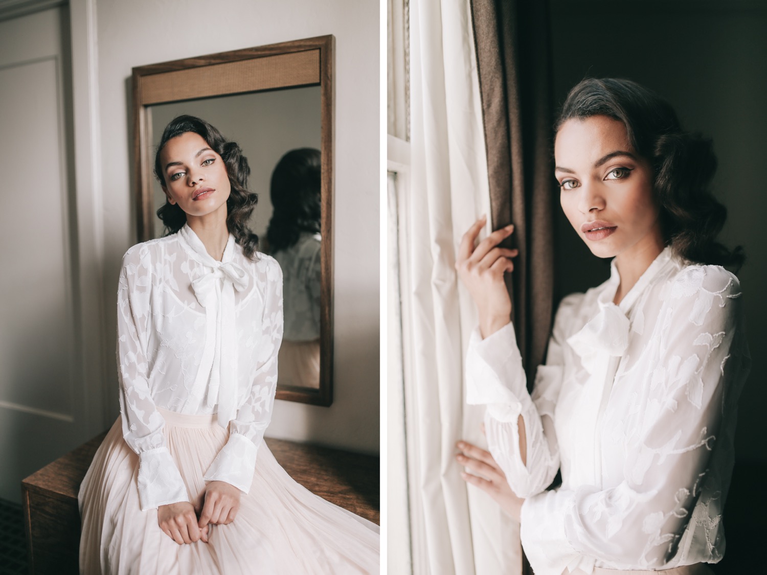
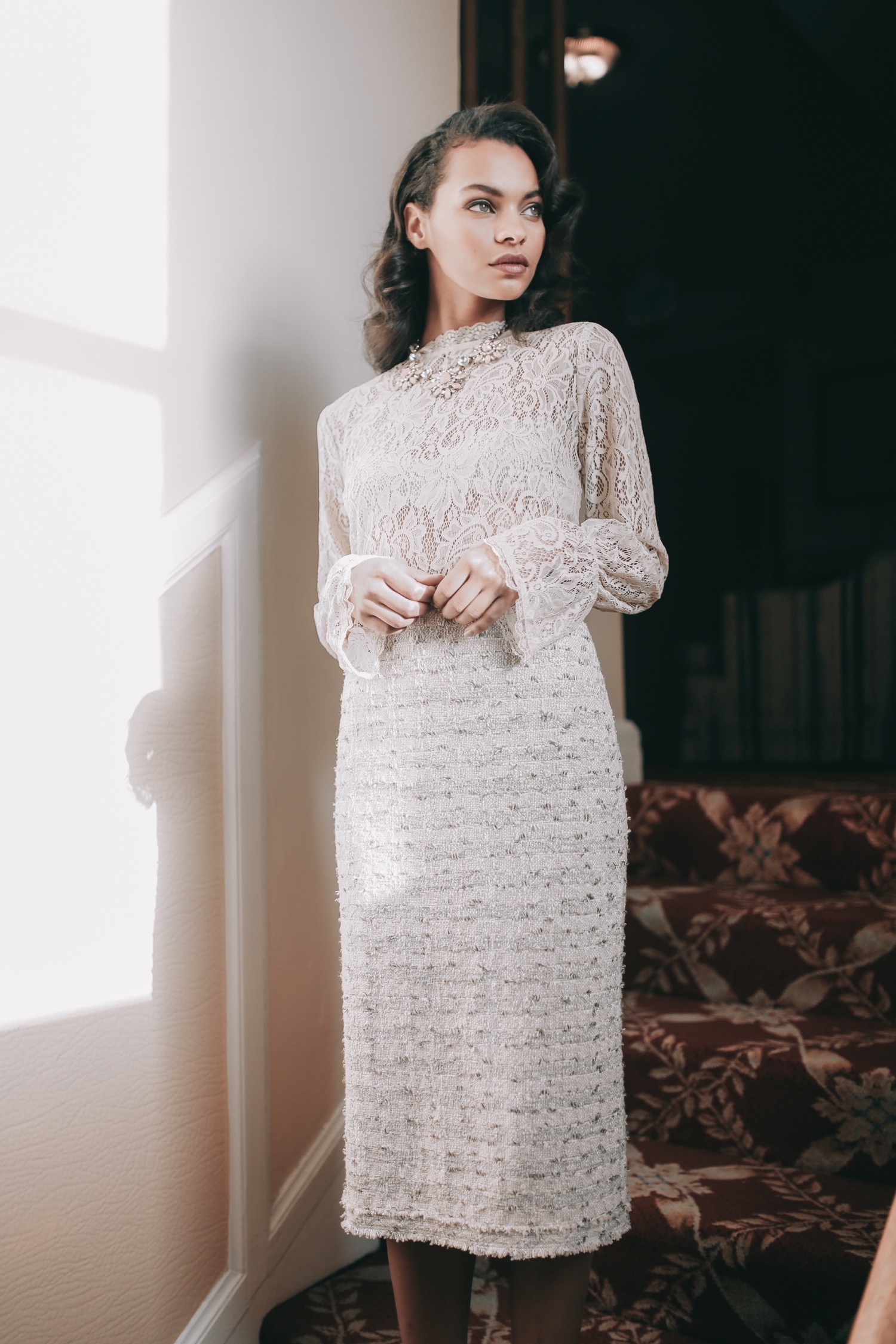
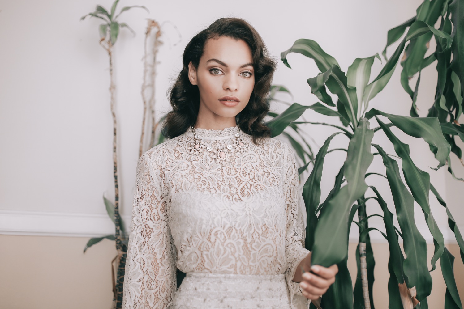
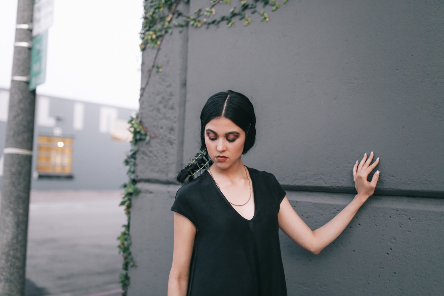
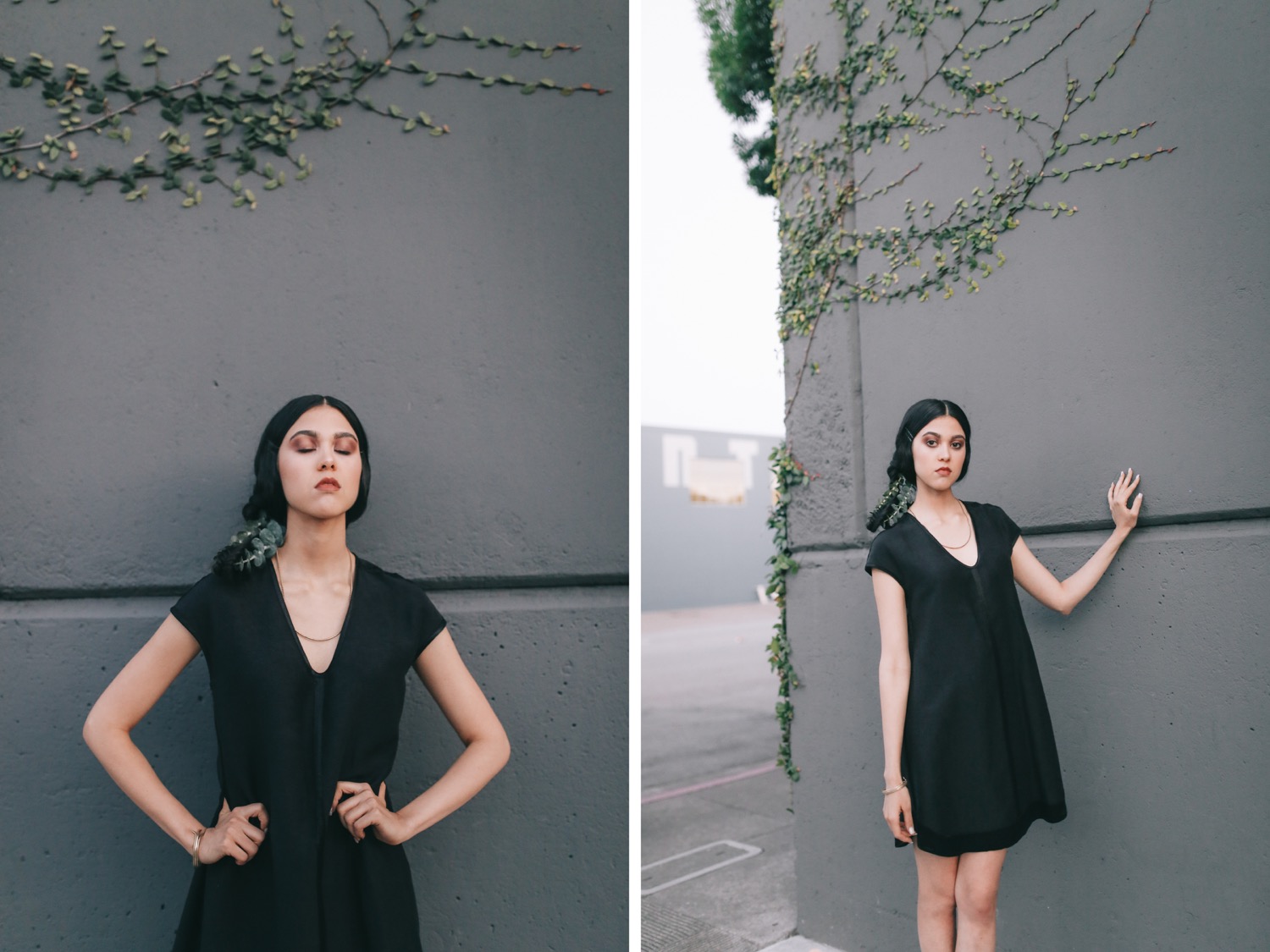
Model: Sophia Jackson (Scout SF) Hair & Makeup: Amy Lawson
Wardrobe & Styling: Amy Lawson
For MITH Magazine
See the tearsheets.








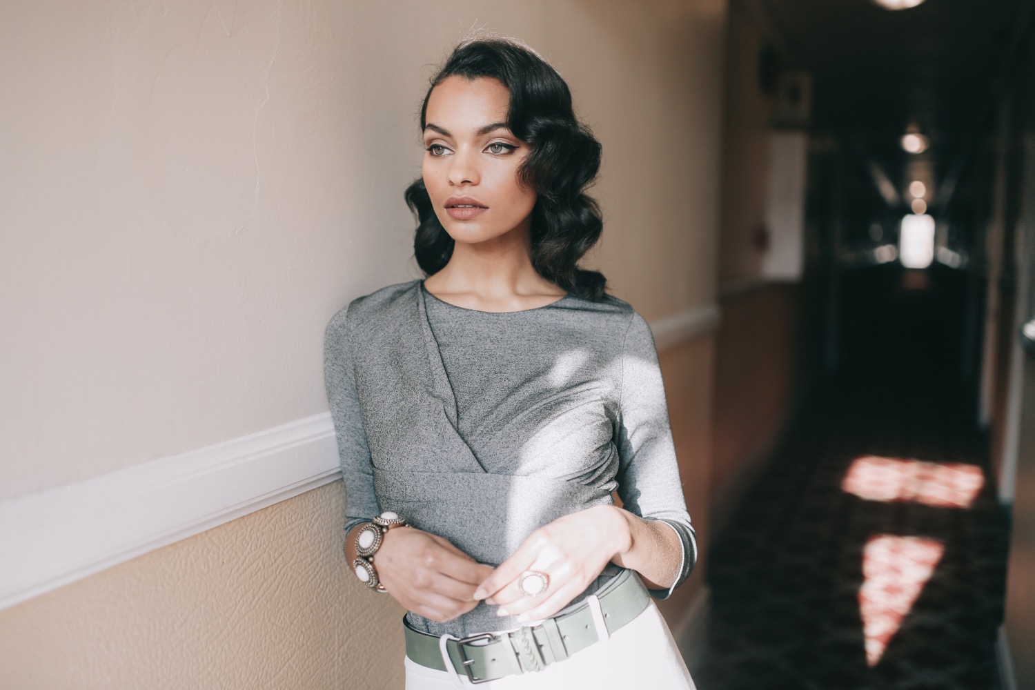
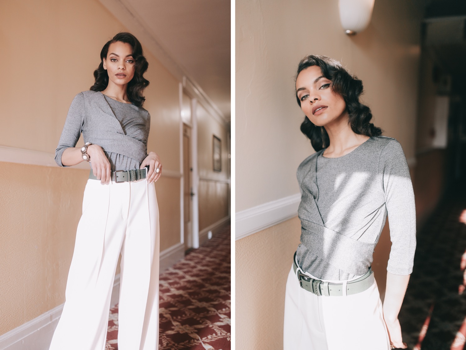
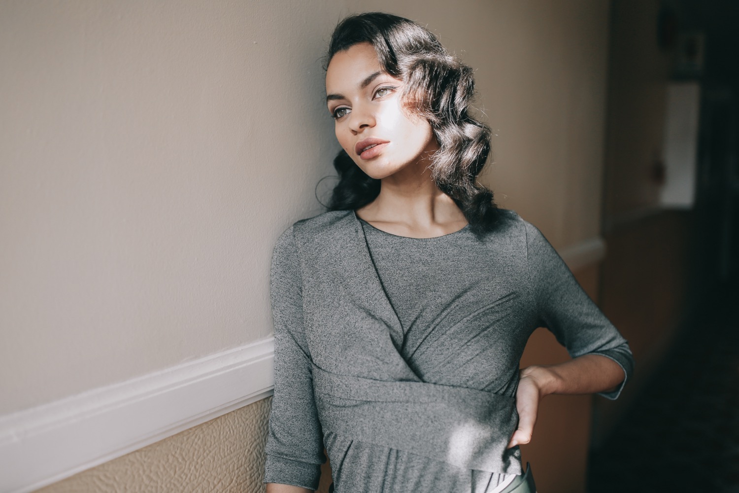
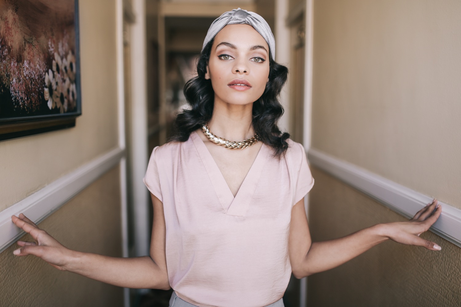
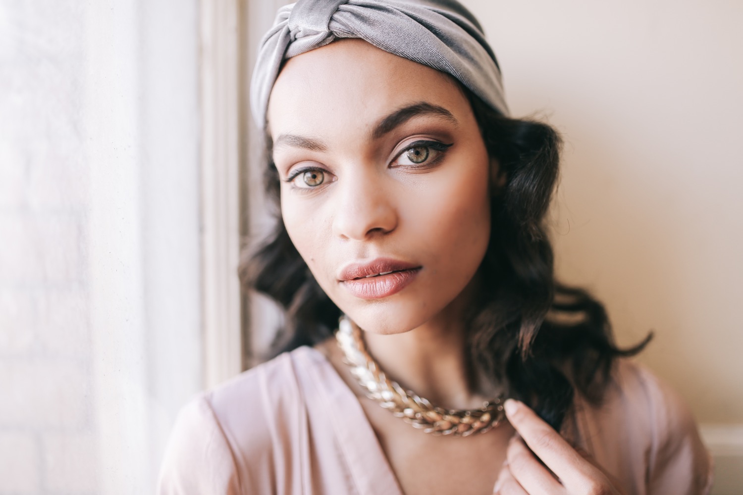




I used to be really afraid of shooting in harsh light. I was always hoping for fog when I had mid-day shoots in San Francisco, and I tried to schedule most of my shoots for golden hour. Golden hour is magical - there's no doubt about that. But I think shooting in harsh light (direct sunlight) is magical in its own way. So much so, in fact, that I have started to intentionally schedule some shoots around 11am or 2pm.

1. Keep your subject's face in the shade. Face your subject away from the sun to keep their face tone even. This, of course, is a rule that is also super fun to break when you get comfortable with this process. Try having a shadow created by a building or some sort of structure bisect their face; this can have a really interesting effect!
2. Expose for the highlights. The look I love involves exposing for the highlights (e.g., the brightest thing in your frame isn't blown out & all the details are preserved) and raising the shadows in post. In most cases, your subject will be the shadow, so they'll look dark in camera, but you'll lift the shadows in post.
3. Find a location that has shade and sun, if possible. It's always nice to have a shady place to resort to in case the harsh light isn't working out so well. Plus, if it is super bright out, there's a good chance that you'll get some nice bounced light on their face from the bright ground in front of them. Urban settings are often better for harsh light (rather than an open field where there's no escape) because there are tons of nice lines and angles to play with, and there tends to be shade somewhere (i.e., one side of a building) at any time of day.

4. Hats and sunglasses are your friends. Hats naturally frame the face and tend to ensure that the subject is nicely shaded (as stated in tip #1). I always tell people to bring hats and sunglasses when we're going to be shooting in harsh light so that we have always some portable shade, per se. Sunglasses will help with squintiness. Or, just have your subject tilt their head and close their eyes (I call this the "daydreaming" pose).

5. Spotty clouds are the best. They add interest if you're shooting the sky and make the image less overwhelmingly full of blue. Even though they usually aren't diffusing the light unless they're directly in front of the sun (in which case, you're standing in shadow), they somehow seem to make the harsh light just a bit softer. Whenever there's a day with big, puffy white clouds, I head out with my camera to take advantage of the dimensional scenery.

6. Know when to use it. If you're being paid to make someone look their best, shooting them in harsh light is probably not the way to go. I use harsh light for more fashion-based work, but I try my best to avoid it for portrait clients. When you're trying to showcase someone's beauty, the best thing to do is find some diffused or bounced light, or stick with golden hour.
What time of day do you prefer to take photos?
If you struggle with editing in harsh light, check out Pop! Harsh Light Pack for Lightroom presets designed to flourish in mid-day sun.

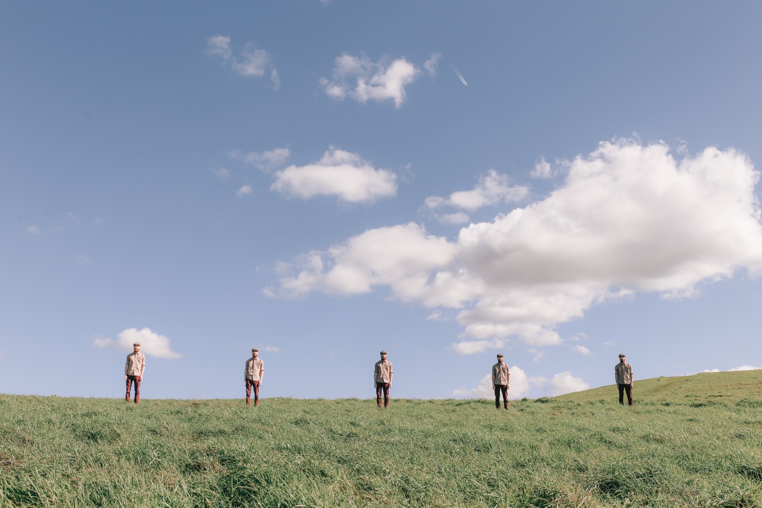
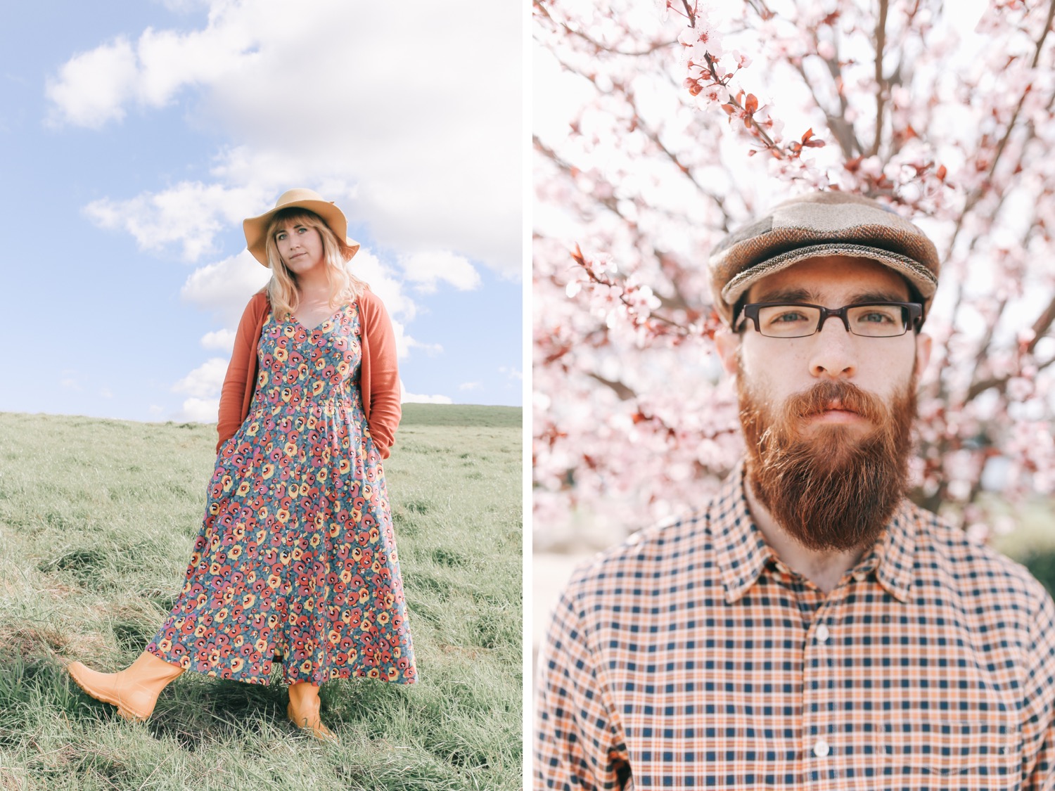
Sometimes it's hard to want to bring out the camera for more everyday moments. But I'm trying to do that more because I know it's more important than all my other work in the long run. I 5-of-a-kinded myself and Padraic. Enjoy these beautiful green rolling hills with puffy white clouds on a crisp day in Dublin (California - not Ireland, unfortunately).




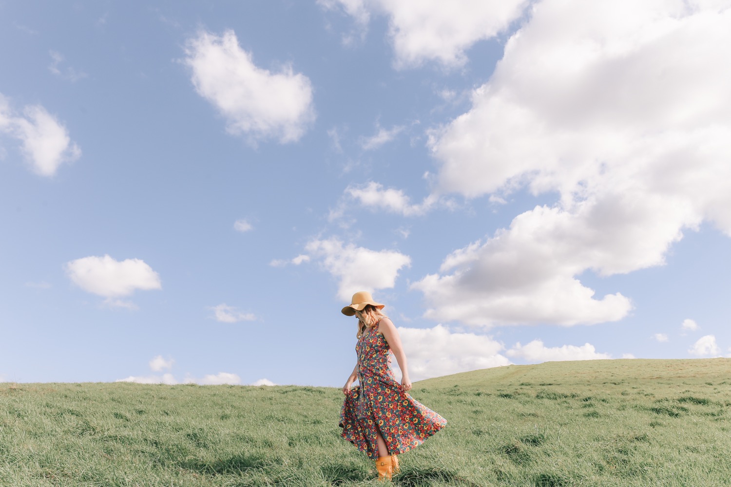





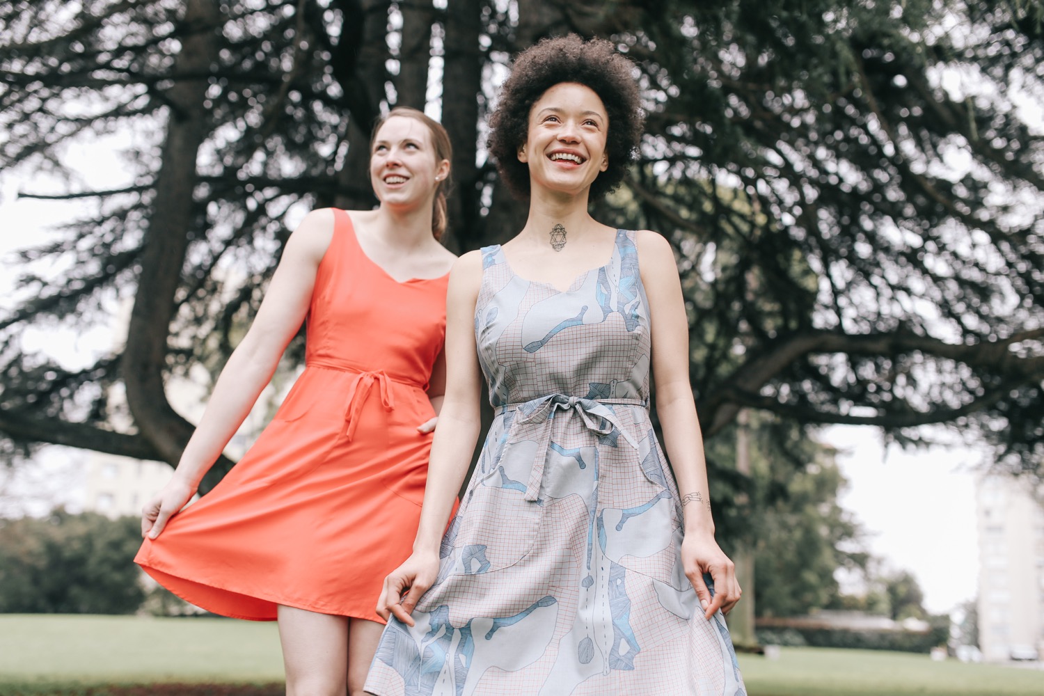
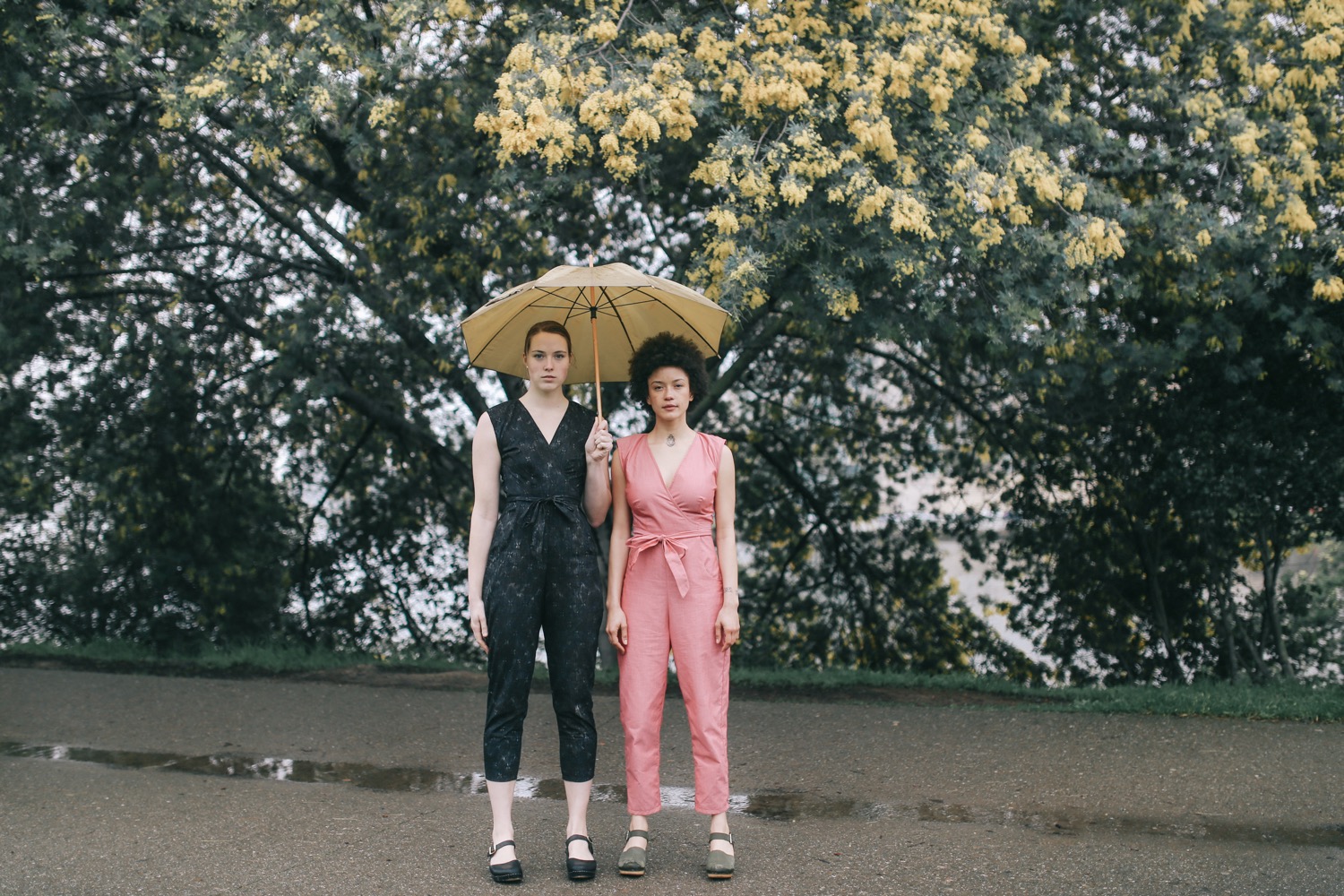
Oakland, California Fashion Photographer Featuring the designs of Field Day
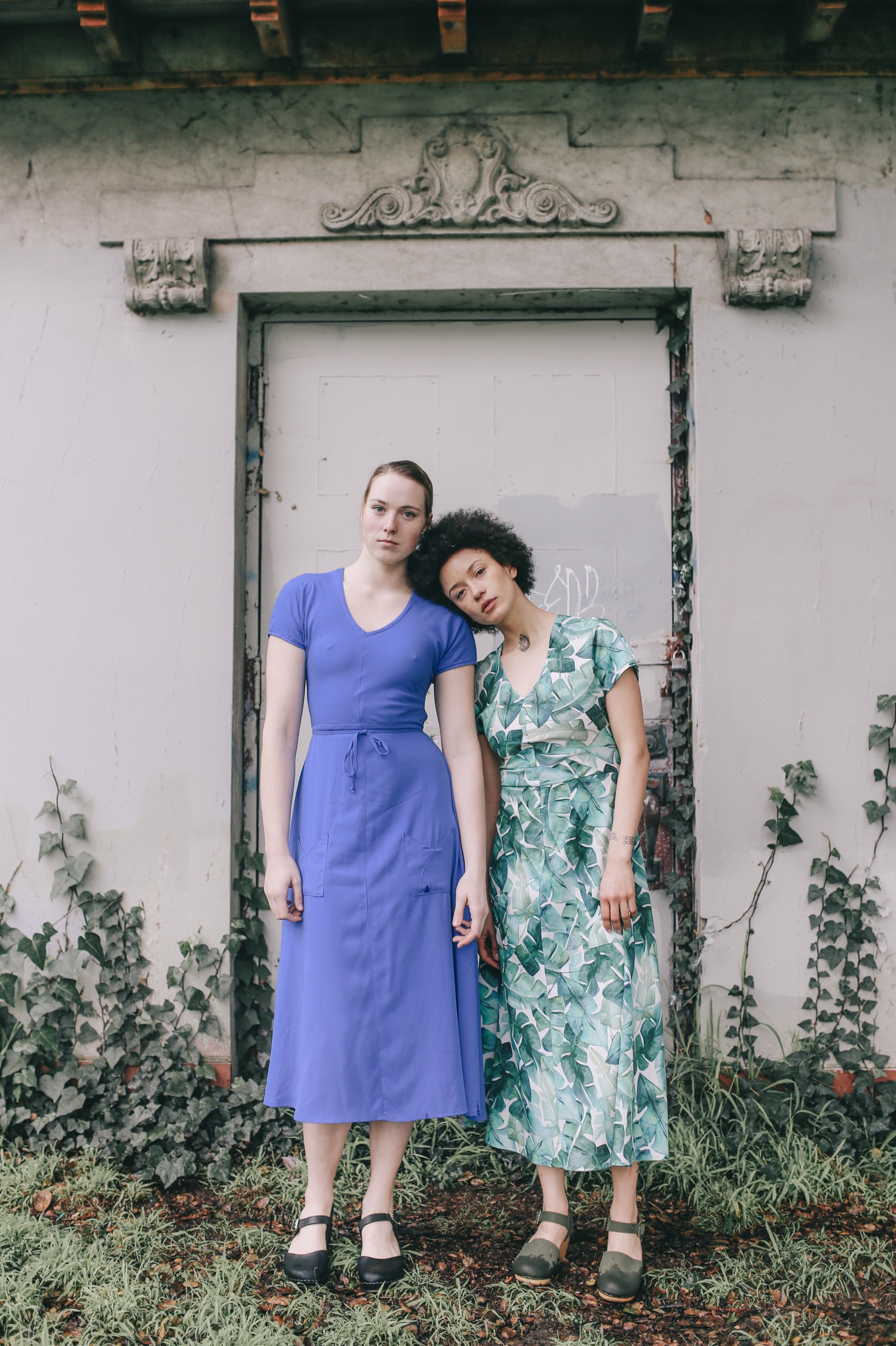
Models: May Daniels & Tabitha Nelson
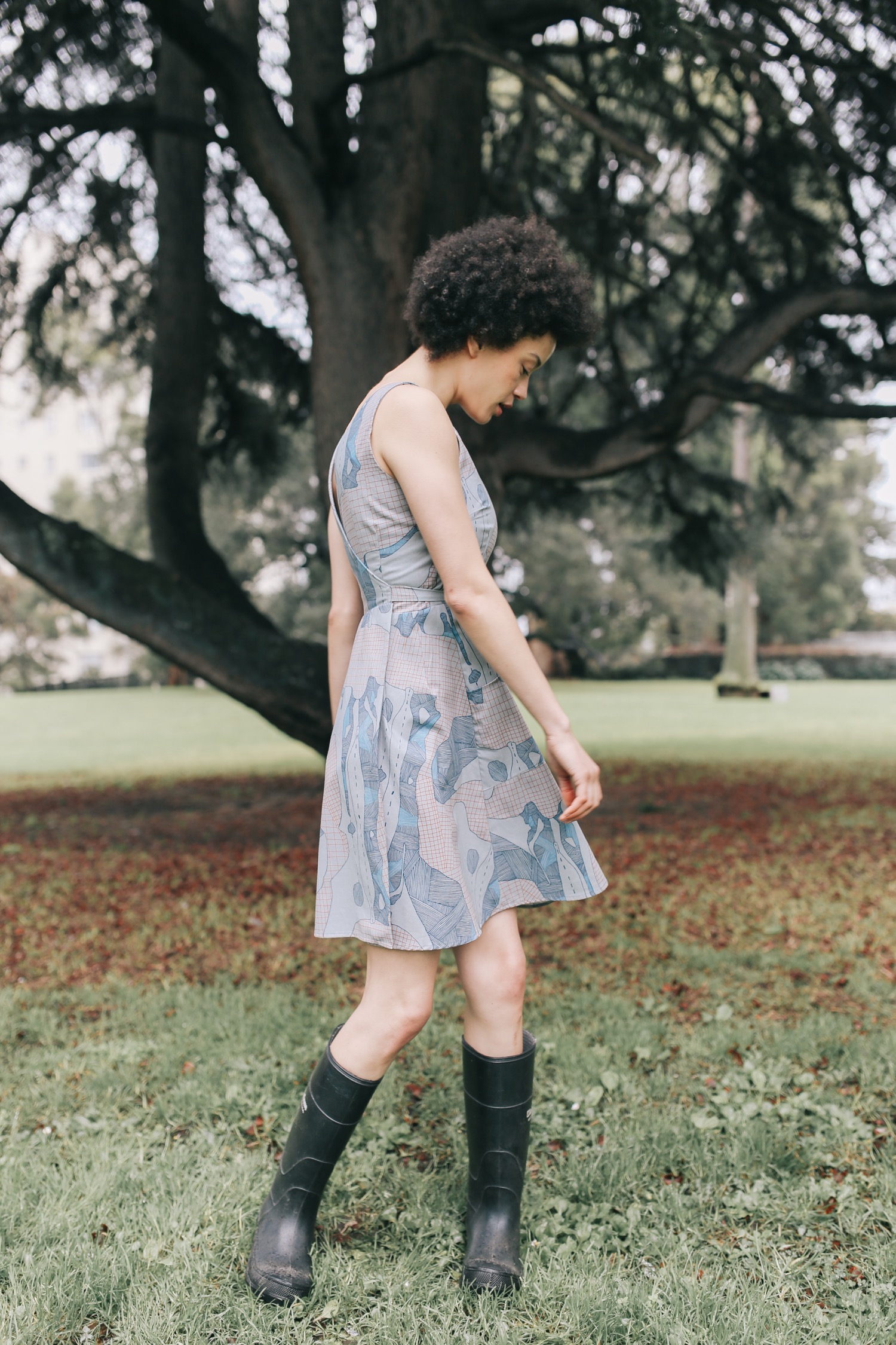





While I love this shot, "technically" it's not perfect. It was taken on my Mavic Air drone, whose images do not handle lifting shadows very well. You can see lots of grain. But just because something isn't technically perfect doesn't mean it's not a cool shot!
If I had a nickel for every time I've heard the line, "Your camera takes amazing shots!" I could probably afford a Canon 5D Mark IV.
But I'd probably spend that money on a few photography classes, or a vacation. Here's why:
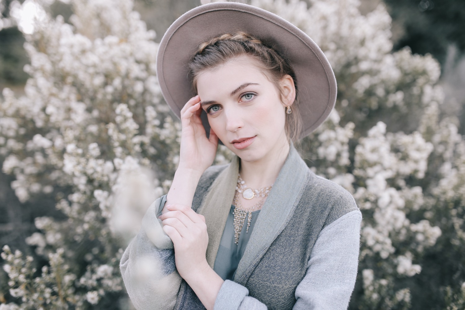

You can be an amazing photographer with just an iPhone. Or an Android, or a pinhole camera you make out of a cardboard box. The camera does not take amazing pictures - YOU do.
It's true that you may be limited by certain technical capabilities (low light sensitivity, depth of field, print resolution, etc.), but you should never feel discouraged by your gear (or lack thereof). While you're working up to your next purchase, think about what other skills you could be developing. Master manual mode and make ISO, aperture, and shutter speed second nature. Experiment with composition. Shoot a lot with whatever you have, and figure out what works.
Good gear doesn't equal a good photographer, and vise versa. I've met photographers with top-of-the-line, excessive gear whose work is, frankly, boring. It may be technically top-notch, but it lacks interest and creativity. You aren't going to stand out with your gear; you'll stand out by producing photos that are unique to you.
Of course, good gear can elevate your work, or allow you to capture more diverse scenarios (i.e., low light) more accurately. But think about how you can keep your gear as simple as possible. I thrive on being inconspicuous. It draws less attention, makes people feel comfortable in front of the camera, and gives you less to worry about on a shoot (less to carry, less to go wrong, etc.).
I'm really happy with my current gear set-up. So I figured I'd share a bit about my gear "journey":
When I first started photography, I had a Canon Rebel (from early 2000s) and the kit lens (18-55mm) it came with. Soon after, I got a 50mm 1.8 lens for just over $100, which I wanted for its shallower depth of field capabilities. It's a great starting lens for portraits!
Even though my work has changed stylistically, I still LOVE this shot, taken with a kit lens and a Canon Rebel in 2010.
Canon 6D: Purchased during Black Friday deal on Amazon I love this camera body. The main reason I needed to upgrade was the full-frame camera body. The Canon Rebel has a cropped sensor which is not as beneficial for low-light situations, and I wanted the wide look of a full-frame sensor with a 35mm lens, where you're able to get up close and still have lots of room around the subject. I don't really use its wifi capabilities (they are kind of clunky), but it's nice that they're there. It also doesn't have a dual card slot (only takes 1 SD card at a time), which is not great for weddings or other events where backup cards are extremely important, but I don't shoot those often. I also love its focus point system! Would highly recommend the 6D over the 5D series if you don't need a dual card slot or the more sophisticated focus points.
The Sigma 35mm lens combined with a full-frame camera allows you to blur out foreground items and achieve crisp focus on your subject while staying close to them. If you prefer a less intimate way of shooting, there are advantages to having a crop sensor, or a longer focal length on your lens.
Sigma 35mm 1.4: Purchased off of Craigslist at a lower rate This lens. I can't recommend it enough. I've heard that people have issues with the lens calibration and focus, but I have been using it for 3 years now without any issues. I rarely take it off. I occasionally use an 85mm 1.8 lens, but that is only once a year or so when I need a longer focal length or want the compression for certain headshots. If you can only get one lens, get the Sigma 35. I've also heard it's better than the Canon 35mm 1.4
TL;DR: 99% of my photos are taken with a Canon 6D and Sigma 35mm 1.4. It's a great set-up for under $3000.
Lighting For most of my shoots I only use available light. However, I recently started getting into product photography and purchased two Paul C. Buff 400W Alien Bees with 47” Octagonal Softboxes.
Post-production:
I use Lightroom to develop my RAW photos, and occasionally Photoshop for more intensive retouching. For my signature editing style, I use my own candy-coated presets, which are available for sale here!
I hope that gives you some insight! What gear did you start out on?
A few more 2010 shots taken on my Canon Rebel and kit lens (18-55):
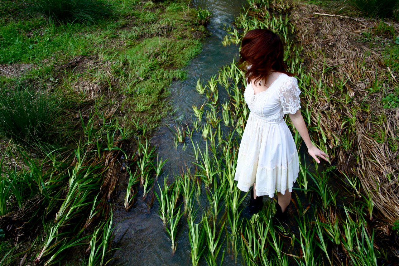


At this time last year, most of my shoots were spur-of-the-moment collaborations that I didn't have clear intentions for. They were fun and contributed to my portfolio, yes, but they weren't really driving my work forward. That's why I decided to start doing more editorial-style work for magazines; it increases my exposure and is necessary for any aspiring fashion/lifestyle photographer. Full disclosure: I've only had about 5 shoots published in some form thus far, with 3 more on the way. I'm not a total expert, and I'm sure I'll be updating this post the most I learn about the process! Here's what I've learned so far:

*Note: I'll be using the word magazine for all types of publications, whether they're print, online, or blogs.
1) Plan ahead. Many magazines have monthly or seasonal themes that you will need to fit into to have your work published. For example, if a fall issue comes out in October, the deadline is probably in September. You may still be in "summer mode," but you'll need to have your shoot finished and ready to go before the deadline. This requires thinking far ahead for what work will be compatible with an issue. Most magazines also require submissions to be unseen, meaning that no one from your team has posted to social media or anywhere public. Be very clear with your team members that posting publicly will compromise the ability to get published! I've also posted things to social media before I realized they would be good for a magazine, which is why it's important to plan ahead and have clear intentions for your shoot.
2) Find a good team. High-quality team members = high-quality work. I have a set of people I like working with, who I know will deliver the same results each time, and we tend to call upon each other to collaborate for editorials. Most magazines require a hair & makeup artist, an agency-signed model, and a stylist. (I've had a hair & makeup artist do both styling and beauty.)

Sidenote about styling: It's important to find a good stylist who understands the requirements of submitting work for publication. Many magazines ask for 4-6 looks, and that each designer only be used once. "Vintage" or "stylist's own" as wardrobe credits are not acceptable when used more than once or twice for most publications, so it's important that your stylist pulls multiple brands, no matter how well-known. They must have a label.
3) Prepare to wait...but not too long. Most magazines/blogs are very communicative and up front about publication dates, but I have encountered one magazine (won't name names) that accepted two of my shoots and never published them. Over a year went by with multiple attempts to contact them, so finally we gave up and submitted to other magazines, which published them within weeks. Waiting that long without a clear explanation is NOT normal or professional, so if you aren't getting an answer, move on. It's typical to have to wait 2-3 months from shoot date to publication, depending on deadlines and the frequency of magazine issues. I wait 10-15 business days to hear back from a magazine, and then submit elsewhere if I don't hear anything.
4) Not all magazines are created equal. This applies to both reach and requirements. Some magazines are stricter than others and have many more specific requirements of the editorials they accept. Each magazine's website tends to have a "submissions" section that details what they're looking for. However, I have occasionally missed some of the requirements and still been accepted, so go for it anyway, as long as you are in the ballpark. You also want to think carefully about how many followers the magazine has on social media, as well as their readership. You're trying to maximize your exposure when you get published, so aim for the stars first, and when you don't hear back, keep climbing down the ladder.
5) Consider composition. Most print magazines only want vertical images, or horizontal images that can be cropped to fit on one page. I think this requirement has influenced my composition, and I notice that I shoot vertically much more than I used to. That doesn't mean don't shoot horizontally, but include mostly vertical shots in your submission.
6) Be sure to get behind-the-scenes content. While you're waiting for your editorials to be published, posting behind-the-scenes content is a great way to generate engagement on social media. Politely ask a team member if they wouldn't mind filming a few clips or getting a few shots with their phone. Some magazines request behind-the-scenes content!
7) Which medium? Print and online both have their value. Print could have higher readership (subscribers), plus it's just cool to see your work on paper and keep it on your coffee table. However, online could have just as high readership, PLUS you have the added benefit of an SEO boost if they link to your website. A link to your page from a credible website tells Google that you're legit and increases your ranking. Online editorials may also be published sooner than print.
8) Be persistent. Don't give up on publication until you've exhausted your list of potential magazines. And even if no one accepts you, it doesn't mean it wasn't a good shoot. I'm not just saying this to be nice; it really might just be the wrong theme for the issue, or it's not really editorial style. I used to submit things that really didn't belong in magazines (and they never made it there!), but I still loved the shots. Examples include shoots that only include one look, feature a non-agency model, or are mostly horizontal, wide shots featuring landscapes more than the model/wardrobe.

9) Don't bother with Vogue. Sorry, I hate to break it to you, but Vogue doesn't take submissions. Your best chance is stalking the editor-in-chief and begging her to even take a look at your work. Other than that, join the rest of us in non-Vogue-land.
10) Don't sacrifice your style to be accepted in a magazine. One issue I have with some magazines is that I find a lot of their content to be similar and overdone. Don't try to fit into a magazine by copying the overall style of the work they feature. Rather, do some research and figure out what magazine fits best with your style. At the same time, editorials are a safe space to take risks. If you've been wanting to try out something super creative or unusual, go for it! That's what editorials are about. You're not pleasing a portrait client or getting paid by a brand. This is your chance to experiment, and it's not just okay; it's encouraged.
Have you submitted work to magazines? What was it like?
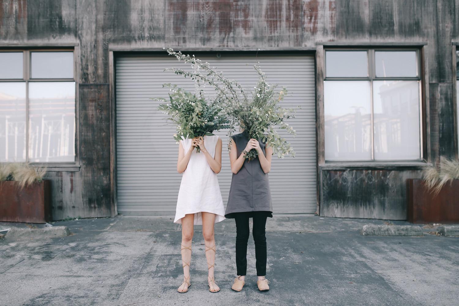
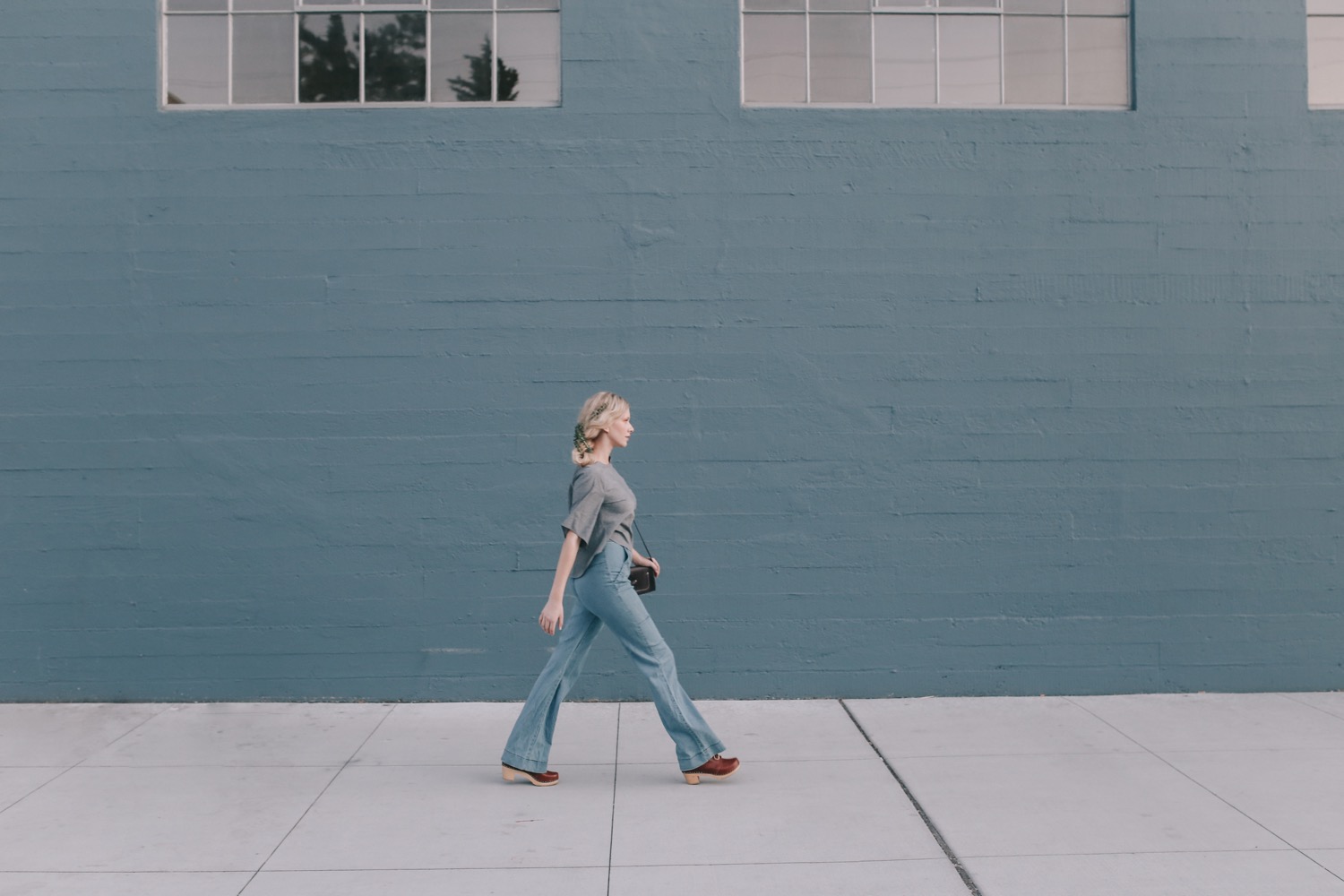
If you'd prefer to see how I edited this photo in a video, check out my latest YouTube post!
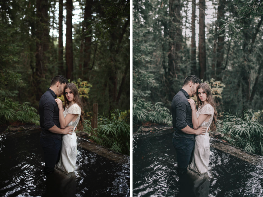
1. Apply preset 400H+1 from VSCO Film Pack 6. 2. Remove grain. 3. Lens Corrections > Enable Profile Corrections > Sigma > Increase vignette to 153 4. +20 exposure 5. -11 contrast 6. -1 tint 7. +4 saturation - default red shadows (split toning) 8. -70 highlights 9. +91 blacks 10. +71 shadows 11. -15 whites 12. -11 saturation 13. +2 vibrance 14. +5 clarity 15. lift left corner of tone curve to add matte blacks 16. -64 green saturation 17. +15 green hue 18. -59 yellow saturation 19. -53 blue saturation
Note: the settings I didn't mention had the defaults that are applied with the preset! I also gave the settings for the original edit, not the live edit in the video.

I hope you found this written step-by-step process to be useful!
Do you ever have waves of intense inspiration in which you want to make your vision come to life as soon as possible? What if you can? Not to sound like a cheesy inspirational speaker, but what's stopping you?
Not every shoot or concept can come to life overnight. My 5 of a Kind shoot, for example, took 7 months to come together successfully. However, occasionally I'm struck with smaller-scale inspiration that I choose to run with.
Some of my favorite shoots have come together in a matter of hours.
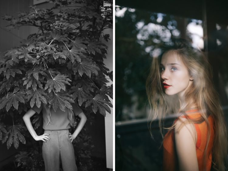
1) Ksenia. In January 2016, I found Ksenia on Model Mayhem on a Thursday night, wondering if she'd be able to shoot a 1960s/1970s theme at my apartment on Saturday. I already had the clothes that I wanted to use, so I had the basic direction in place. I sent her a message on Thursday, didn't hear anything until Friday night (while I was sleeping!), as I woke up to a text from her that morning saying that she could be there as early as 10am. I wrote back immediately, saying, "YES! Let's do it." And we did. I quickly headed to the fabric store and pulled a few backdrop options. I shoved all my furniture to one side of the room and hung up the fabric with pushpins. I had the clothes laid out on my bed. And we worked with my apartment and the surrounding area to put together a fun set of images.
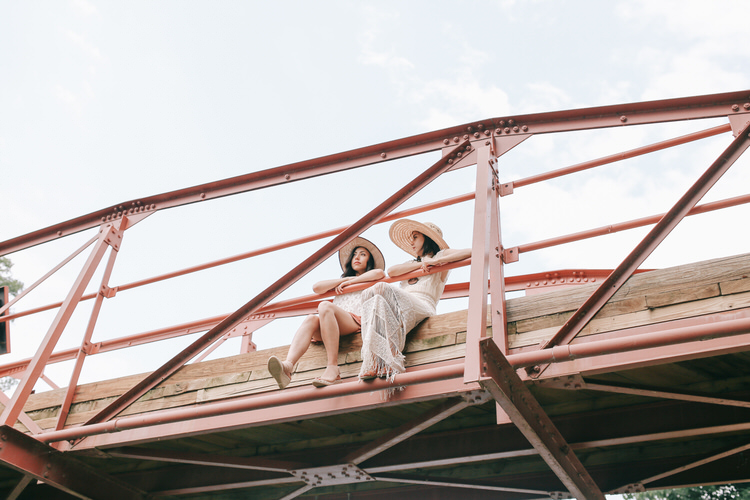
2) Anthropologie. In June 2016, I was heading to Washington, D.C. for my best friend's wedding. I don't know why I didn't think of this sooner, but it hit me 4 days before I was supposed to leave that I might as well do a shoot while I'm visiting the other side of the country. I went on Instagram and searched hashtags voraciously: #dcstylist, #dcmodel, #dcfashion – desperately looking for some team members! I stumbled across a local Anthropologie account (@anthro_chevychase) and sent them a message, wondering if I could source clothes from them. They replied saying that they could bring a bunch of clothes AND models! A done deal. Not to mention, last minute work for a major brand! We met up 4 days later and had a successful shoot.
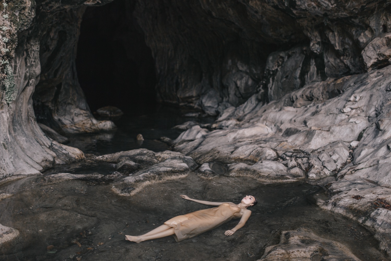
3) Laney. I guess a big chunk of my inspiration comes from wanting to make use of the beautiful locations I visit. Every summer, my family and I spend most weekends up in gold country near Angels Camp, California for houseboating and waterskiing. For a long time, I'd been meaning to make use of the beautiful scenery. The Thursday before we were heading up to the lake, I got a rush of inspiration and decided I wanted to do a shoot that weekend. I went on Instagram and searched #angelscamp, plus hashtags for surrounding towns, looking for locations and anything I could find in the area. I came across Natural Bridges, a beautiful cave system just 20 minutes from the lake. Boom. That's my location. Now I need a model...After coming up dry on Instagram, I resorted to Model Mayhem. There weren't many options in this area, but I found Laney, and miraculously she was available to shoot! I took a gold slip I'd used for a shoot in the past and went to Target for a few gold accessories, making the theme "Gold Country."
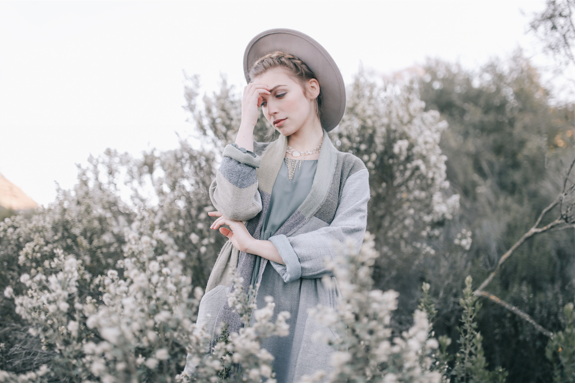
4) Lydia. This time my source of inspiration came from the model. I connected with Lydia on Instagram a few months back and had been wanting to shoot her. She has a really cool look and I thought she'd do well with a classic, timeless theme. The timeline for this shoot was:
Tuesday night: ask Lydia if she's free (she is!); ask Amy if she can style (answer's yes!) Wednesday morning: hear a few "nos" from make-up artists and continue to reach out to others; virtually scout locations for rolling green hills and oak trees Thursday: Amy pulls clothes; Inna (make-up artist) is on board! Friday morning: I scout locations in the Dublin/Pleasanton/Livermore area. Find one I like (Del Valle Reservoir) and pass on all the meeting details to the team. Saturday afternoon: We meet at my apartment to prep and then head out to shoot!
Don't underestimate the power of taking an idea and running with it. You'll notice that in a lot of these situations, the team is small (often just me and the model(s)), which helps in terms of travel and availability. It also helps to have a large network of team members so that you can find someone who's available more easily. I ask for referrals from people I trust to expand my network.
I think great work can come out of last minute planning - sometimes the less details and time to think, the better! What's your experience with last-minute shoots? Have they been successful for you? Or are you more of a long-term planner?